A visible step indicator across the checkout flow
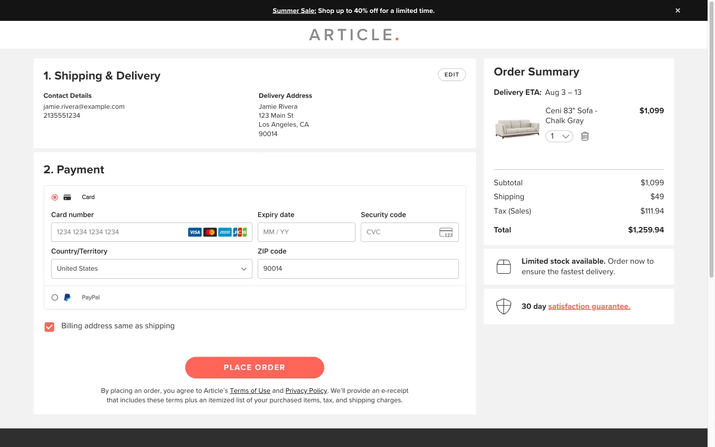
Numbered sections, Shipping then Payment, collapse into a short summary with an edit link once completed, so the shopper always knows how much is left and can see exactly what they already confirmed.
What it is
Each checkout stage is a numbered, titled section rather than one long form. Once a section is submitted it collapses into a short summary of what was entered, with an Edit link back to it, while the next numbered section expands as the one still open, so the shopper always sees which step is done and which is current.
Why it works
Multi-step checkout without any progress marker feels open-ended, and an open-ended task is easier to abandon than one with a visible end. Once a shopper can see step 1 has collapsed into a confirmed summary and step 2 is the only thing left open, the remaining work reads as small and specific rather than as an unknown amount of typing still to come, and that shift is enough to keep people moving through a screen they would otherwise be tempted to close out of, especially if something interrupts them partway.
How to test it
- Hypothesis
- Adding a visible, collapsing progress indicator across checkout will lift checkout completion rate, because shoppers can see how much of the flow remains instead of facing an open-ended sequence of forms.
- Primary metric
- Checkout completion rate (sessions that start checkout)
- Guardrail metric
- Abandonment at the final step, which could rise if seeing the first section collapse as "done" sets an expectation of near-completion that a longer-than-expected payment step then violates
Related ideas
Want this tested on your store?
We run the experiment, call the result honestly, and get paid on what it adds.
See the performance program