Conversion ideas, with the test attached.
Every idea here is running on a real storefront. We captured it, explained why it works, and wrote the test you would run to find out whether it works for you.
101 ideas
Homepage
12 ideas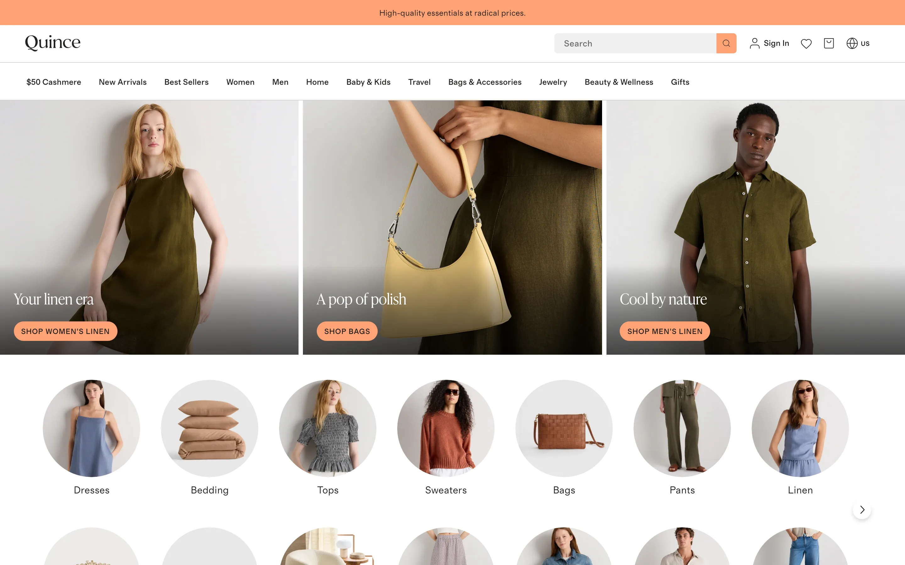
Lead the homepage with visual category tiles, not just a hero banner
A row of circular, photographed category tiles sits directly below the hero, each one taking the shopper straight into a specific section in a single tap.
Quince
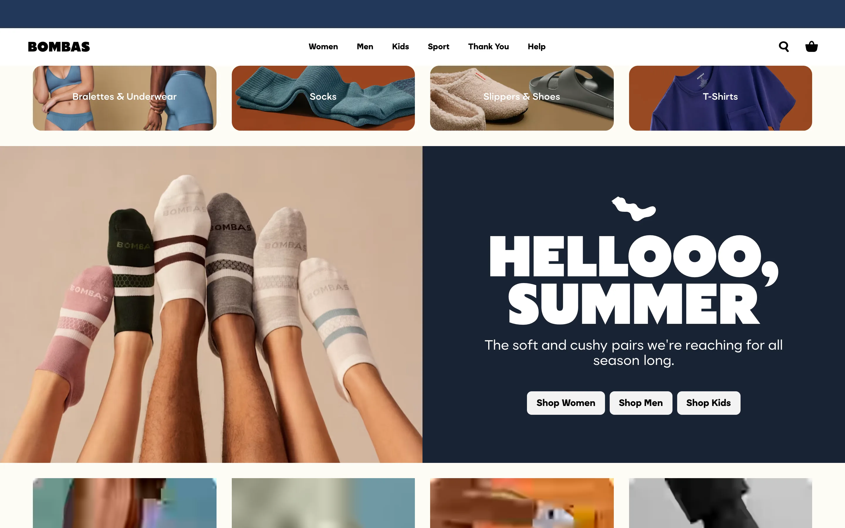
Split the homepage hero CTA by audience instead of one generic button
Instead of a single Shop Now button, the hero offers three parallel buttons, Shop Women, Shop Men, Shop Kids, so a multi-audience retailer sends each visitor straight to their own department.
Bombas
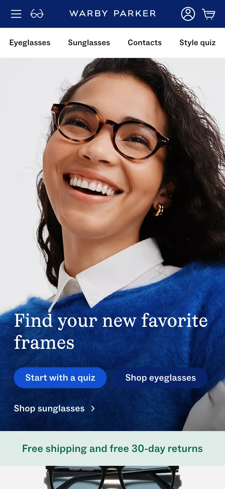
Offer a style quiz as the primary homepage CTA for a fit-uncertain category
Start with a quiz sits as the first, most prominent button in the hero, ahead of a plain shop-the-catalog link, guiding an unsure shopper toward a short set of questions instead of a full catalog.
Warby Parker
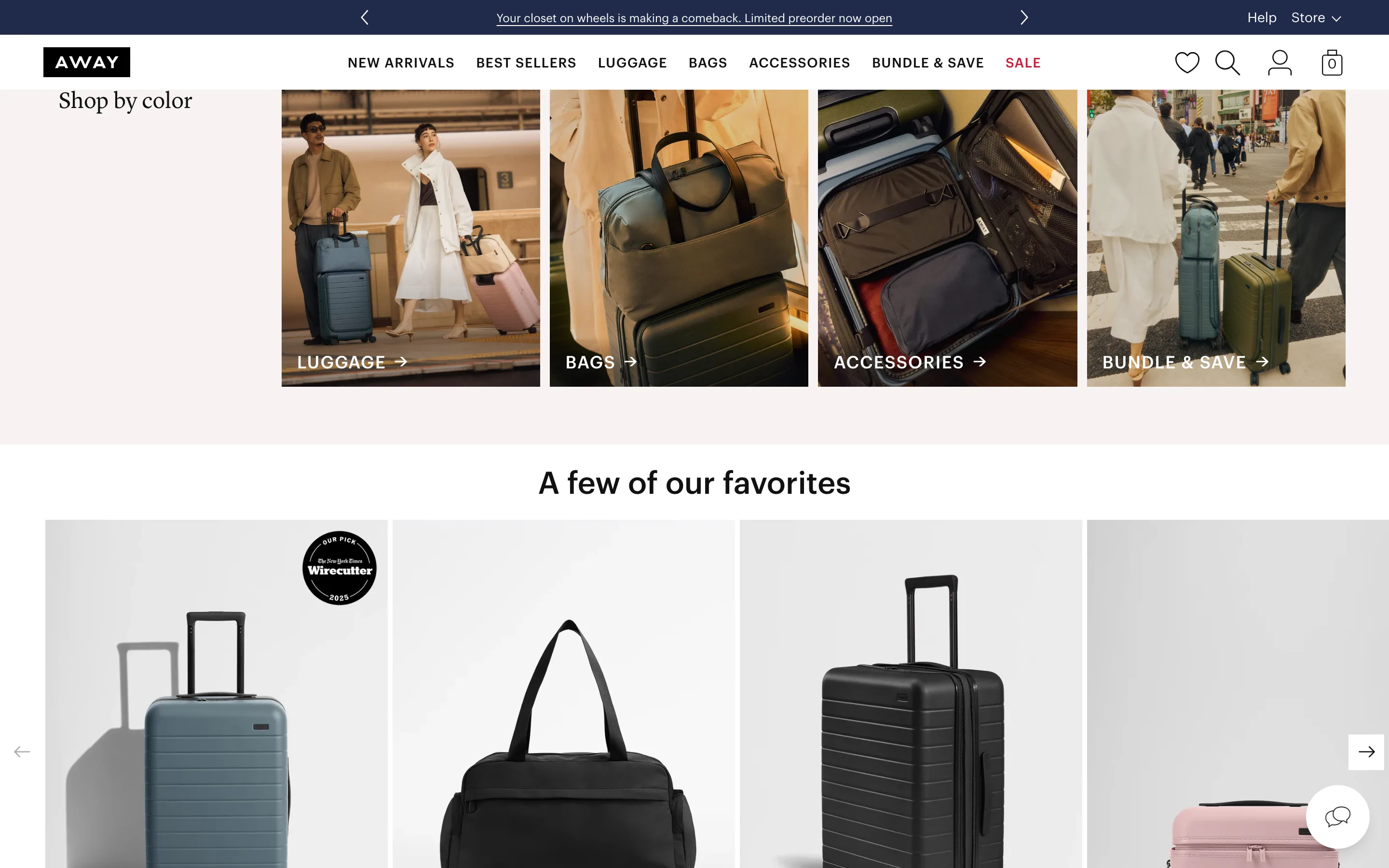
Overlay a third-party press award directly on the product photo
A round award badge crediting a named outside publication sits on top of the product image in the homepage bestseller carousel, not tucked into a caption or a separate credibility page.
Away
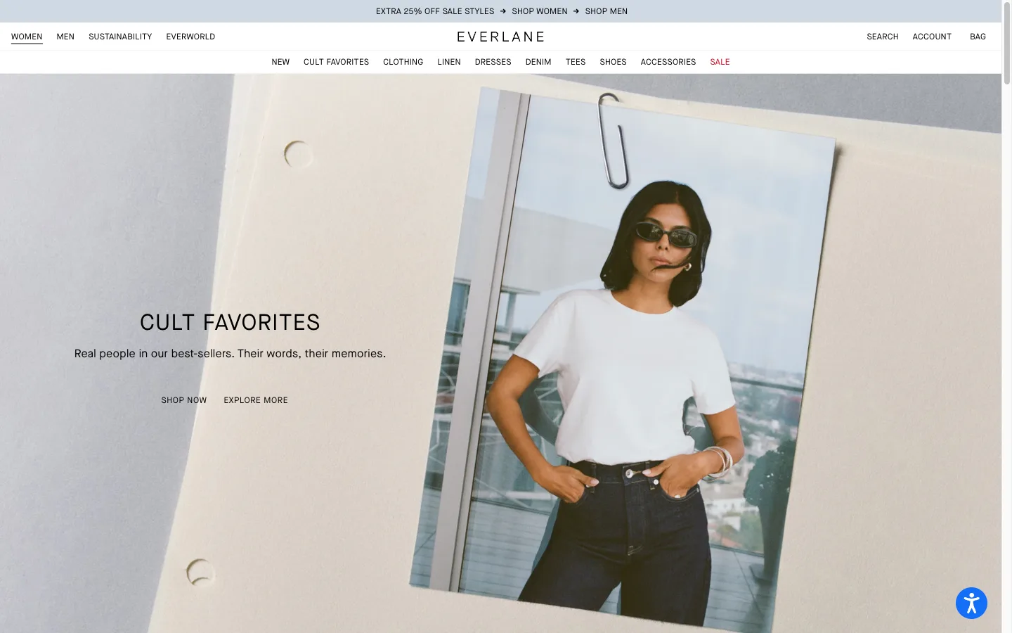
Give the homepage hero a second, lower-commitment CTA
Alongside the main Shop Now button, the hero adds a secondary link into editorial content about the featured collection, giving a not-ready-to-buy visitor somewhere to go besides the product grid or the back button.
Everlane
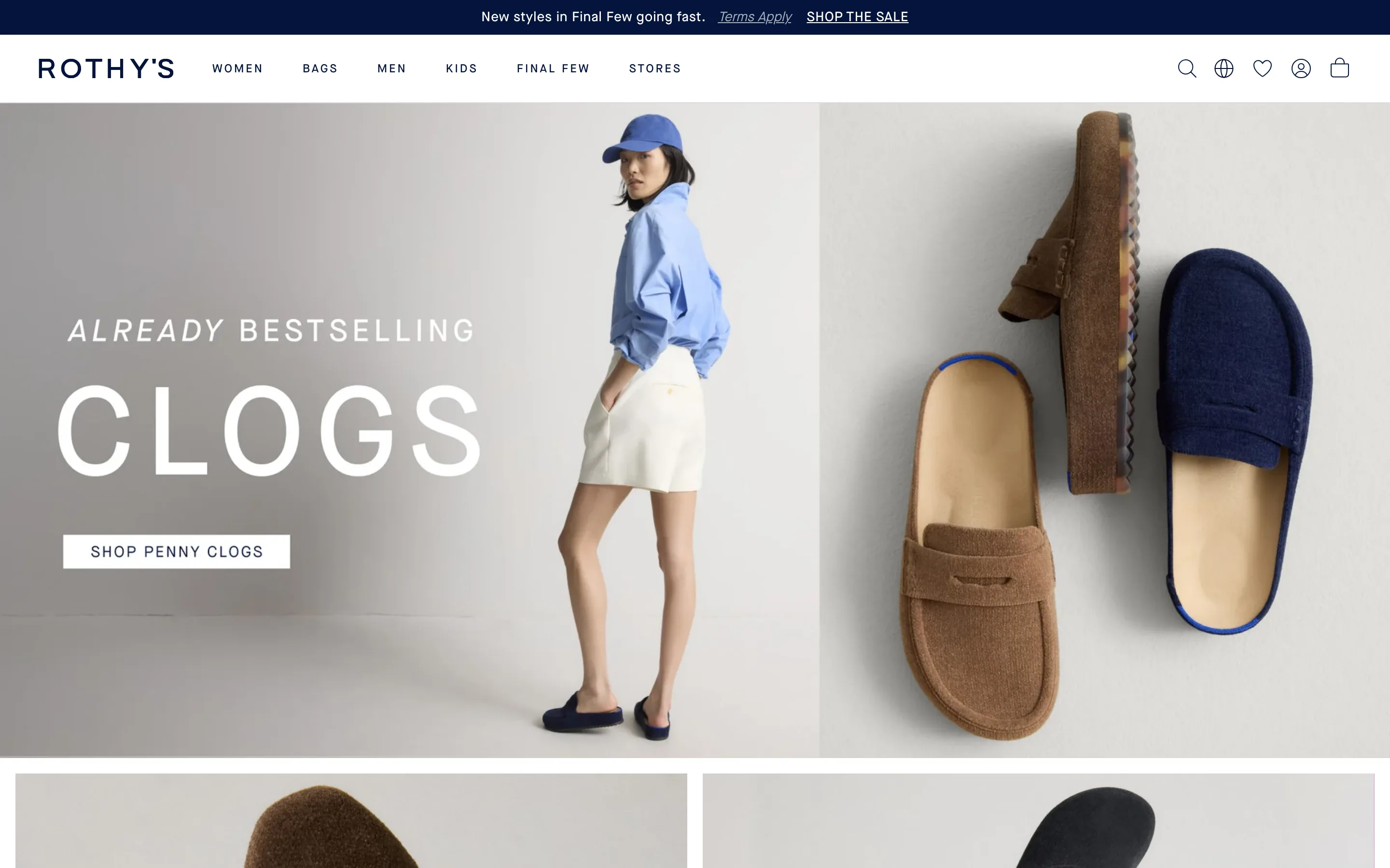
Name the actual collection behind an urgency claim in the announcement bar
The top bar names a specific, genuinely limited collection and links straight into it, instead of a generic sale banner that dumps the shopper on the homepage.
Rothy's
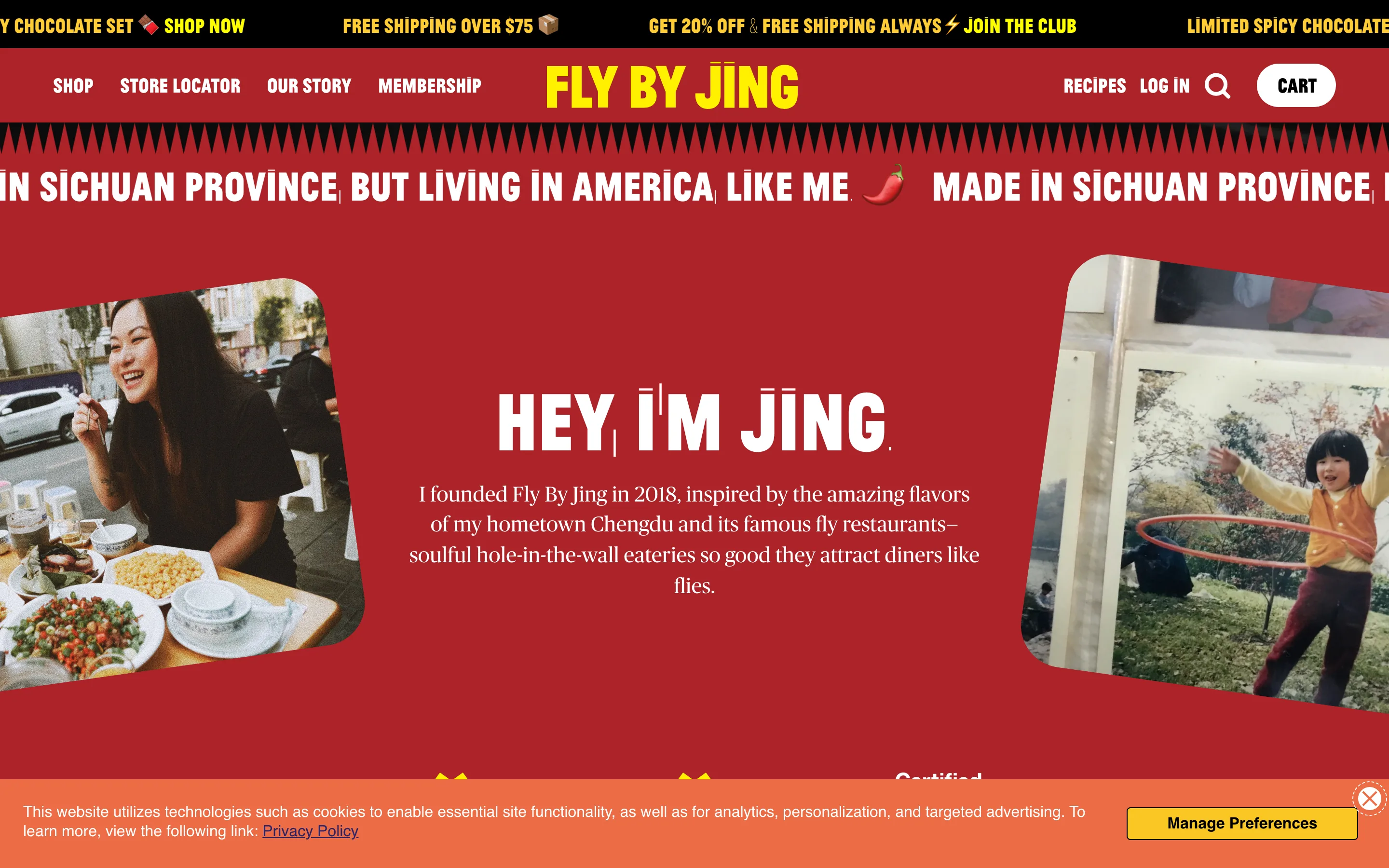
A first-person founder story with a real face
A founder block in first person ("Hey, I am Jing") pairs a present-day photo with an archive one, putting a real, present person behind the brand.
Fly By Jing
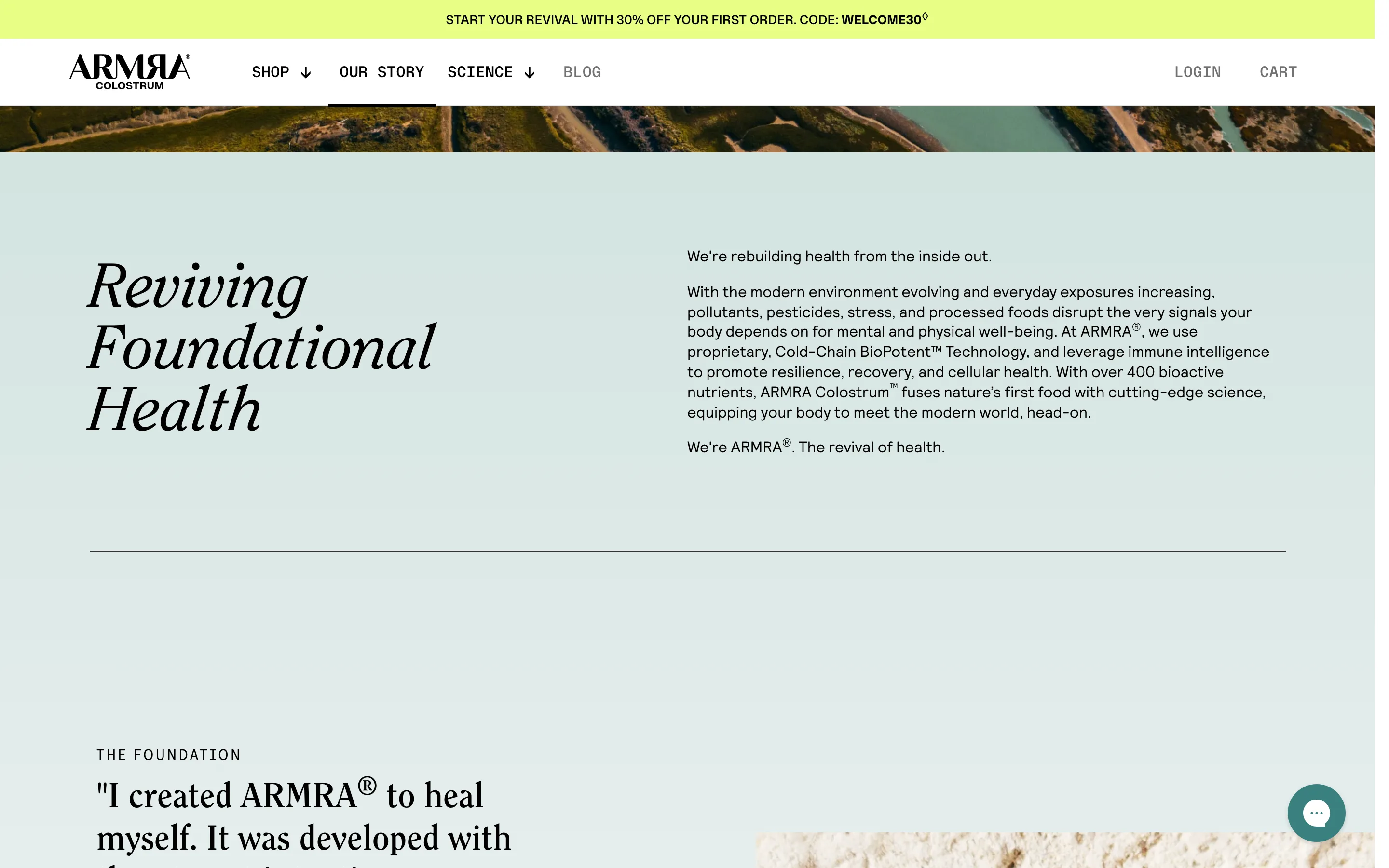
An editorial About page that leads with the mission
An Our Story page opens with a large serif mission statement beside a tight "why we exist" paragraph, then the founder foundation, reading like a magazine feature.
ARMRA
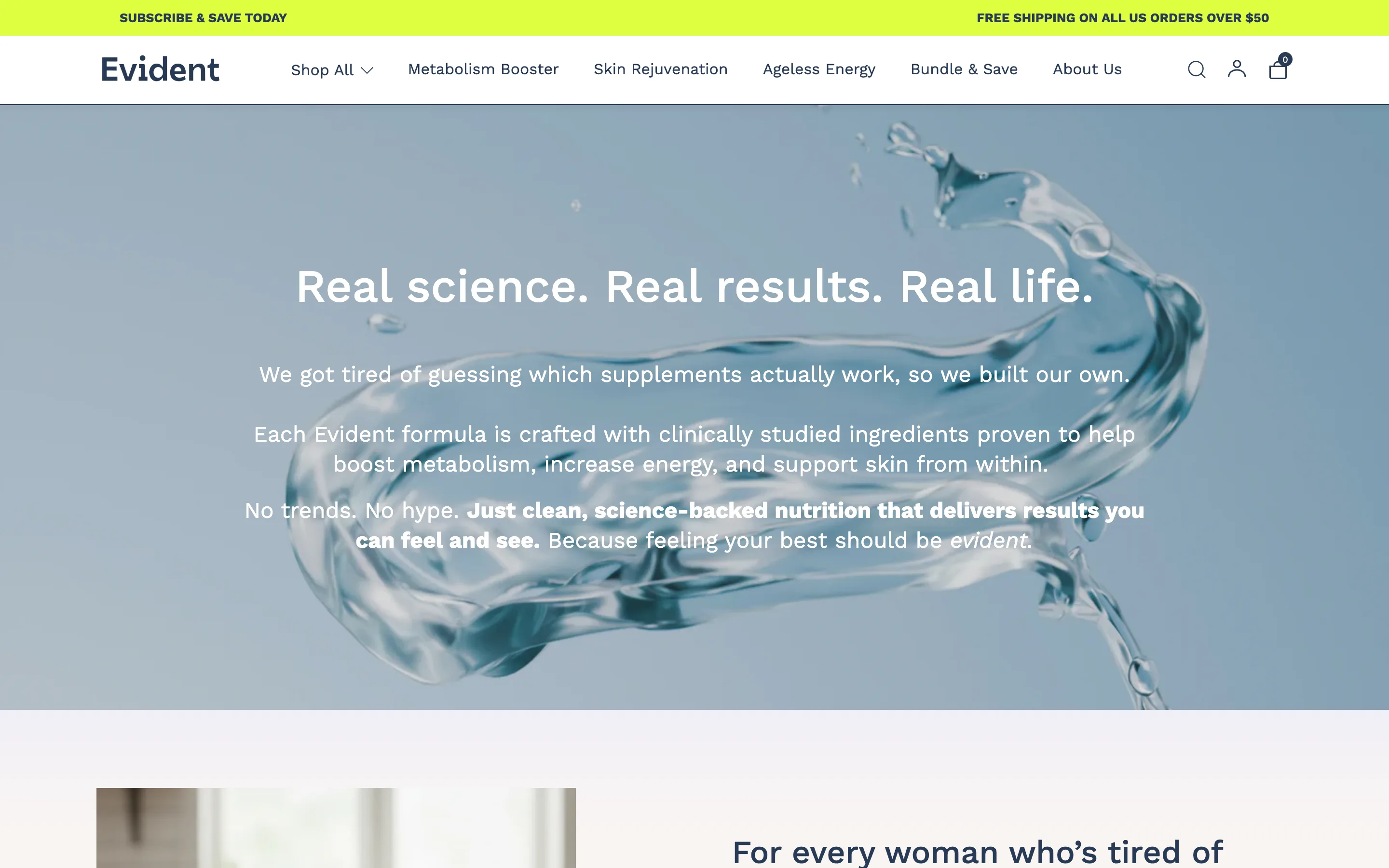
An About page hero that states the brand belief
The About page opens on a full-bleed image with a plain-spoken belief statement (we got tired of guessing, so we built our own), setting the voice before any product.
Evident
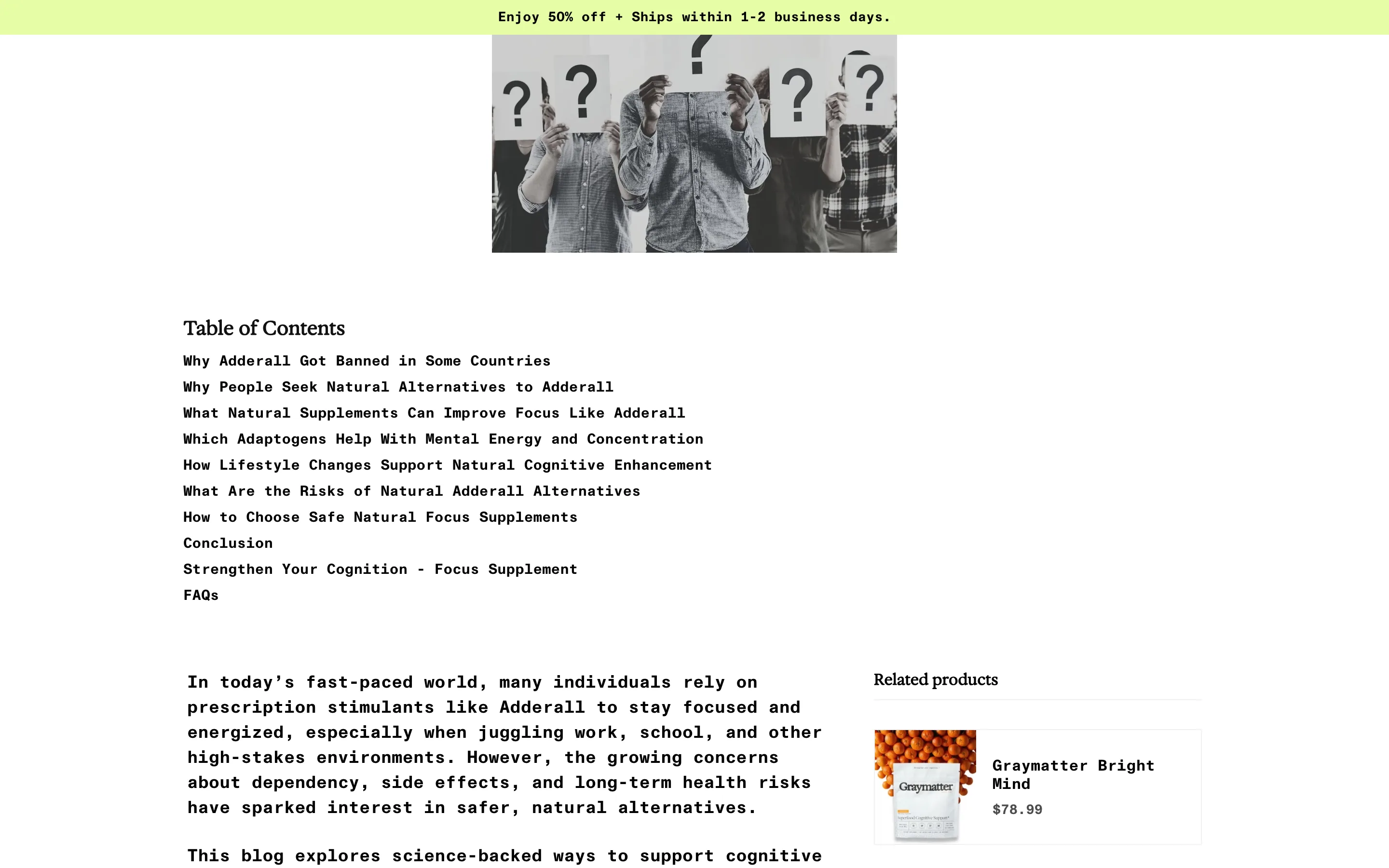
An advertorial article with an in-article product rail
An educational blog article (with a table of contents) answers a search question and carries a related-products rail and CTAs, selling without reading as an ad.
Graymatter
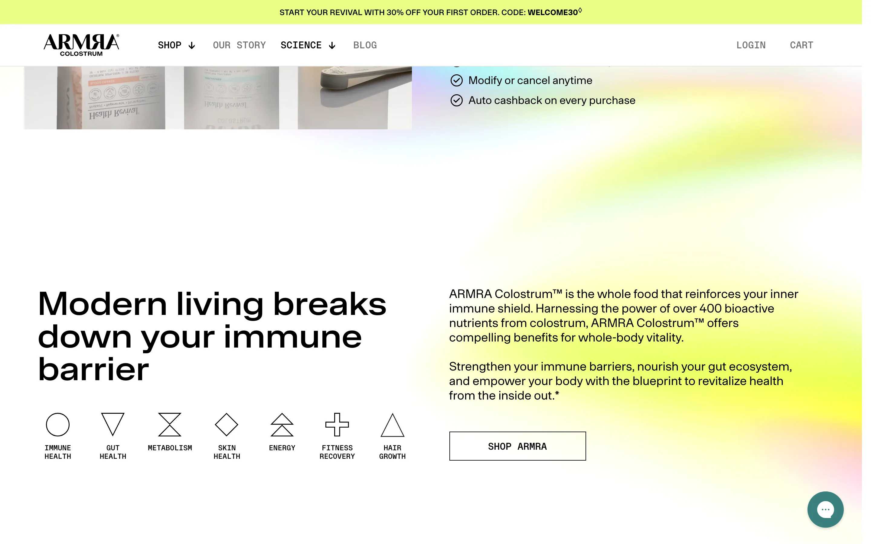
A benefit icon row naming every outcome it serves
A row of simple icons names each outcome the product supports (immune, gut, energy, skin), showing full breadth in one scan next to the claim.
ARMRA
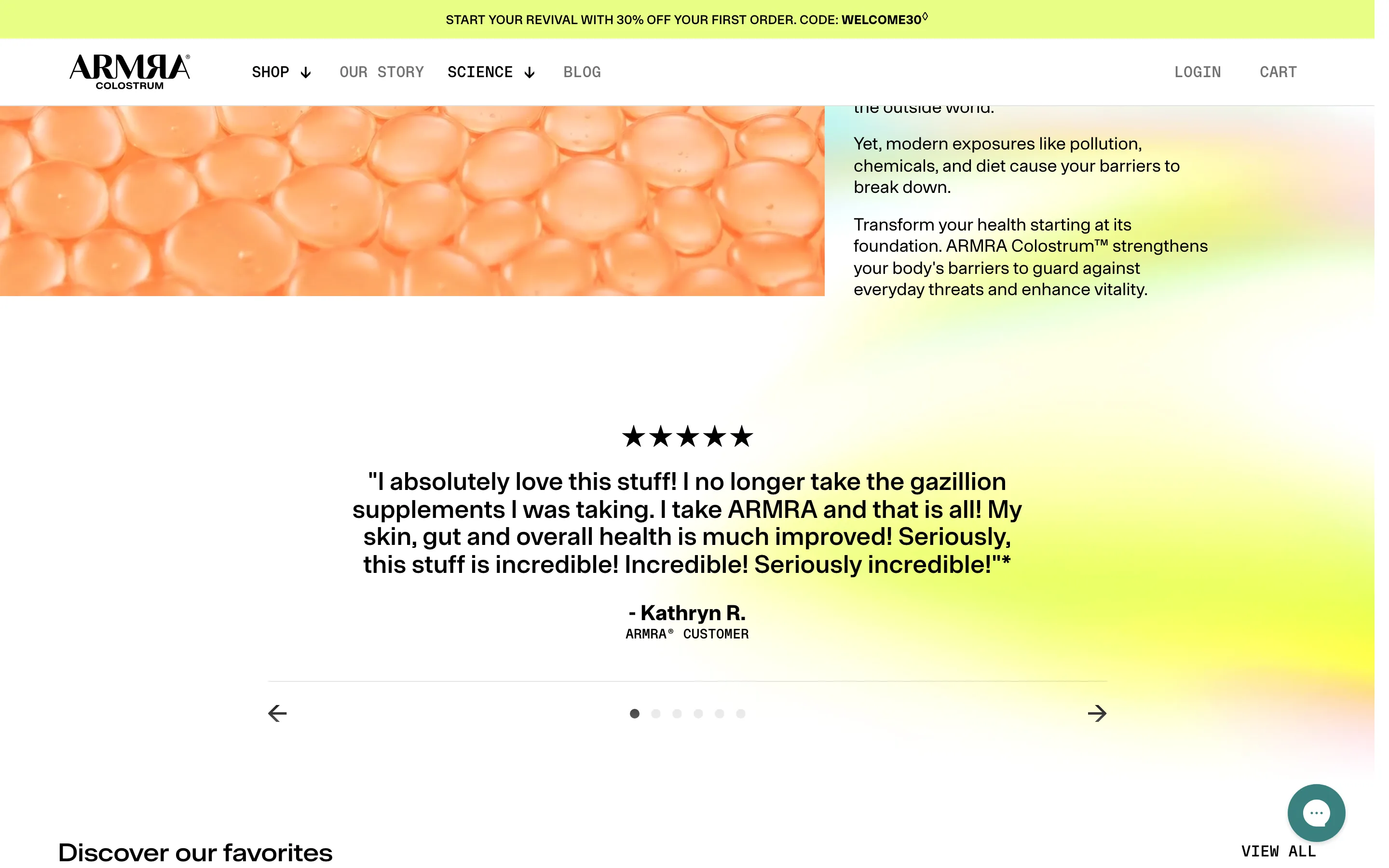
A review carousel that shows one big quote at a time
One customer quote at a time, set large with stars and the name, rotating via arrows and dots, so each voice gets full attention instead of a crowded grid.
ARMRA
Landing page
3 ideas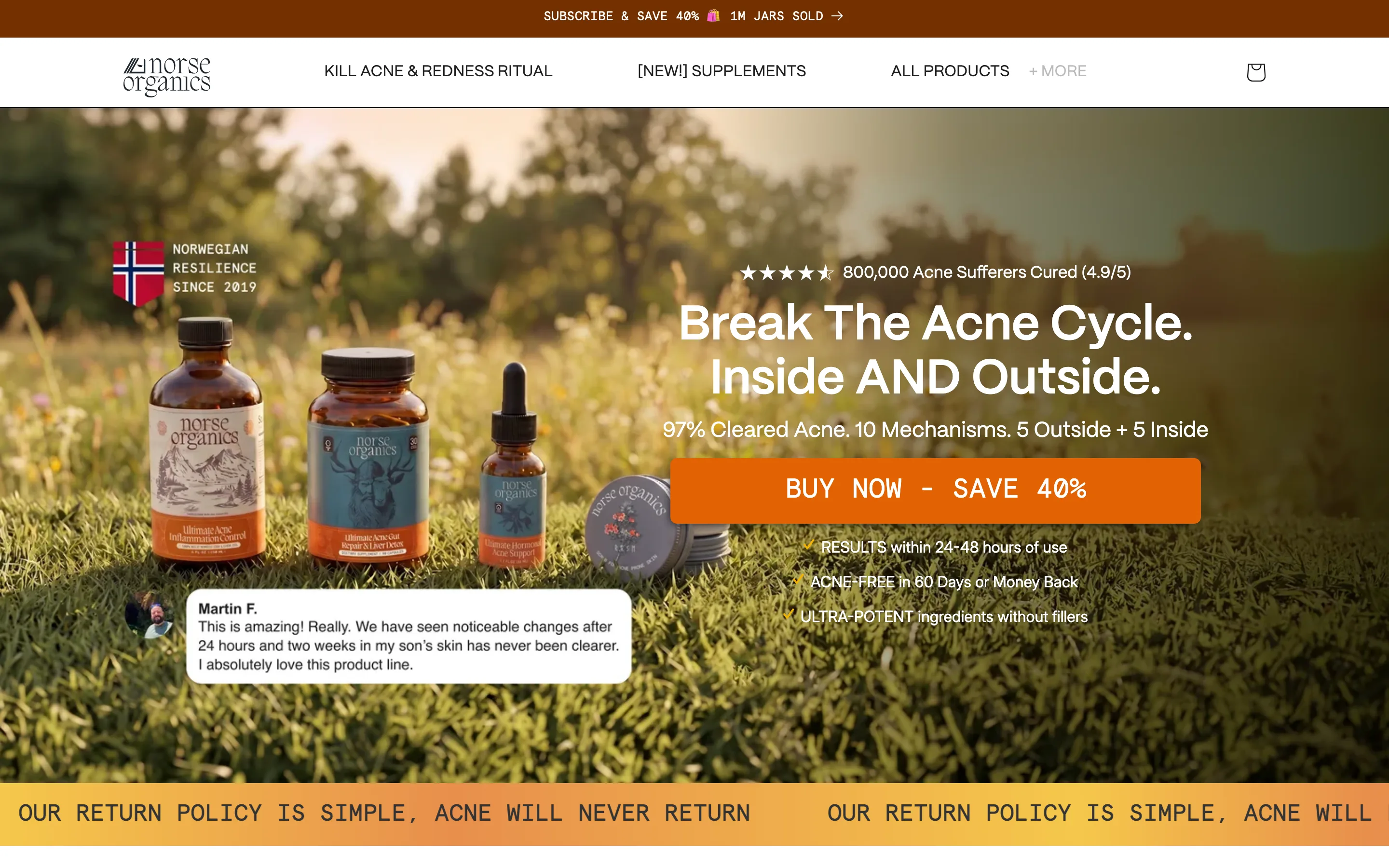
A direct-response hero that stacks the whole offer
The hero stacks a cured-customer count, headline, mechanism subhead, one loud CTA, three benefit checks and a floating customer quote, so the pitch lands without a scroll.
Norse Organics
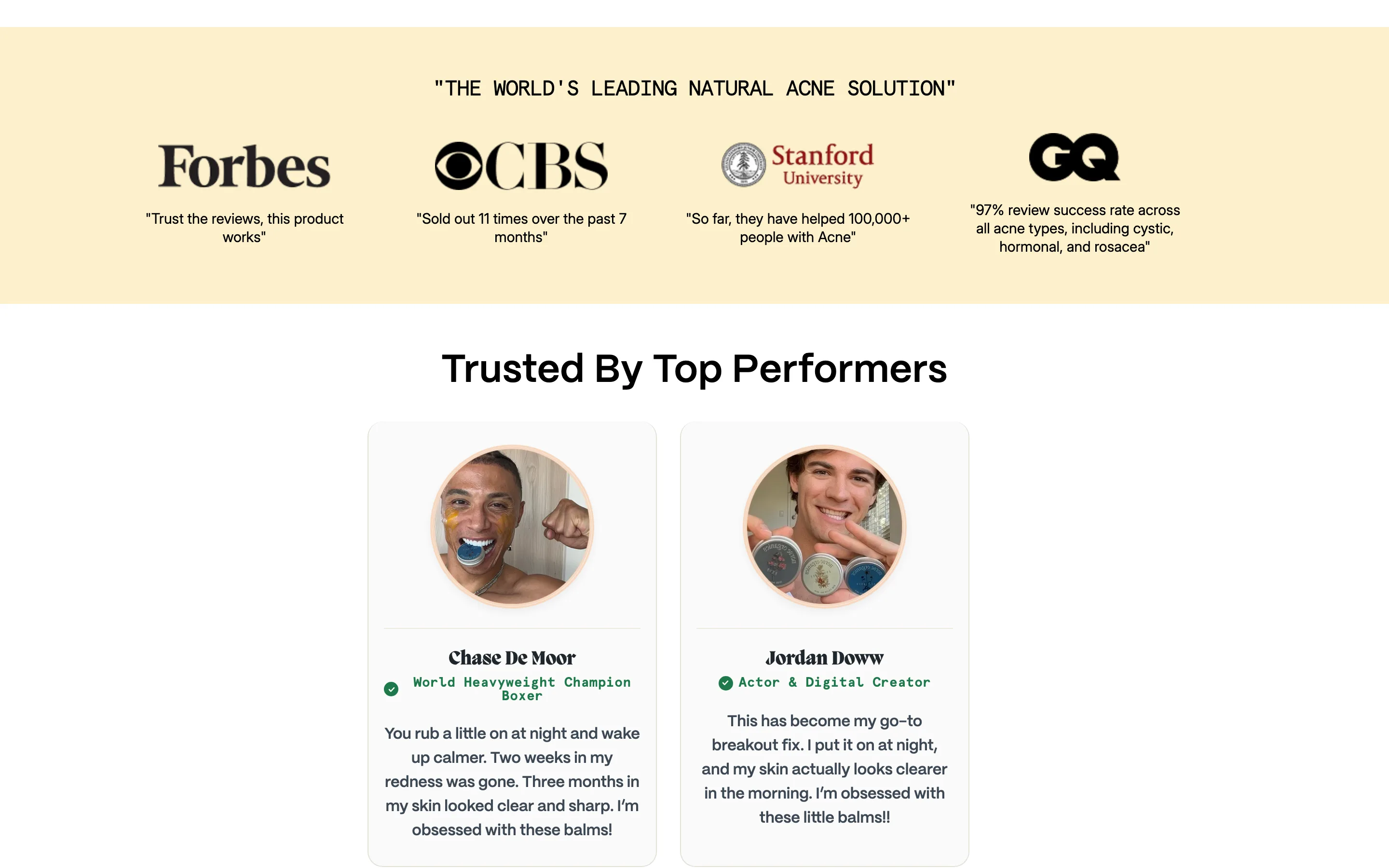
A press strip where every logo carries a pull-quote
Media and university logos each sit above a specific quote from that outlet, turning a decorative logo wall into evidence a visitor can actually read.
Norse Organics
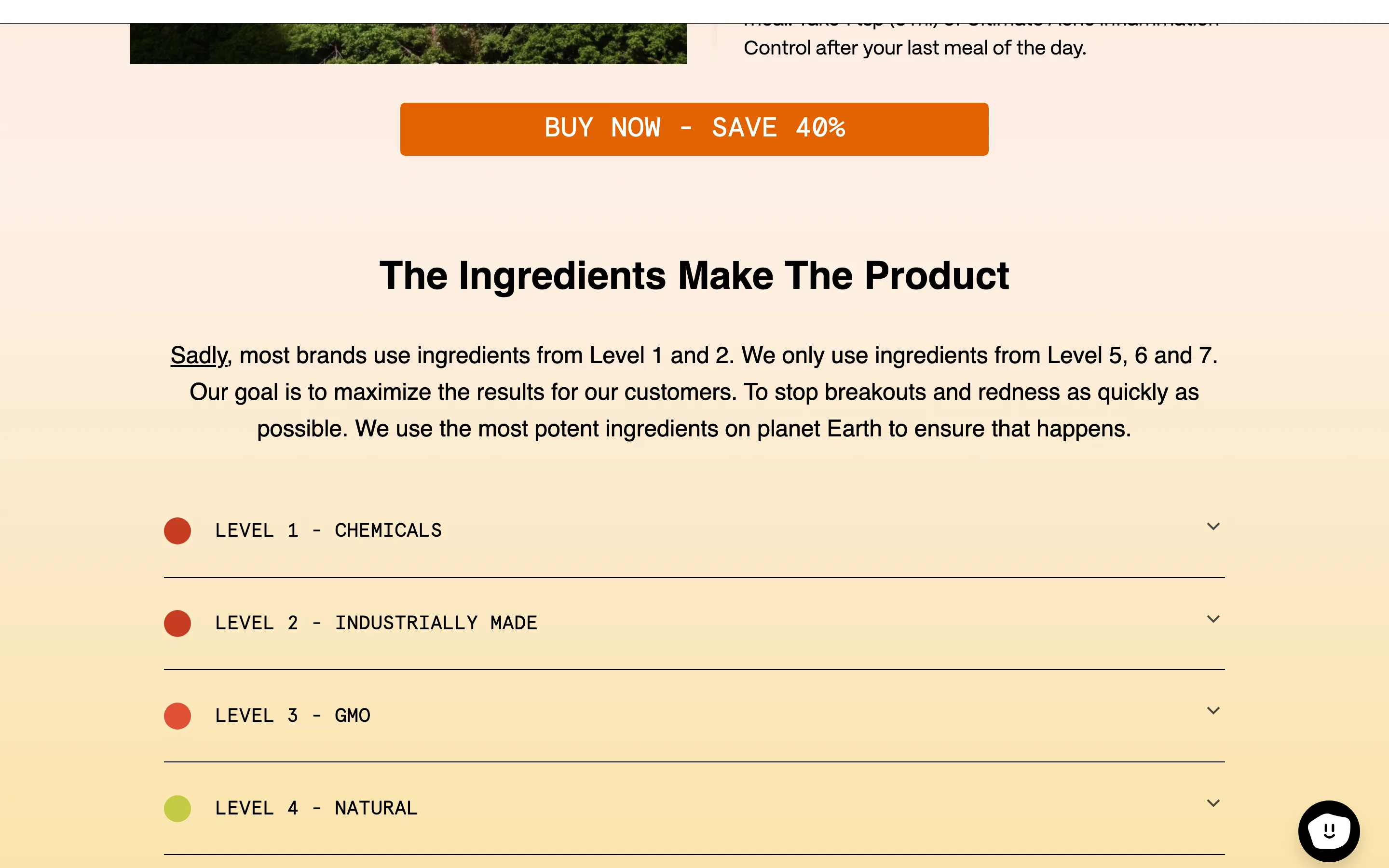
Rank ingredient quality on a ladder and sit at the top of it
A colour-coded ladder of ingredient grades states that most brands buy at the bottom levels and this brand only buys at the top, positioning every rival without naming one.
Norse Organics
Category
6 ideas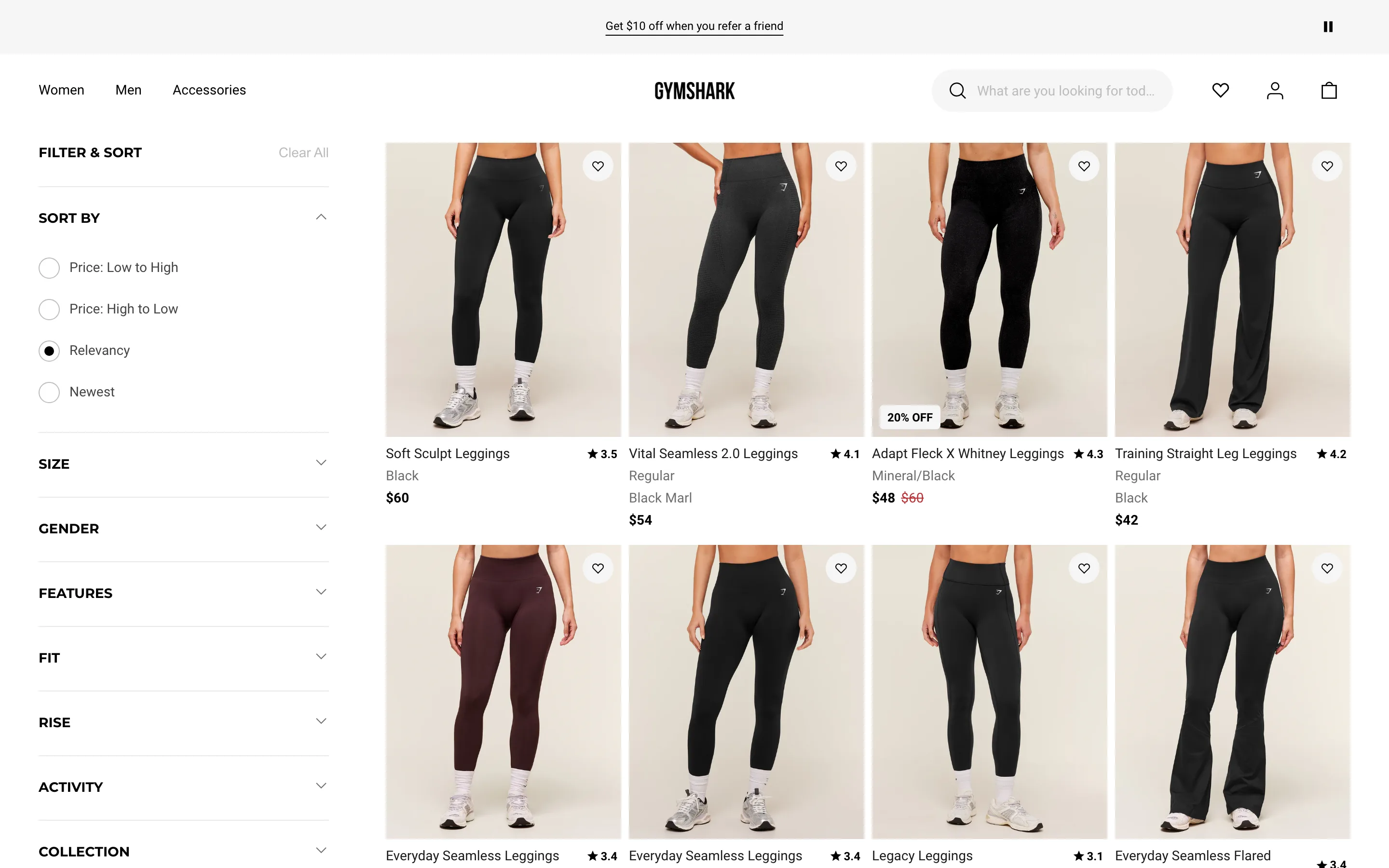
Filter by how the product is used, not just size and color
Alongside standard Size and Color, the category sidebar adds use-case filters like Fit, Rise and Activity, letting a shopper narrow a large grid down by what they will actually do in the product.
Gymshark
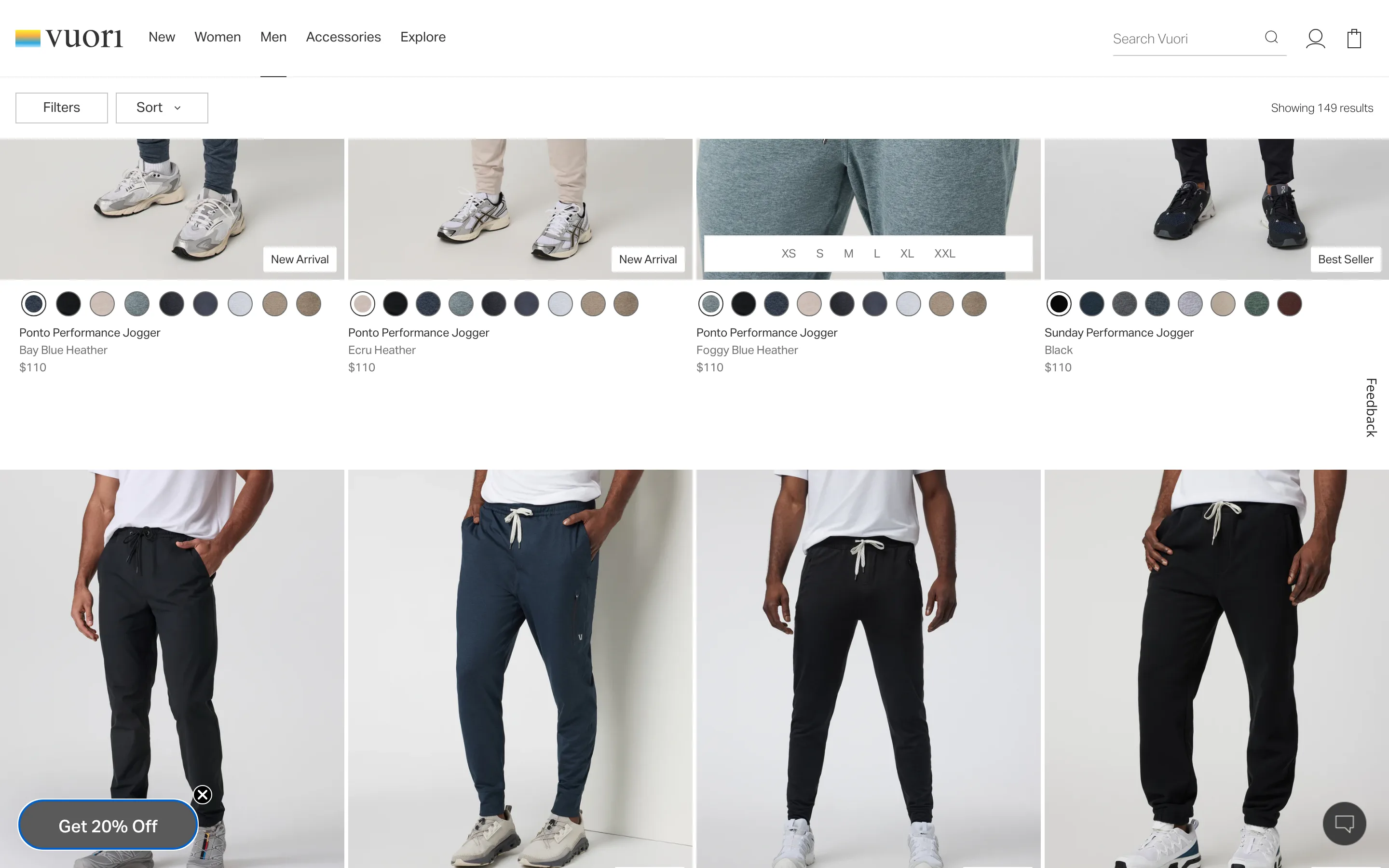
Show every color option as a swatch on the category tile
Each product tile in the grid carries a row of color swatches beneath the photo, letting a shopper see a different colorway without opening the product page.
Vuori
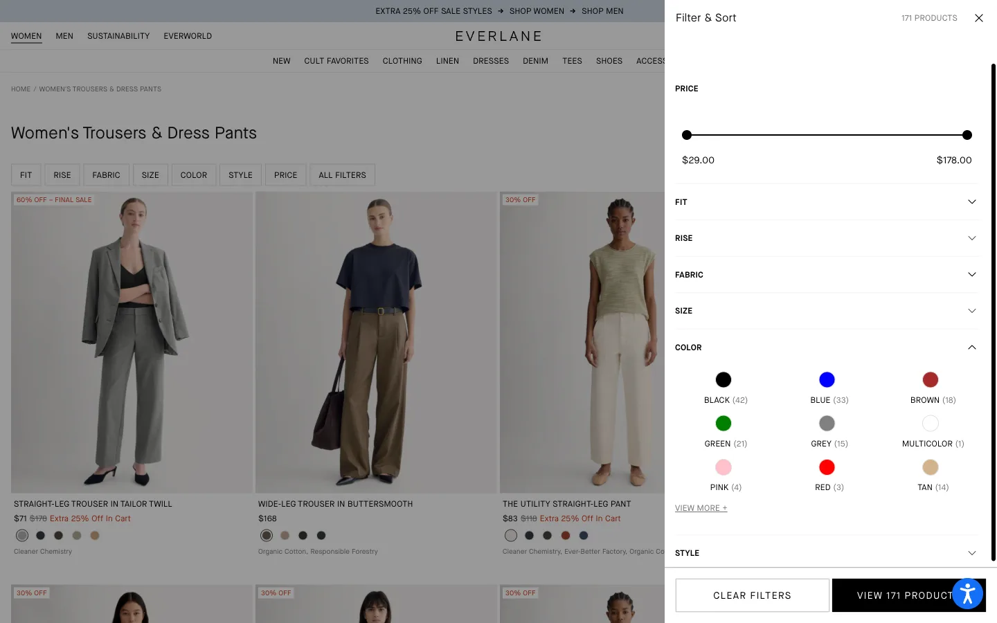
Show a live result count next to each filter option before it's applied
Opening the filter panel shows a count in parentheses next to every option, so the shopper knows how many results a filter will leave before clicking it.
Everlane
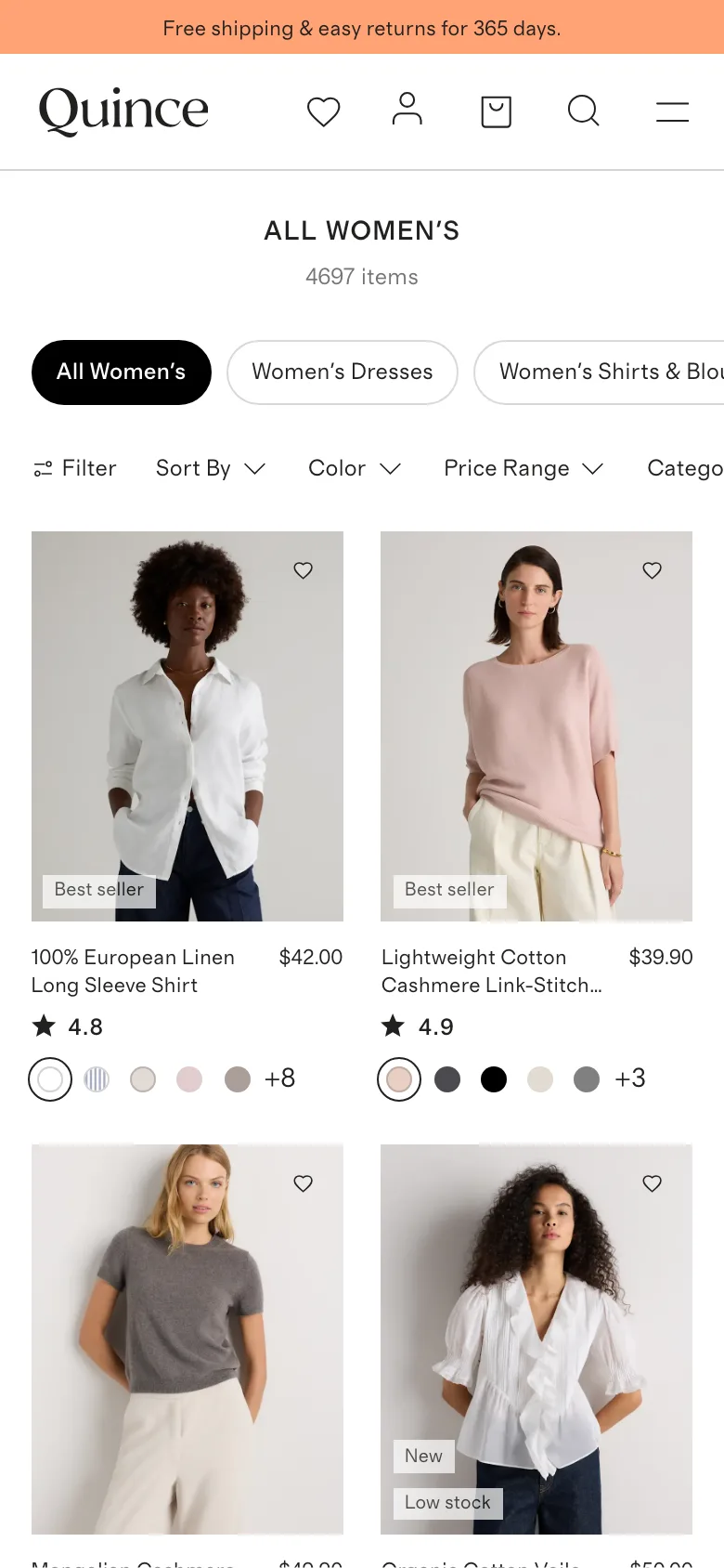
Put rating, badge, price and color count on the same tile
Each mobile grid tile stacks a star rating, a merchandising badge, the price, and a color-overflow count directly under the photo, so a shopper can screen out non-fits without opening a single product.
Quince
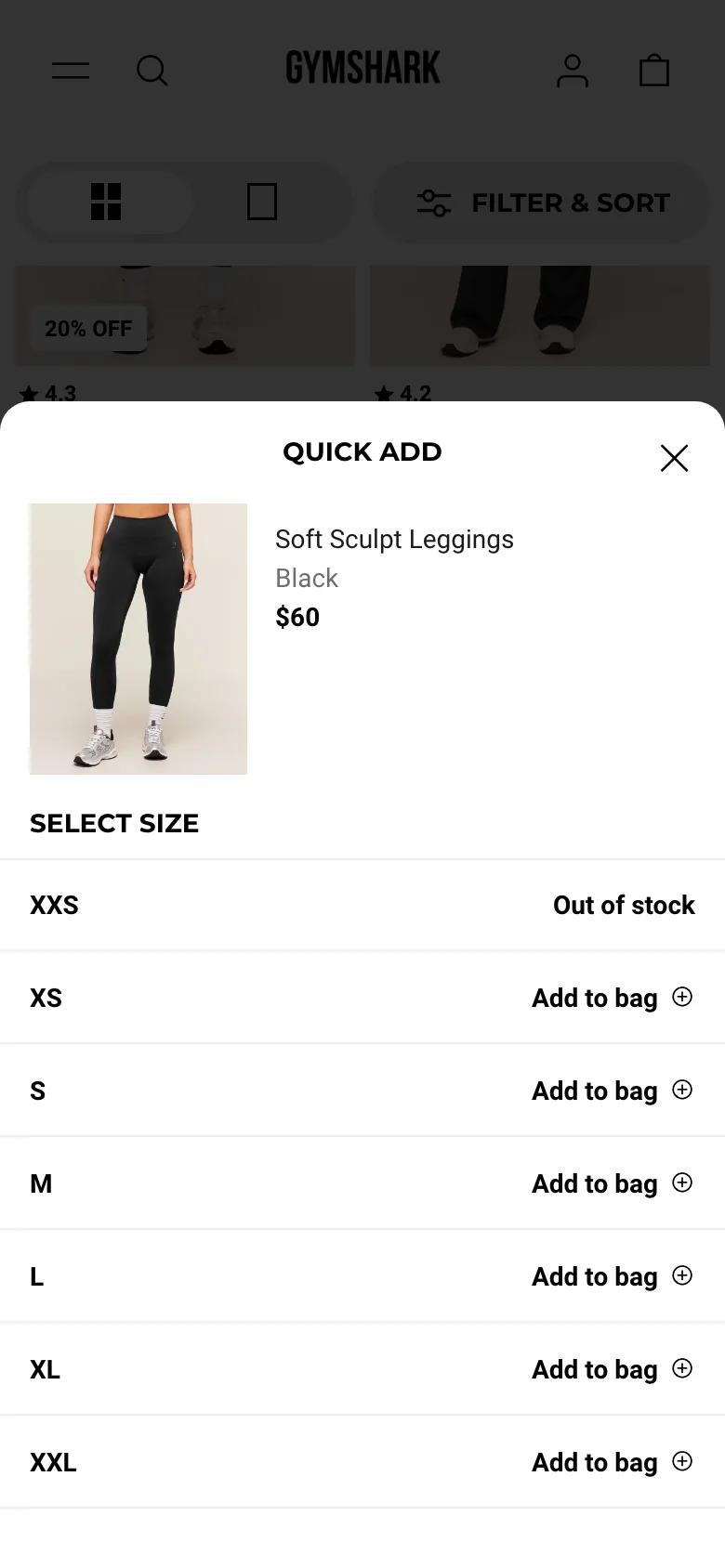
Open a size picker straight from the category tile, no product page required
Tapping a small plus icon on a grid tile opens a lightweight size-picker panel with the product photo, price and a full size list, each size directly addable to the bag without loading the product page.
Gymshark
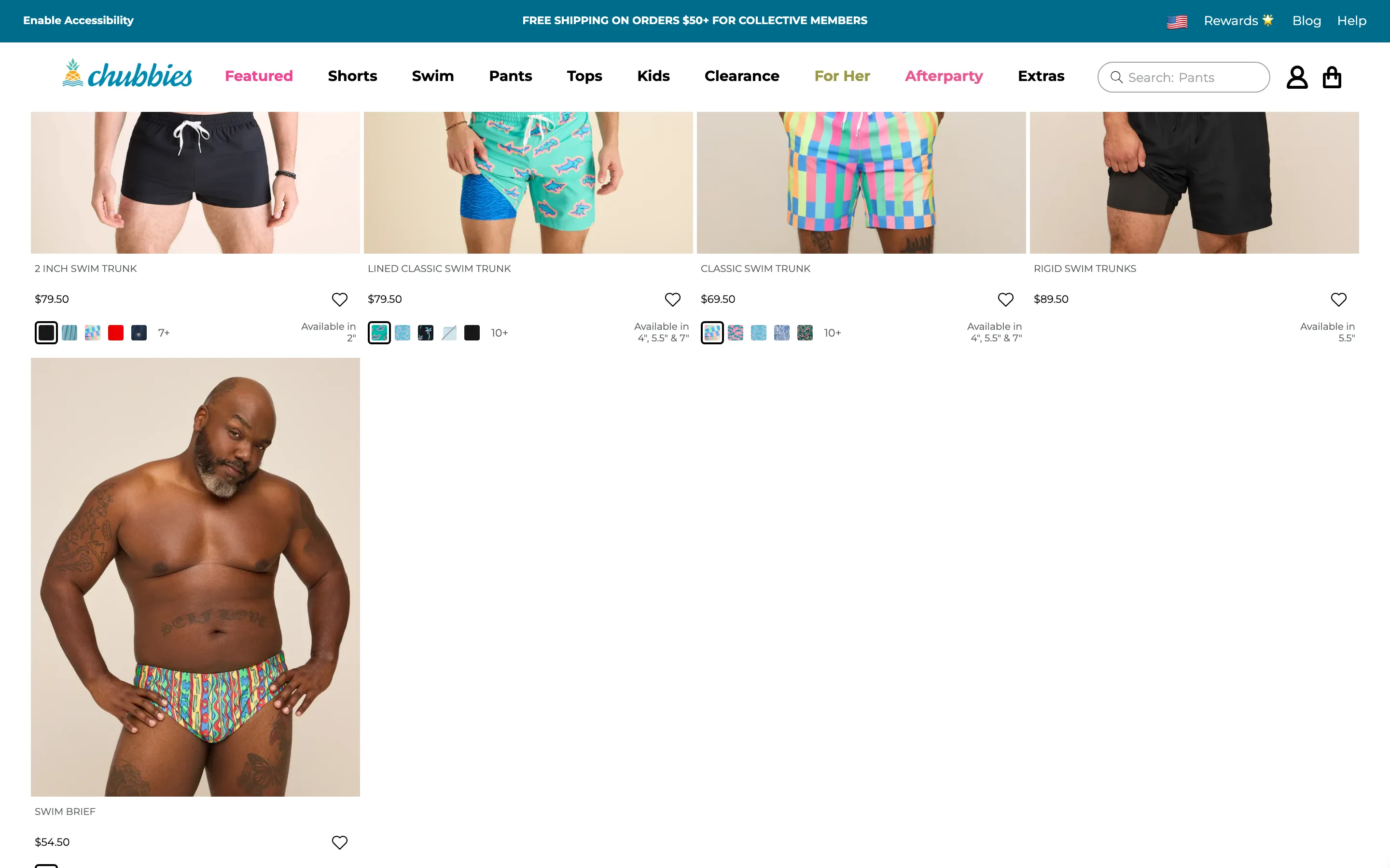
State which fit or length options are actually in stock, right on the tile
Below the color swatches, the tile spells out which fit-defining variant is currently available, plus a rough stock count per color, so a shopper does not click into a product only to find their preferred option is not offered.
Chubbies
Product page
46 ideas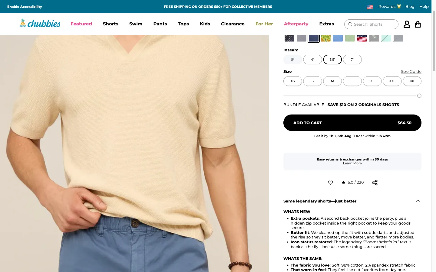
Show an estimated delivery date on the product page
A calculated delivery date, not a generic shipping-time range, sits next to the add-to-cart button so the shopper knows when the order will actually arrive before they commit.
Chubbies
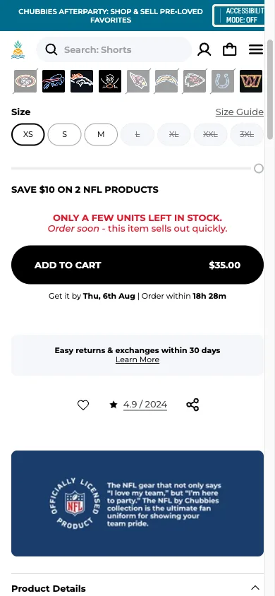
Show a live low-stock warning when inventory is genuinely low
A stock warning tied to actual inventory, "Only a few units left in stock", replaces a generic low-stock badge and gives the shopper a real reason to decide now instead of leaving the tab open.
Chubbies
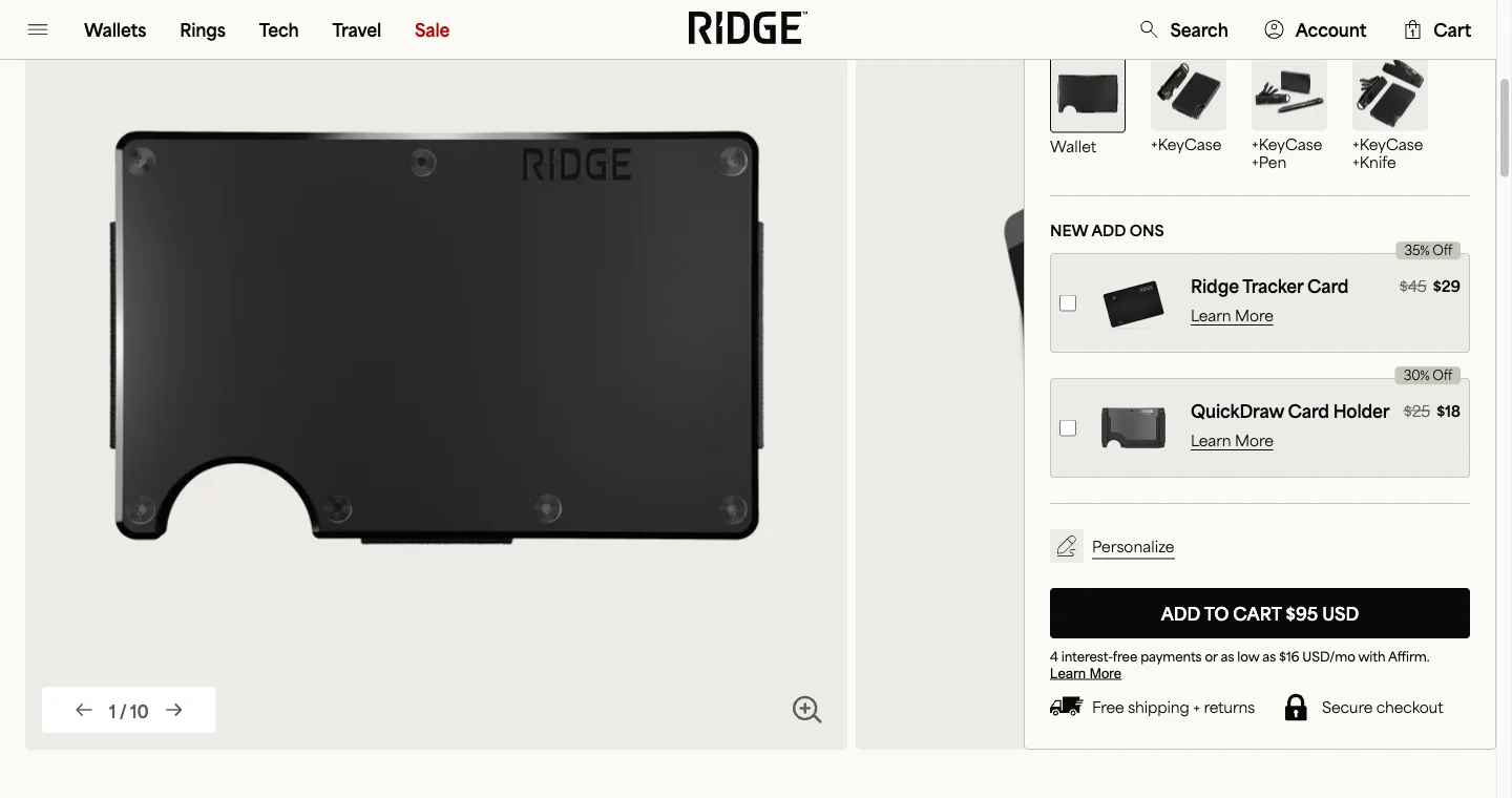
A frequently-bought-together bundle on the product page
A short, specific set of items other shoppers actually bought with this one, addable to the cart in a single click, sitting below the main product rather than buried in a generic recommendations carousel.
Ridge
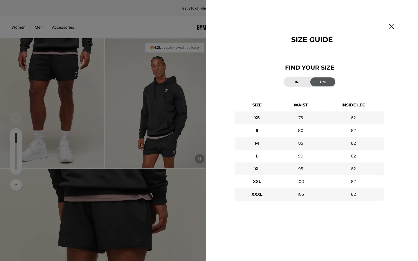
Open the size guide as a modal at the point of variant selection
A size chart that opens without leaving the page, positioned right where the shopper is choosing a size, so checking fit does not cost them their place on the product page.
Gymshark
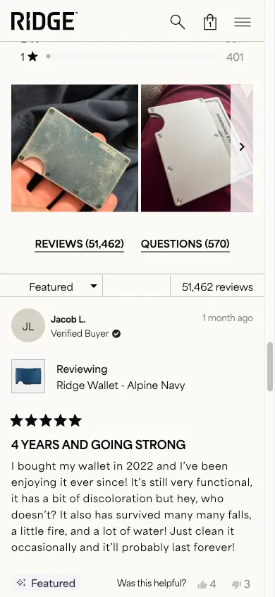
A customer photo gallery inside the reviews section
Real photos submitted by past buyers, shown as a scrollable gallery above the written reviews, so the shopper can see the product in ordinary settings before reading a single word.
Ridge
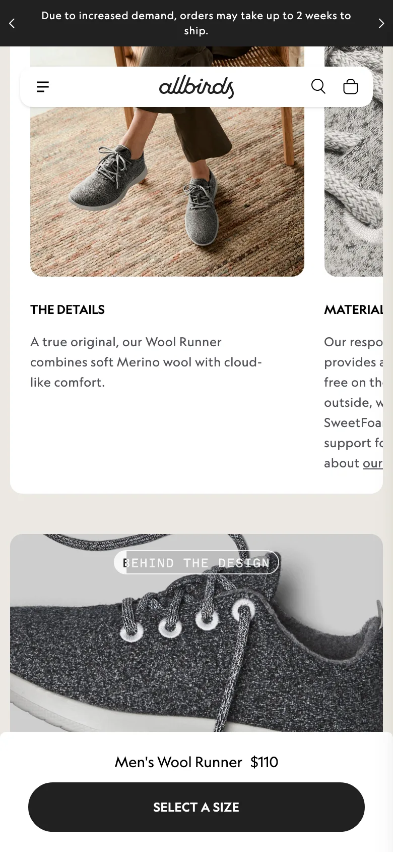
Sticky add-to-cart bar on mobile product pages
A persistent add-to-cart bar that stays pinned as the shopper scrolls a long mobile product page, so the buy action is never more than a thumb-tap away.
Allbirds
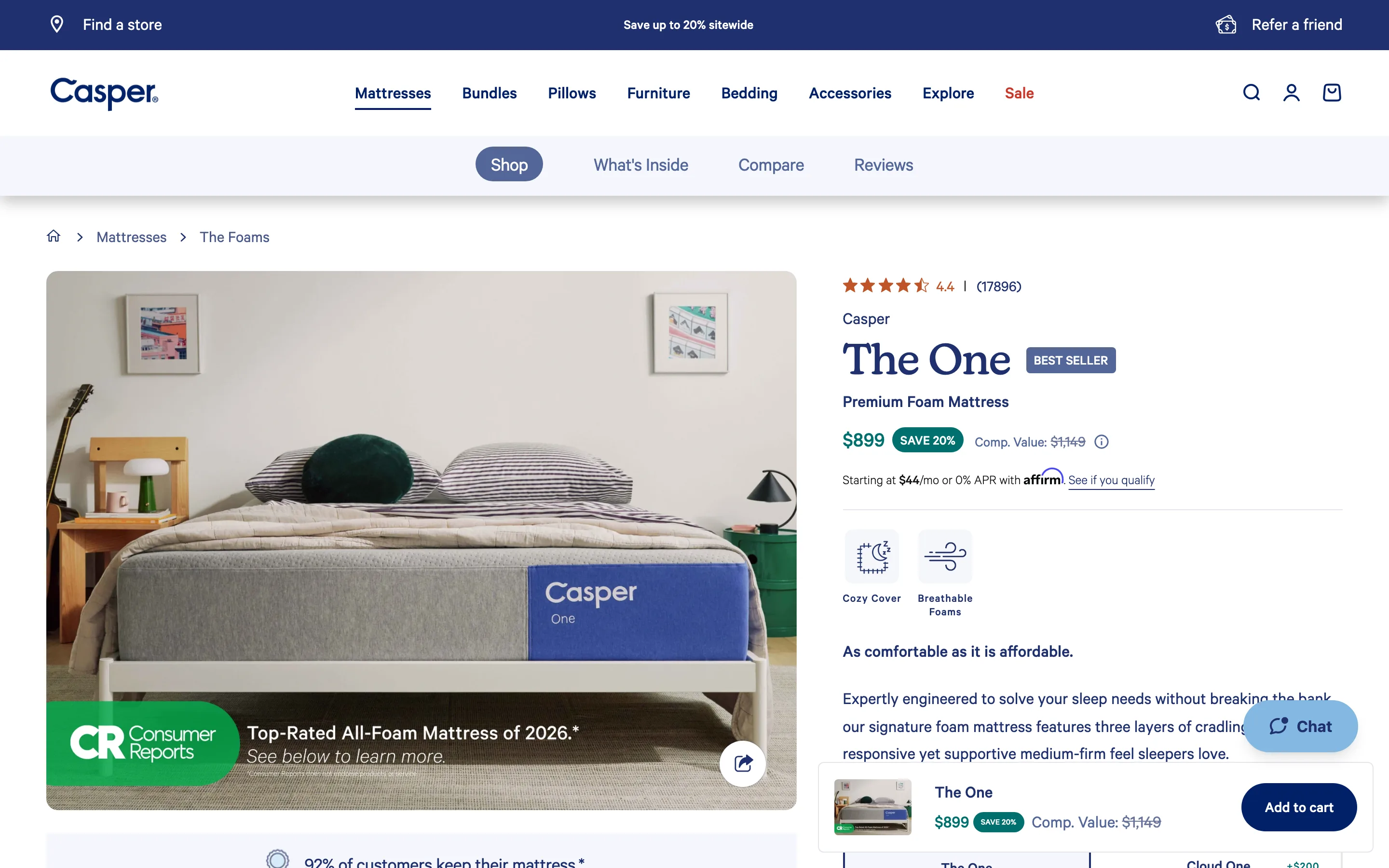
Put the star rating above the product title, not below the price
The rating and review count sit above the title, so the first thing a shopper reads is that others bought and rated this, before any claim.
Casper
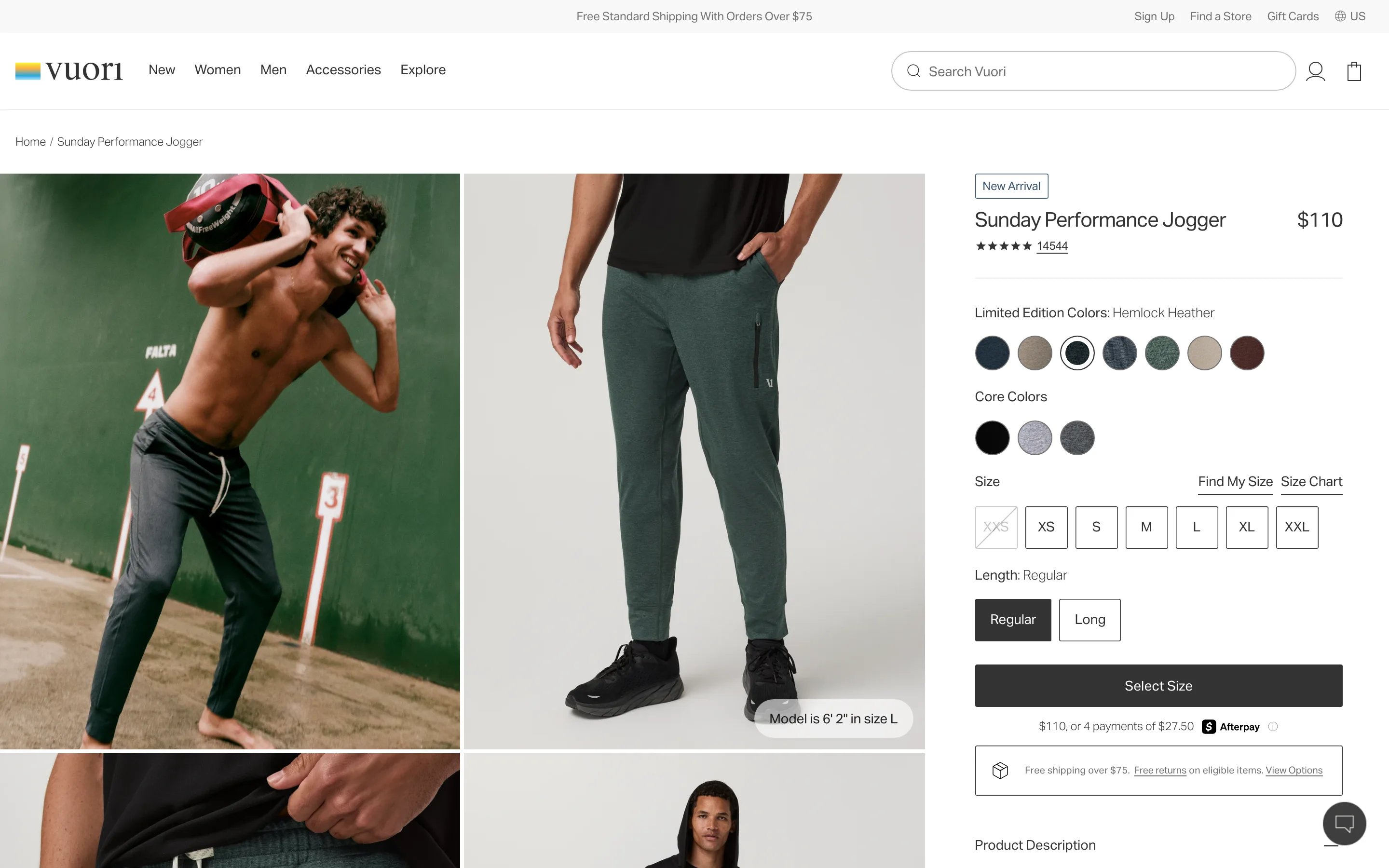
A benefit icon row directly under the add-to-cart button
A short row of icon-and-label reassurances (free shipping, warranty, easy returns) sits beneath the add-to-cart, not in a policy page.
Vuori
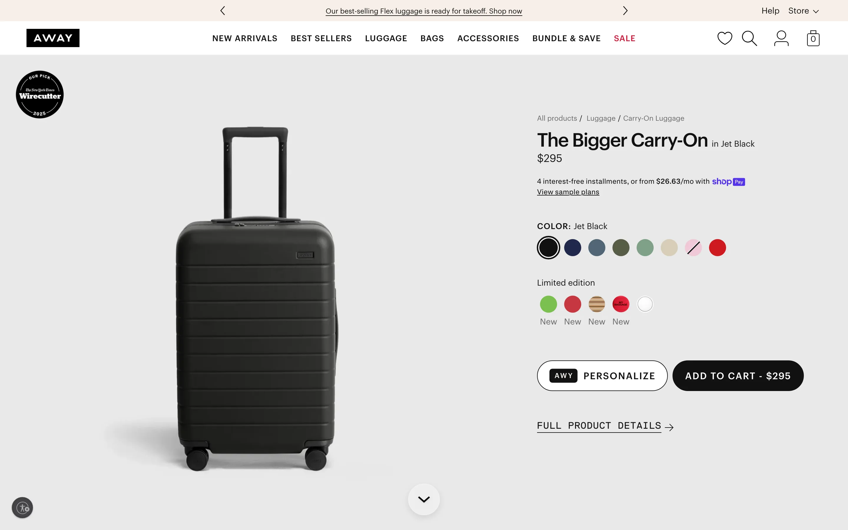
Show the installment price under the sticker price
Under the price the page shows the pay-in-four option, reframing a single large number into a smaller, easier one without discounting.
Away
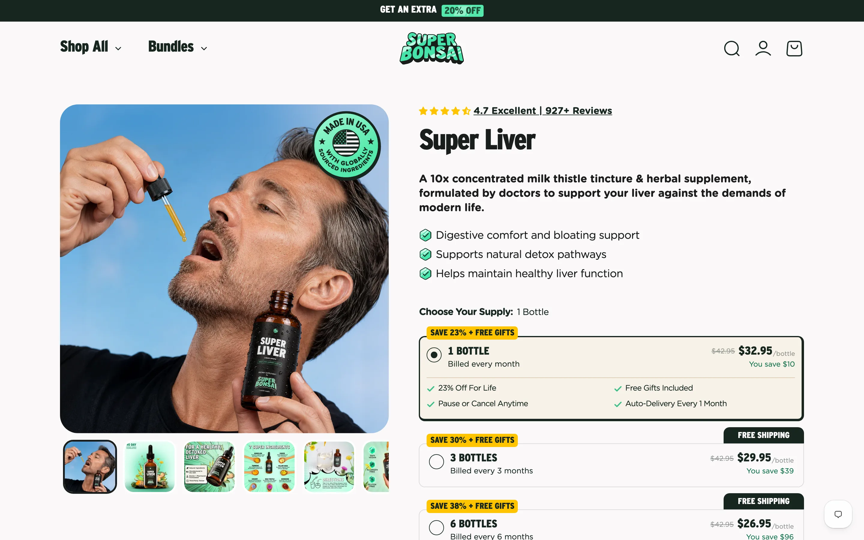
Turn gallery slides into designed infographics, not just photos
Gallery slides are built graphics with icons, callouts and comparison panels, so the carousel argues for the product rather than only showing it.
Super Bonsai
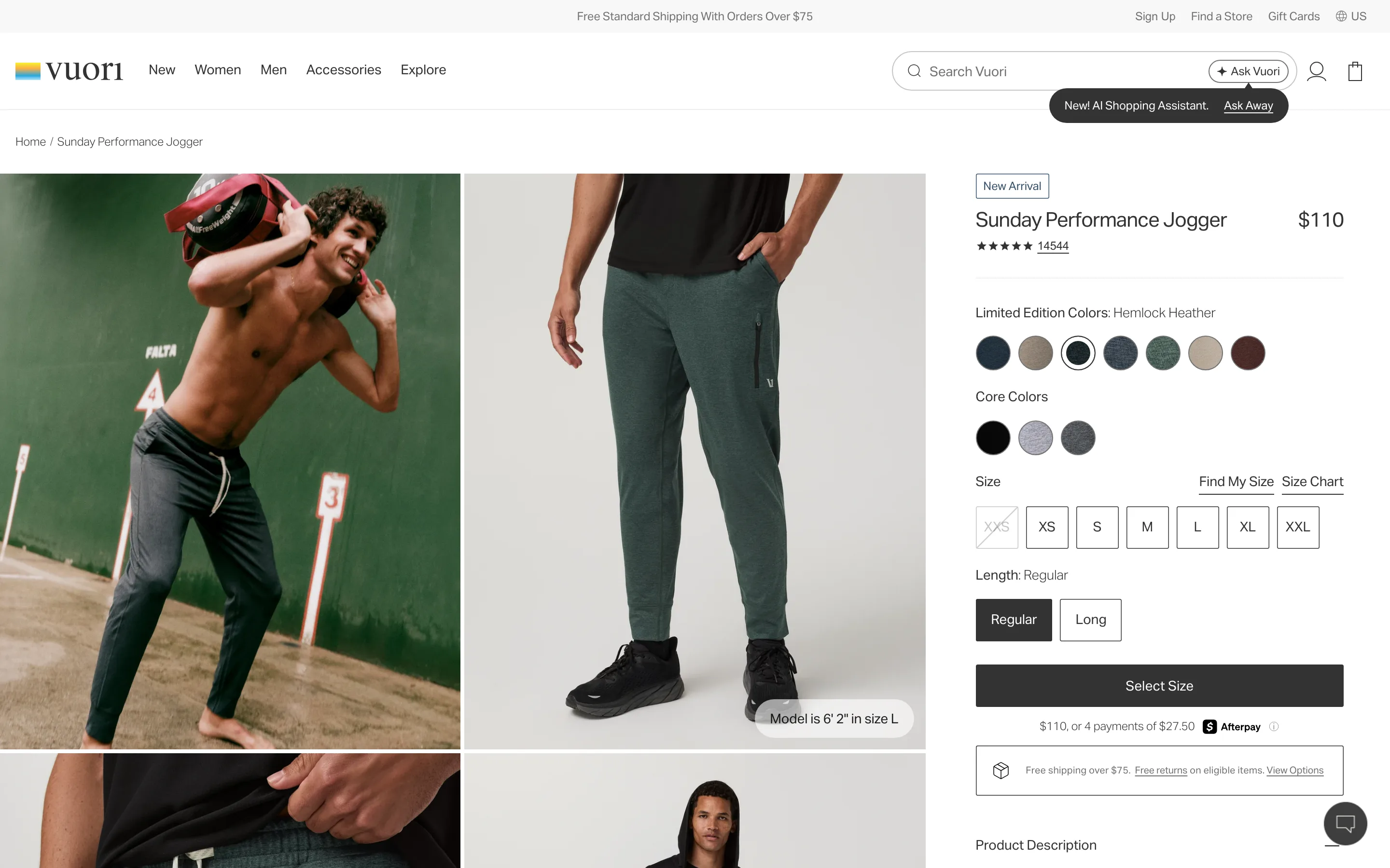
Put an in-use, on-body shot in the first gallery slides
An in-use or on-body shot appears in the first few gallery slides, answering fit and appearance before they become reasons to leave.
Vuori
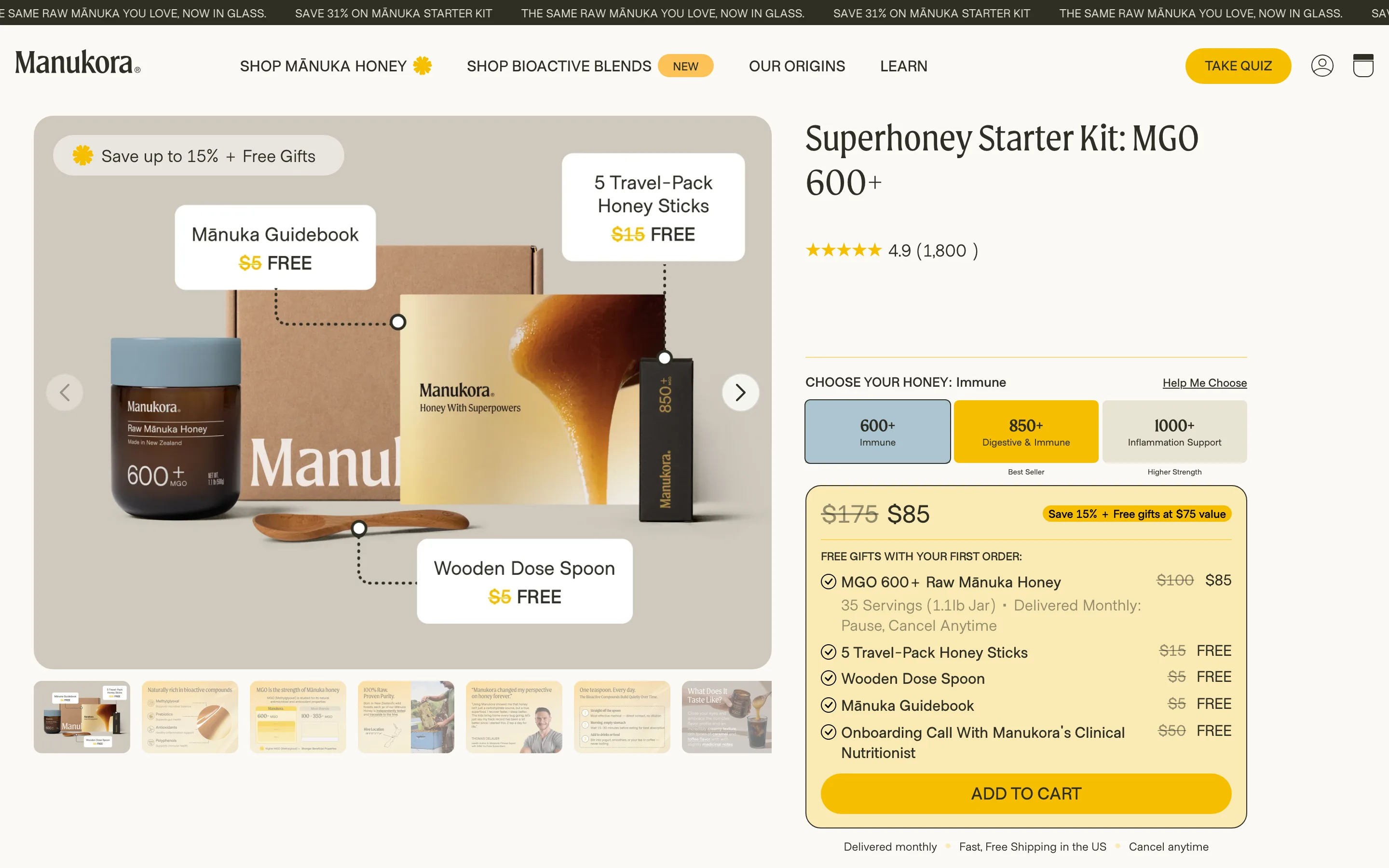
Label variant tiers by outcome, not just a spec number
Variants are labelled by the goal they serve (Immune, Digestive, Inflammation) instead of a bare number, so shoppers choose by what they want.
Manukora
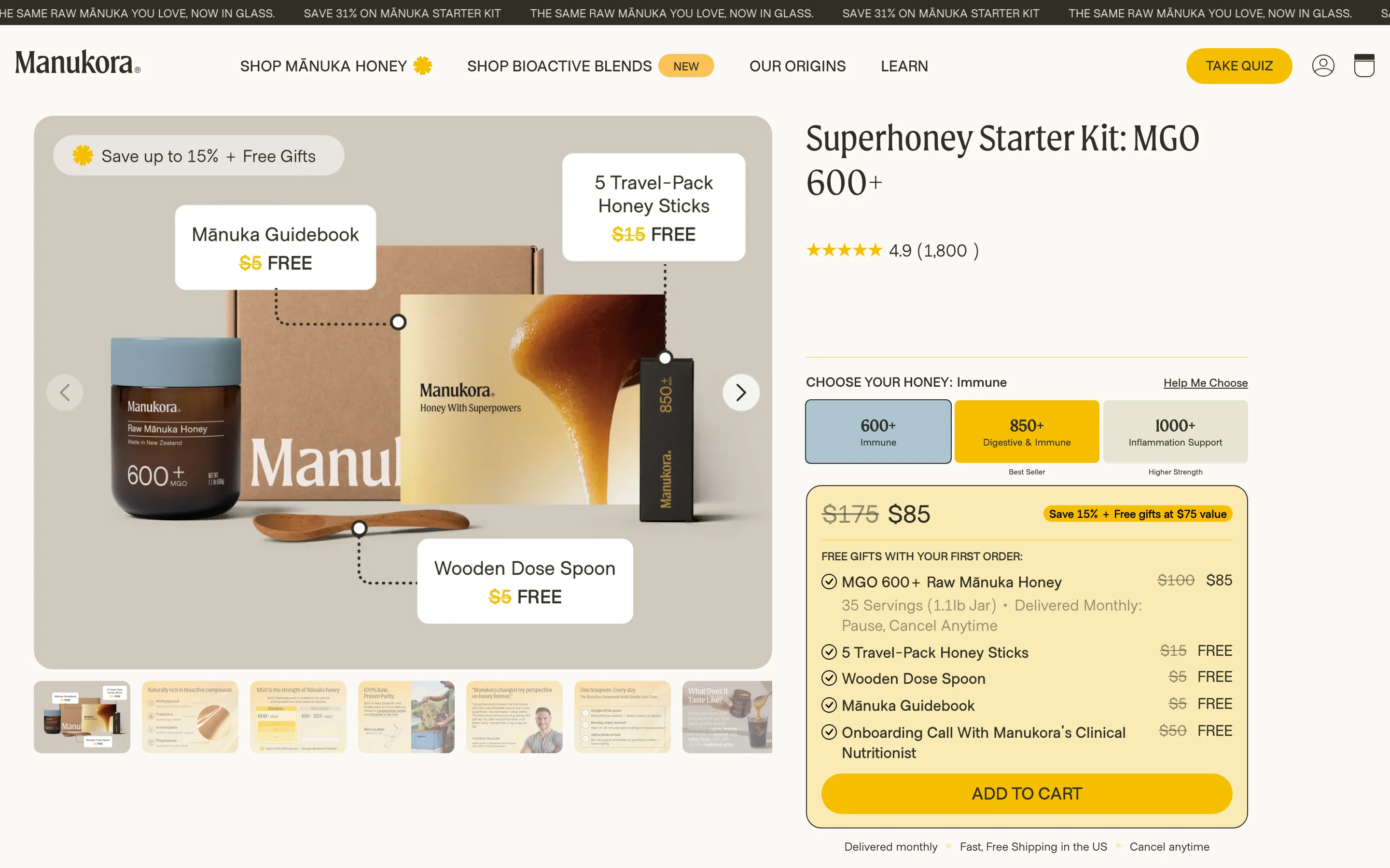
Add a "Help me choose" link at the variant selector
A low-commitment helper beside the variant selector recommends an option from a question or two, rescuing shoppers who would otherwise leave to research.
Manukora
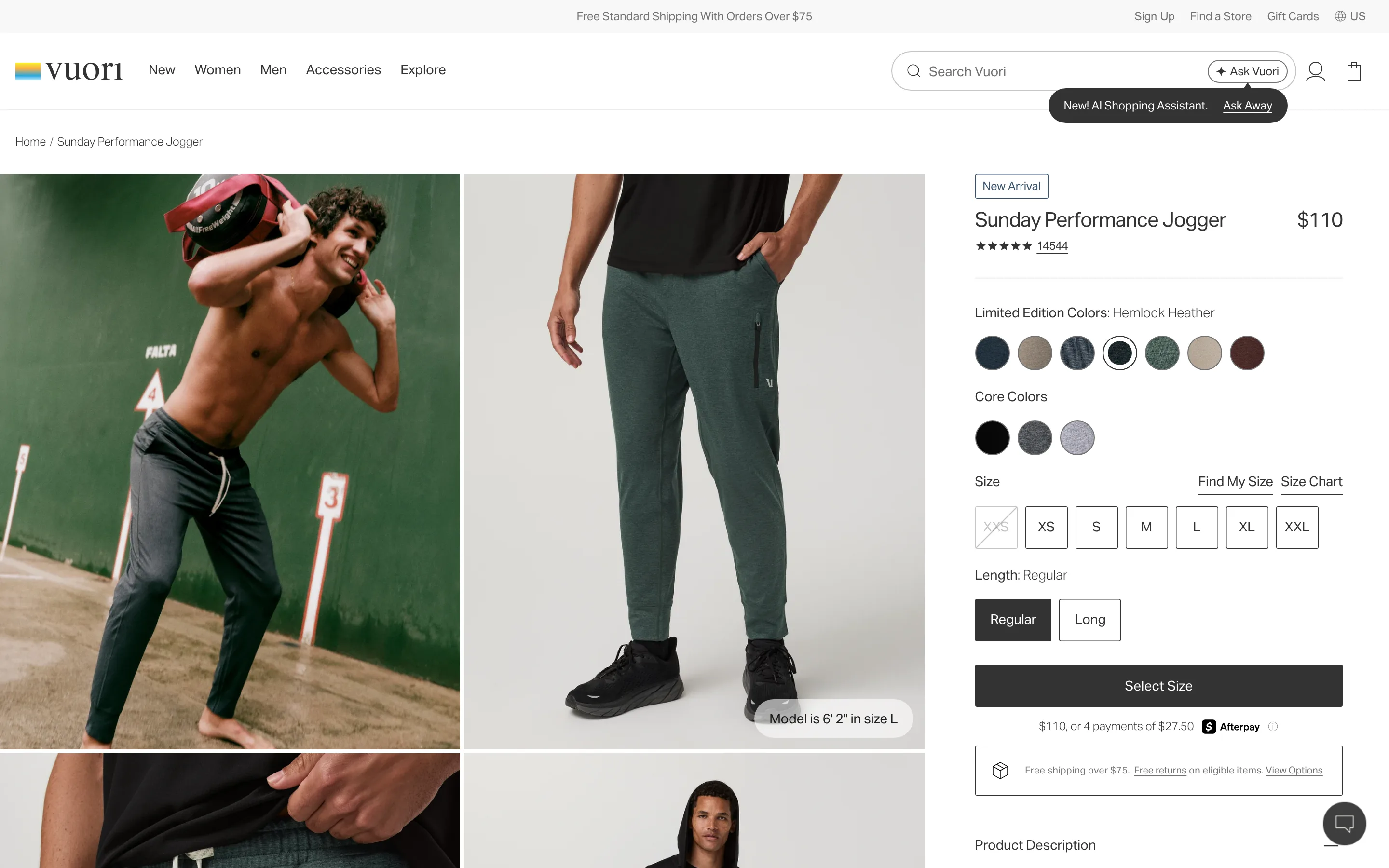
Badge the recommended variant as the best seller
A Best Seller badge sits under the specific variant it describes, nudging the undecided toward a safe default while leaving every option visible.
Vuori
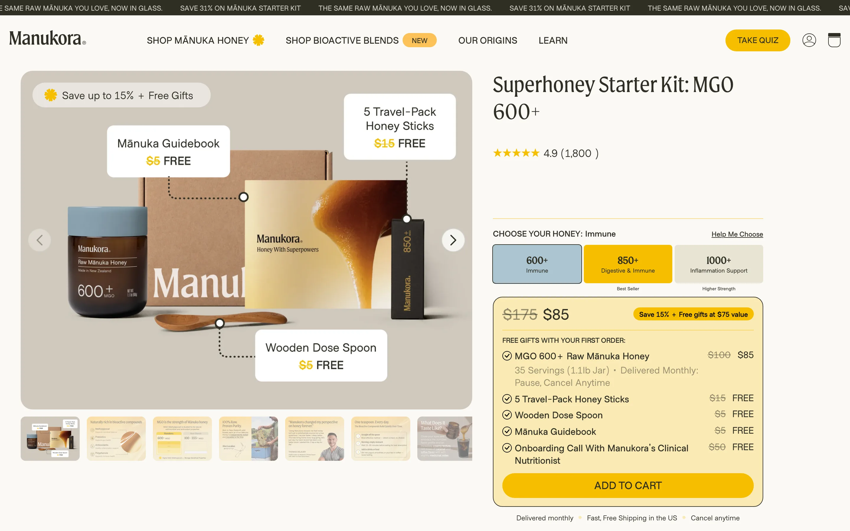
Itemise a bundle as a value stack struck to FREE
The buy box lists every bundle item with its own price struck through to FREE, so the discount is itemised as evidence rather than asserted as a percentage.
Manukora
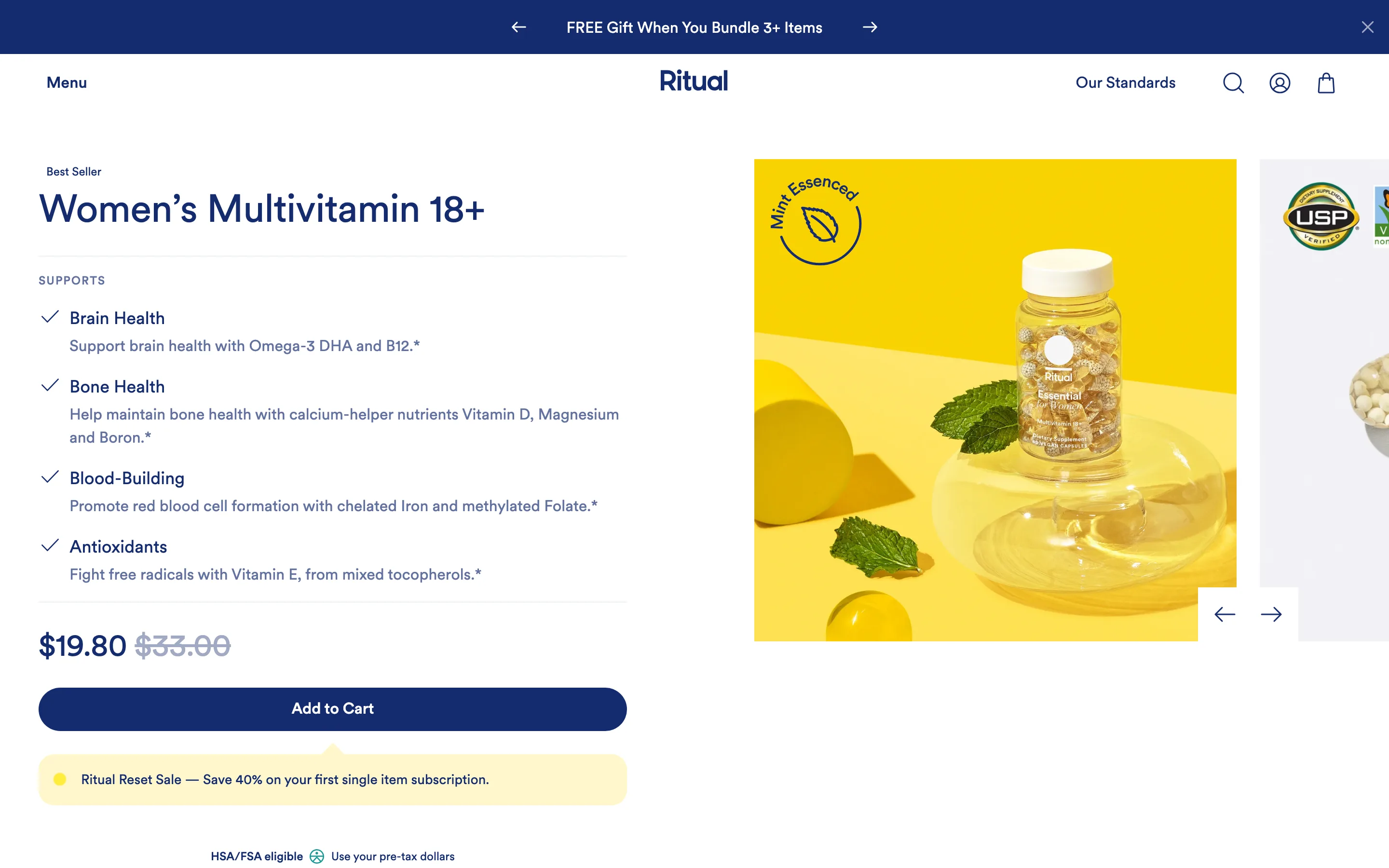
Put the subscribe-and-save control on the add-to-cart line
Subscribe-and-save is a control on the ATC line showing frequency and the discounted price beside the struck one-time price, not a separate page.
Ritual
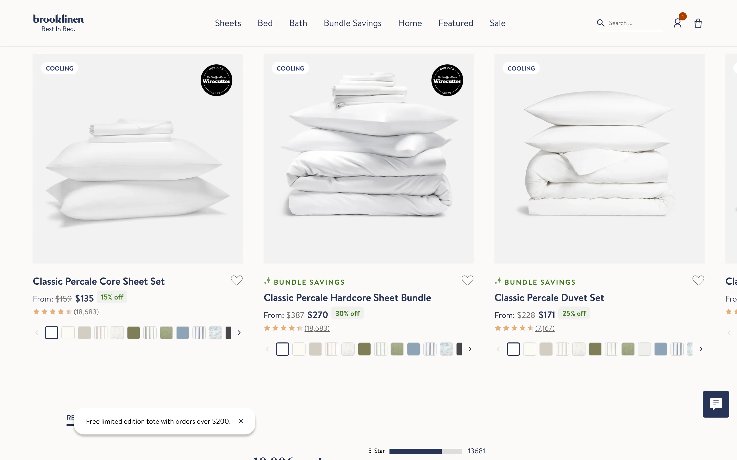
Offer a build-a-bundle set with a combined saving
The page lets a shopper assemble a matching set in one action with a small combined discount, raising basket size by solving the next need.
Brooklinen
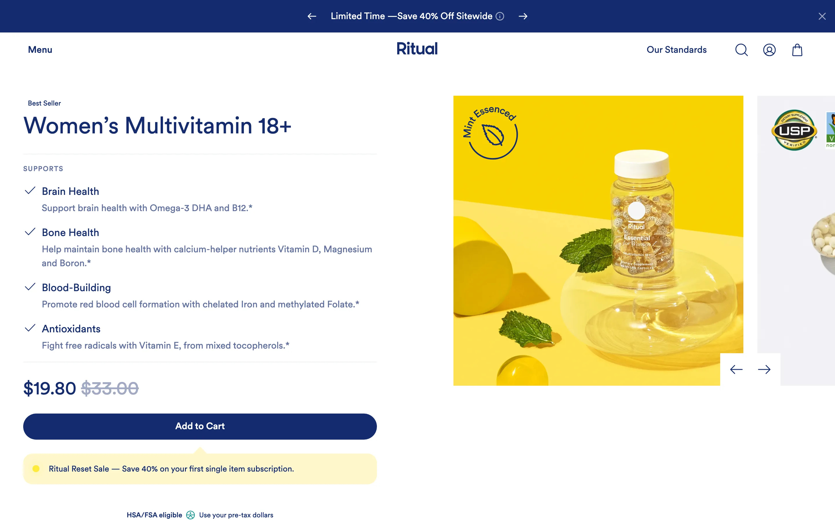
Add a numbered "how it works" mechanism section
A short numbered section explains the actual mechanism, distinct from the benefits, so the claims read as believable rather than marketing.
Ritual
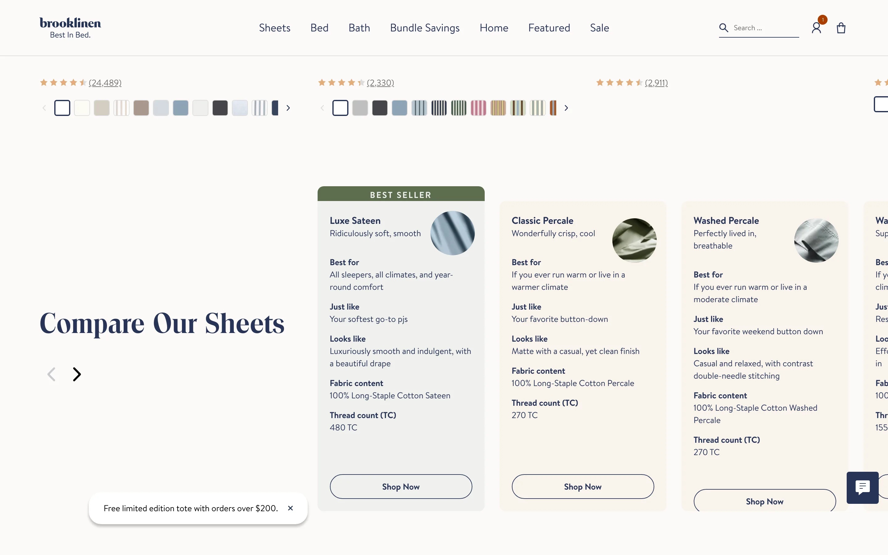
Add a side-by-side comparison panel on the product page
A compact panel sets the choices side by side, the range of options or the product against the usual alternative, so the right pick is obvious at a glance.
Brooklinen
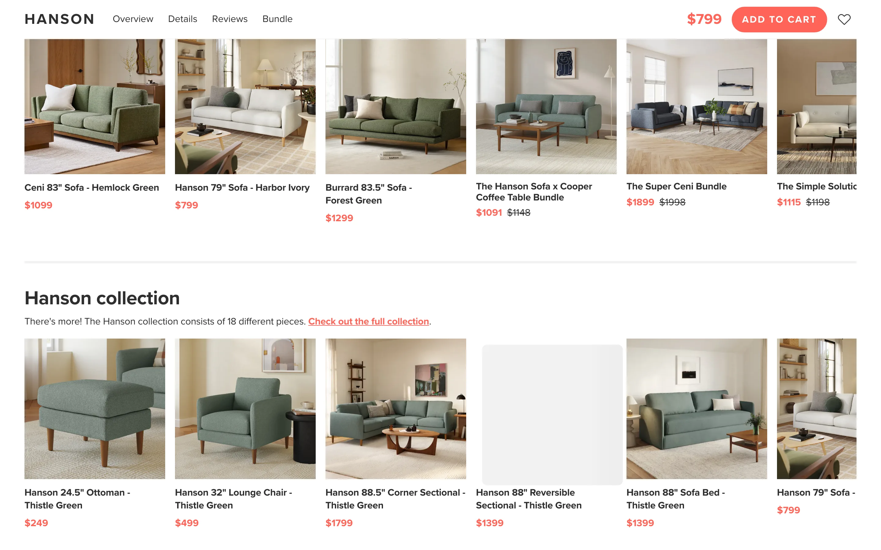
A "complete the look" cross-sell shown in context
A complete-the-look module suggests the one or two items genuinely used with this product, shown styled together rather than a generic grid.
Article
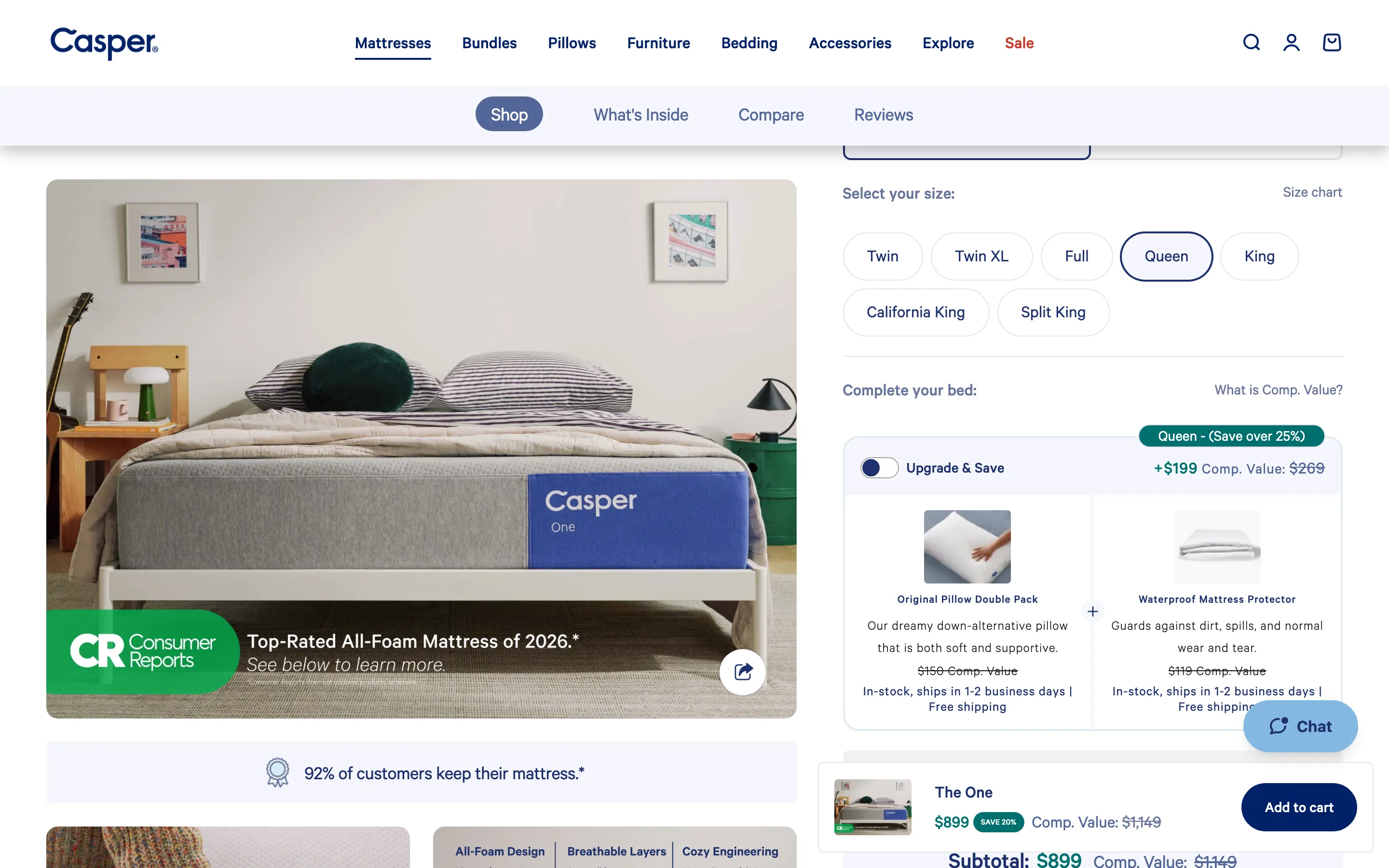
A sticky add-to-cart bar that carries the struck price
Once the buy box scrolls away a sticky bar pins the add-to-cart carrying the selected variant and the discounted price beside the struck original.
Casper
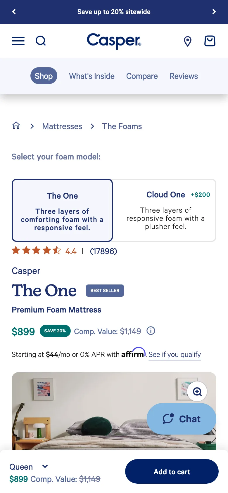
Give the mobile variant selector large tap targets
On mobile the variant selector uses full-width chips or a bottom sheet with large tap targets rather than a small native dropdown.
Casper
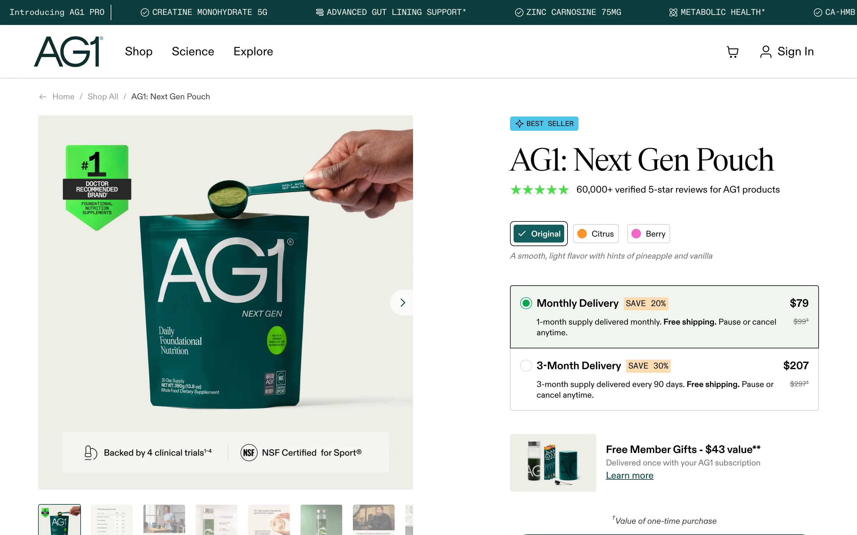
Let a premium gallery be pure photography, zero text
Every gallery slide is clean photography with no text overlaid, letting a premium product carry the page in the restrained register buyers expect.
AG1
An accent-coloured trust bar under the hero
A full-width bar in a bright brand accent carries a few icon-and-label proof points, so it reads as part of the brand rather than a grey compliance strip.
Graymatter
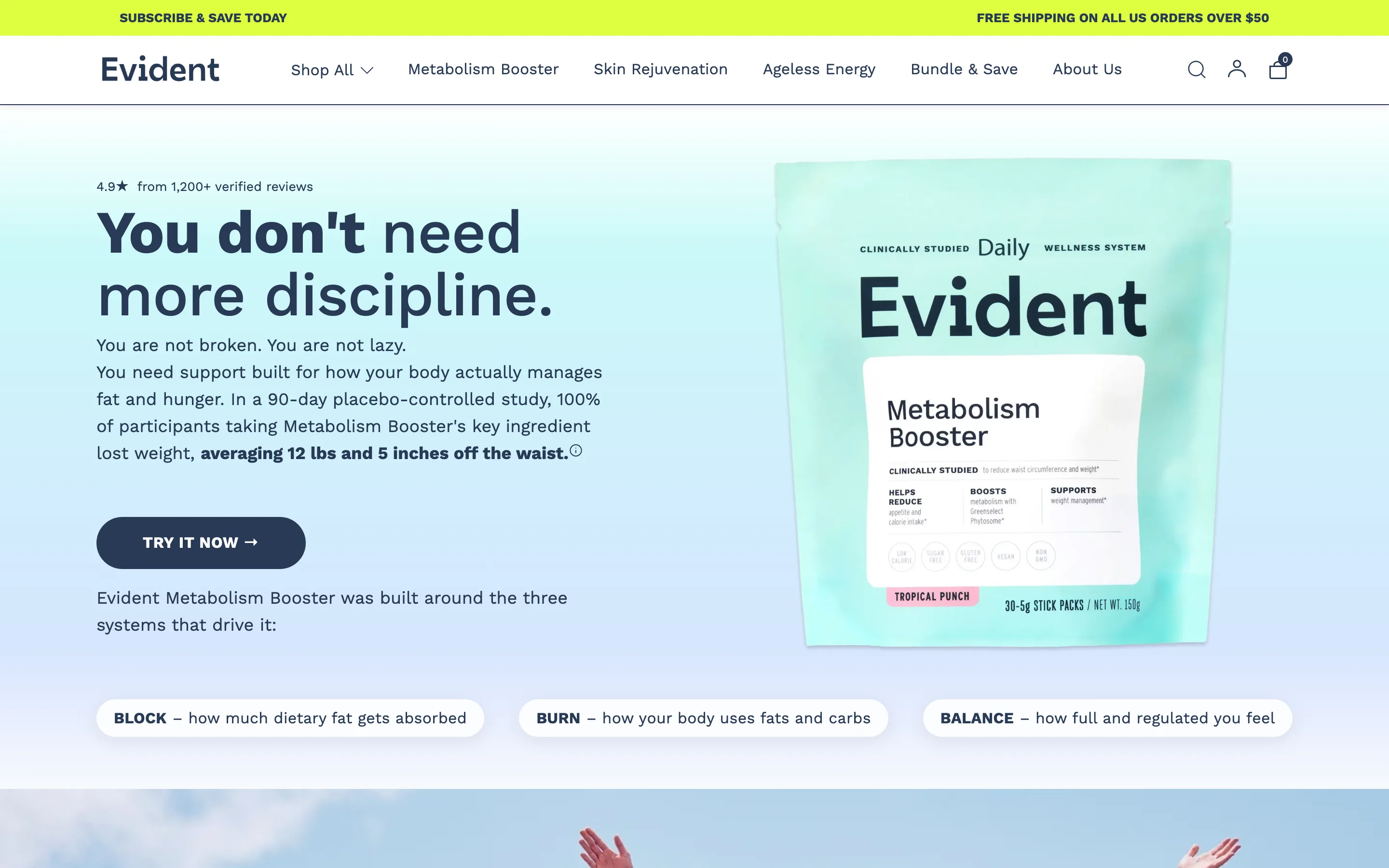
Lead the hero with a verified rating and proof
A prominent rating and review count sits at the top of the hero, paired with a specific result, so trust is set before the product is even described.
Evident
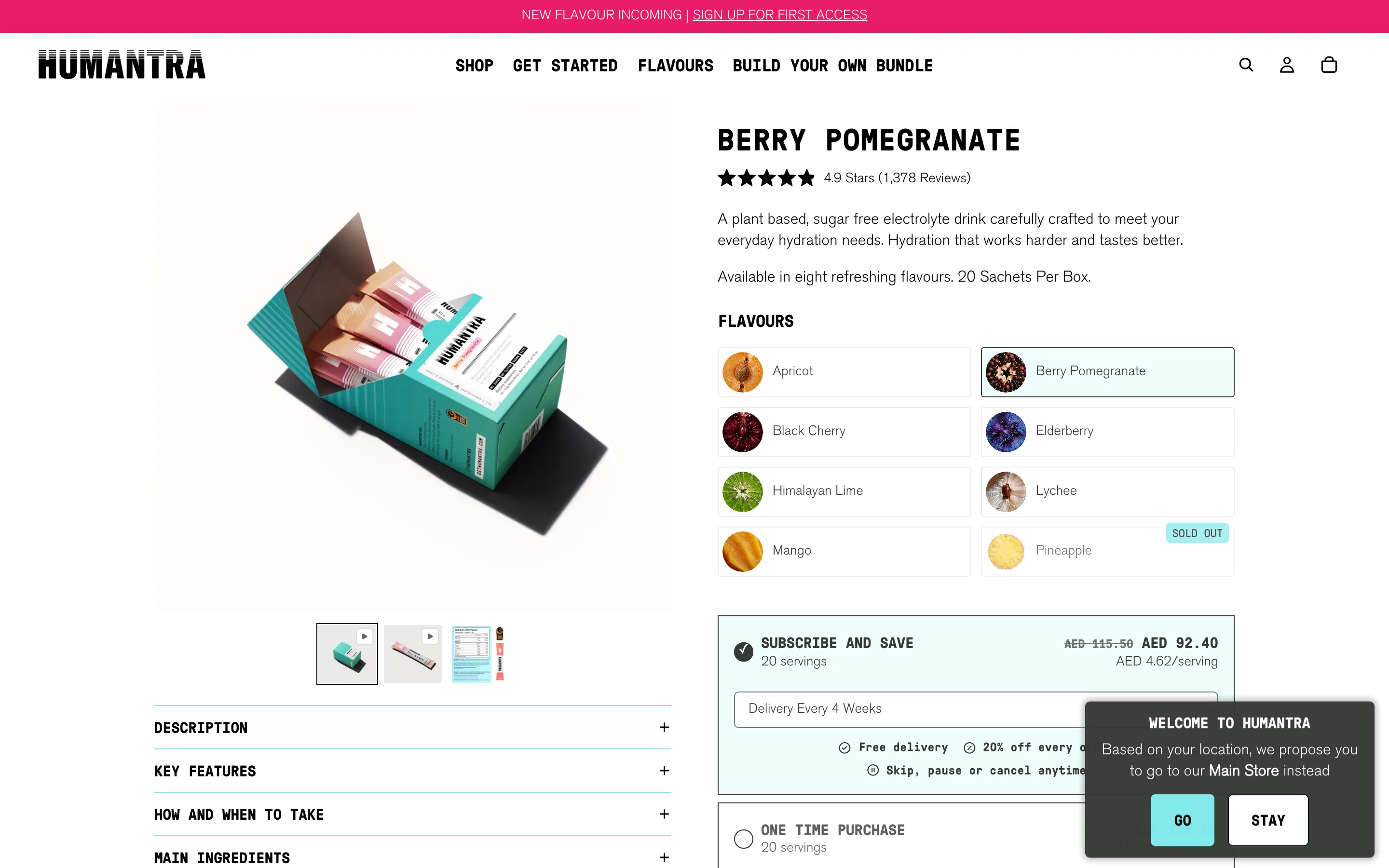
Show flavour and variant chips above the headline
A compact row of flavour or variant chips near the top shows the full range without a product grid, so a shopper sees breadth on one focused page.
Humantra
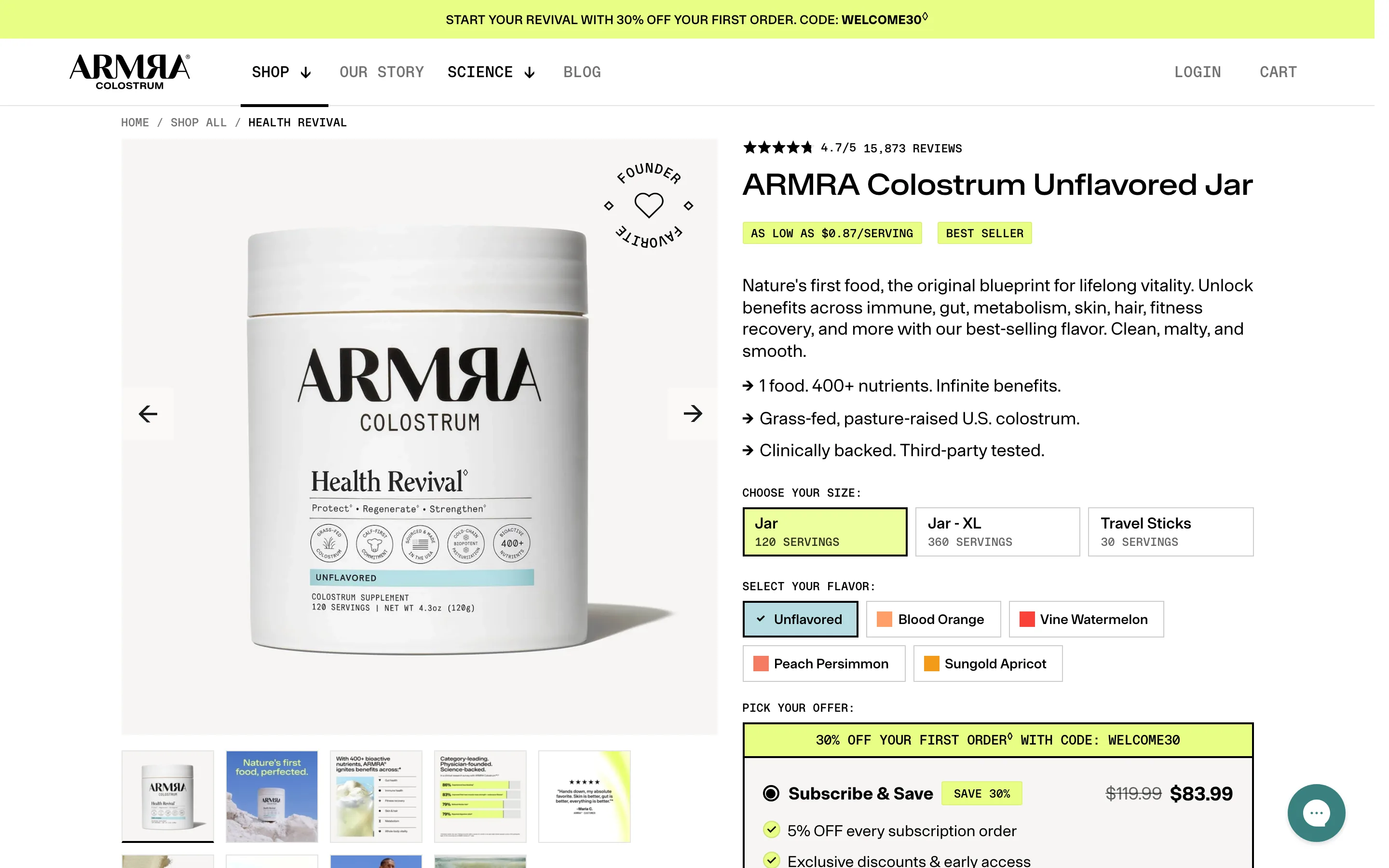
Offer size tiers with a per-serving price
Size options are shown as tiers with servings and a per-serving cost, alongside a subscription saving, so a larger commitment reads as the better value.
ARMRA
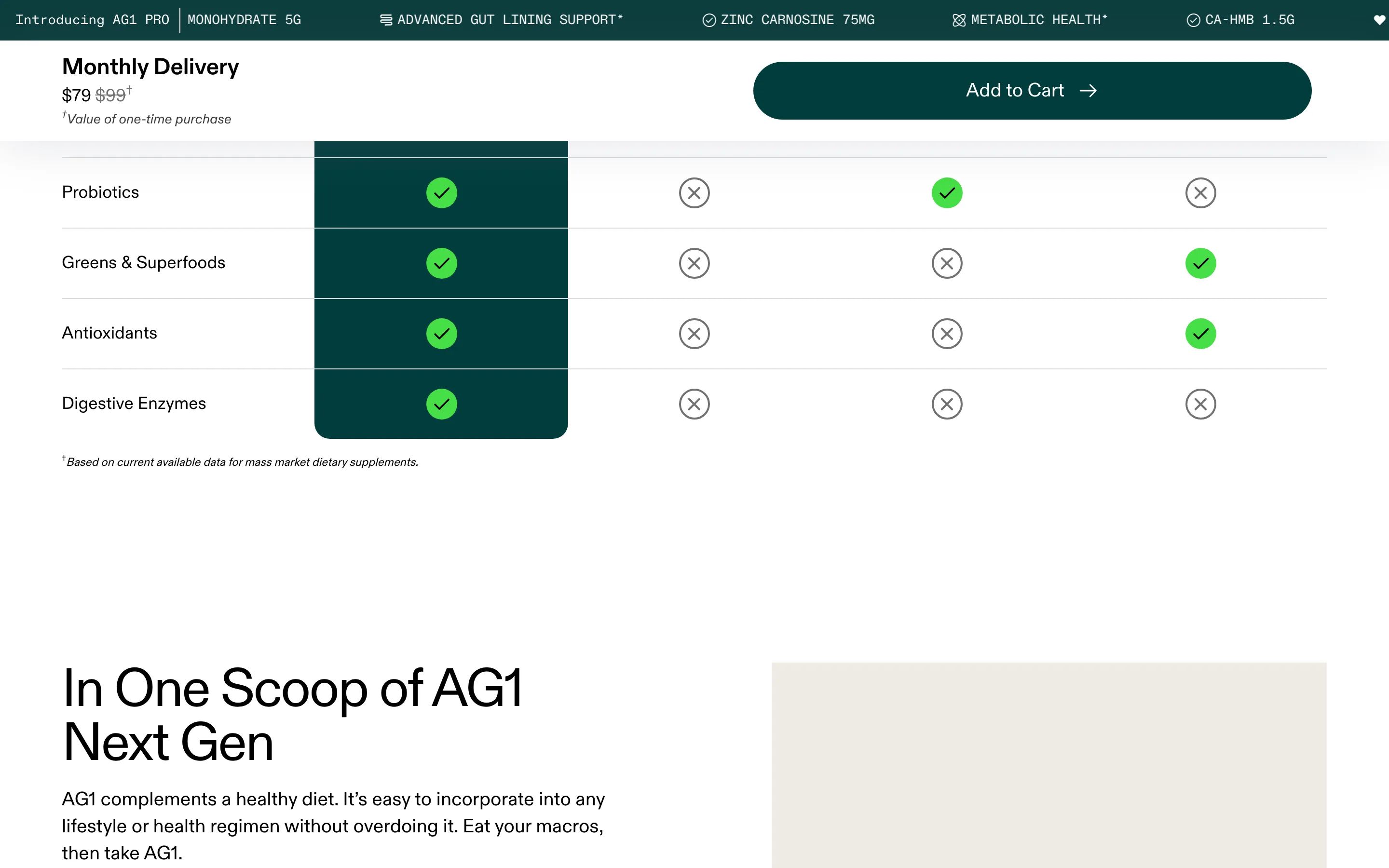
A checkmark comparison chart versus the alternatives
A feature matrix puts the product in a highlighted column of green checks beside competitors that mostly miss, so the advantage is obvious at a glance.
AG1
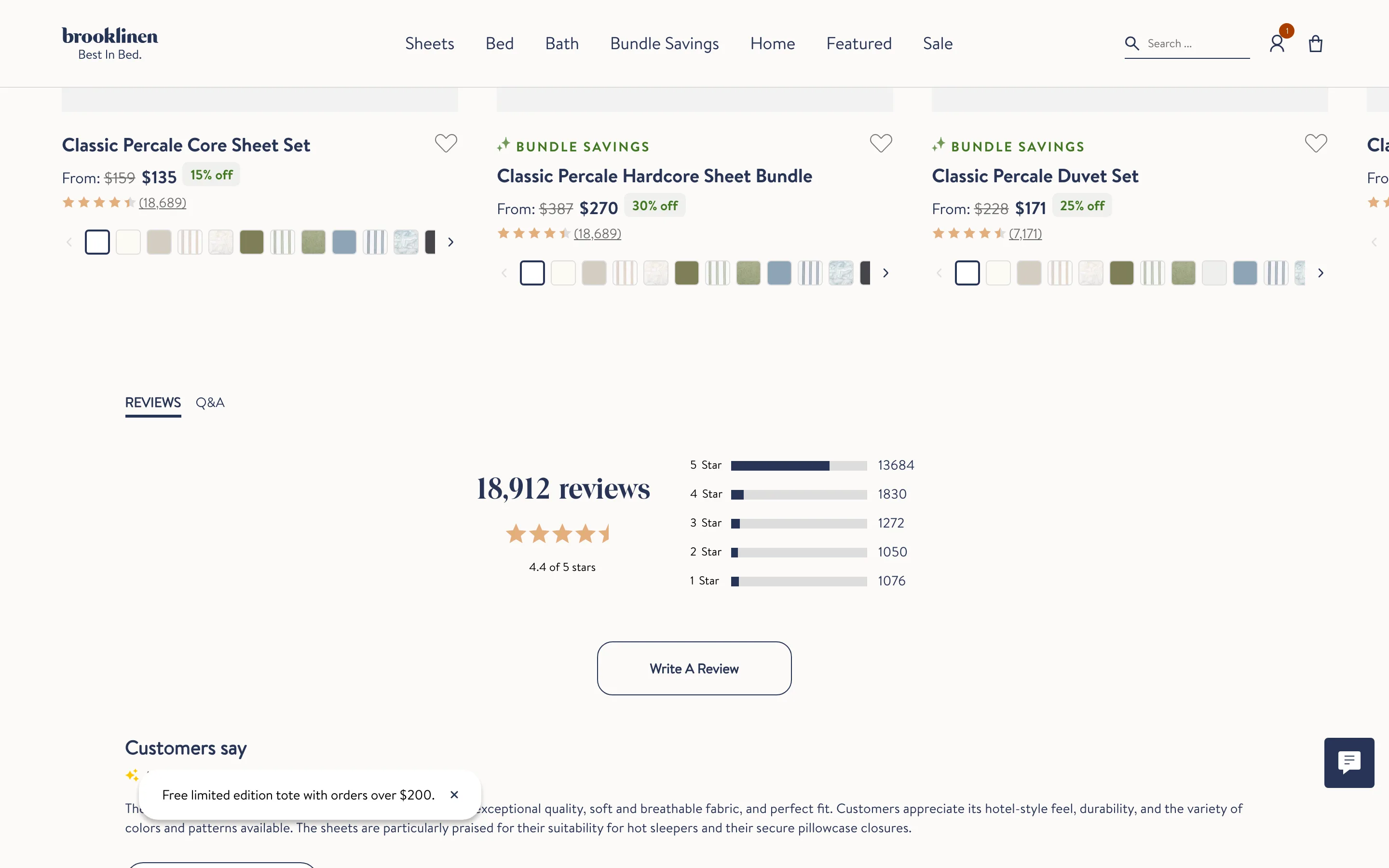
A full reviews section with a rating distribution
The reviews block leads with the total count, average stars and a 5-to-1-star distribution histogram, then a summary of what customers say and the reviews.
Brooklinen
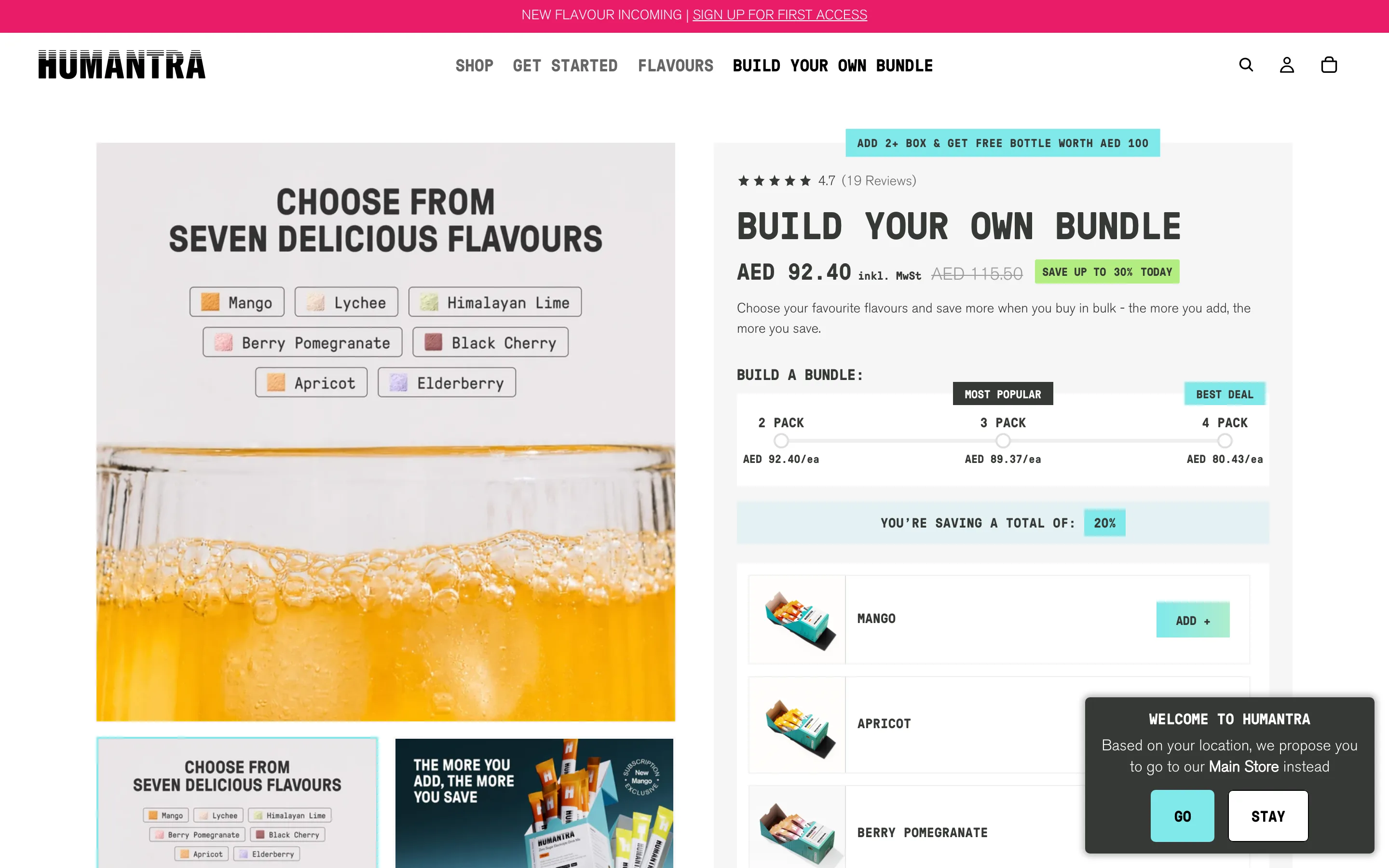
An interactive build-your-own-bundle with a savings slider
A pick-your-items builder with a pack-size slider (2/3/4) showing per-unit price and a running savings total that update live as the shopper adds items.
Humantra
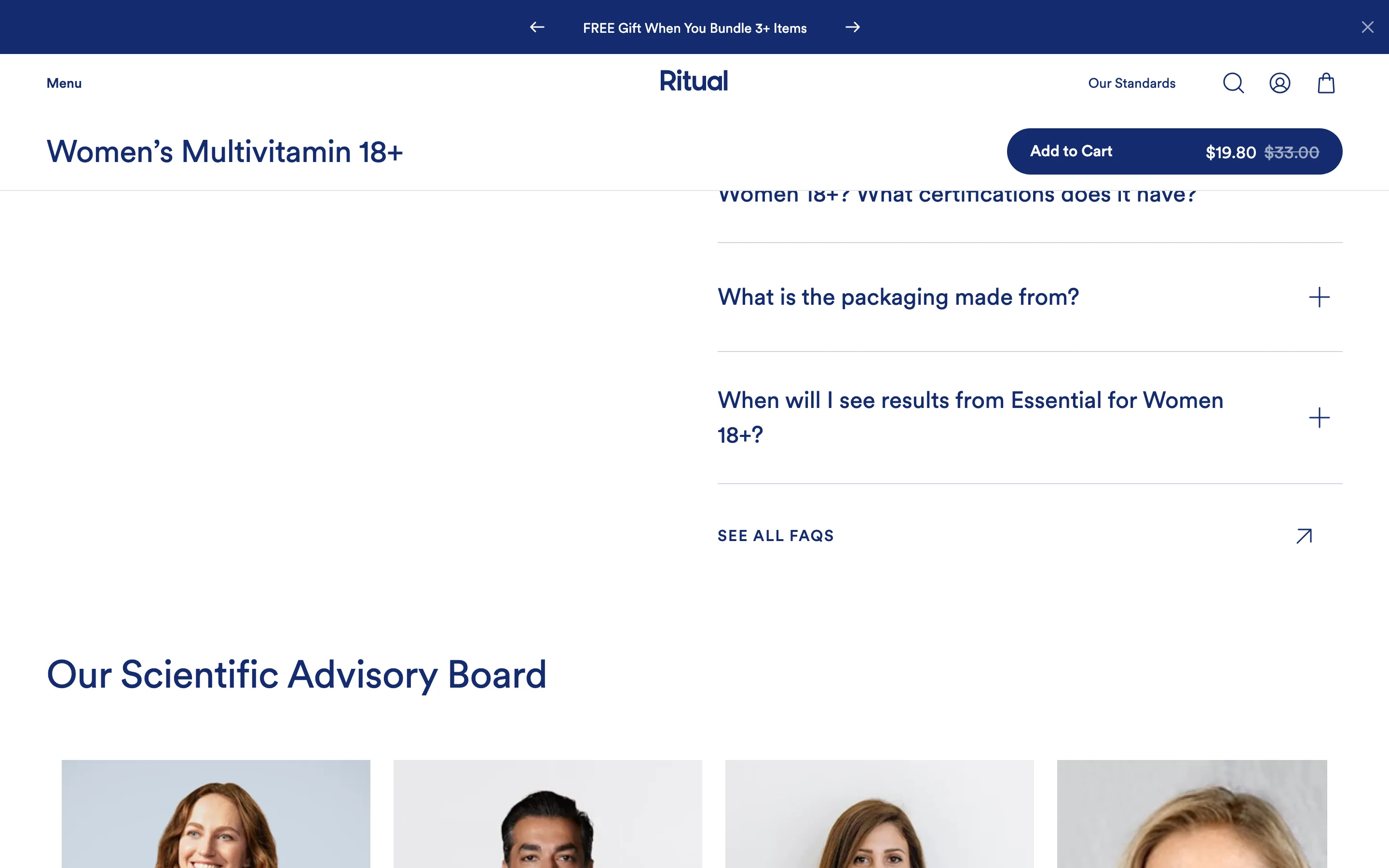
A FAQ accordion that answers objections on the page
Expandable questions near the buy decision handle the top objections (results timing, certifications, packaging) without sending the shopper to a help page.
Ritual
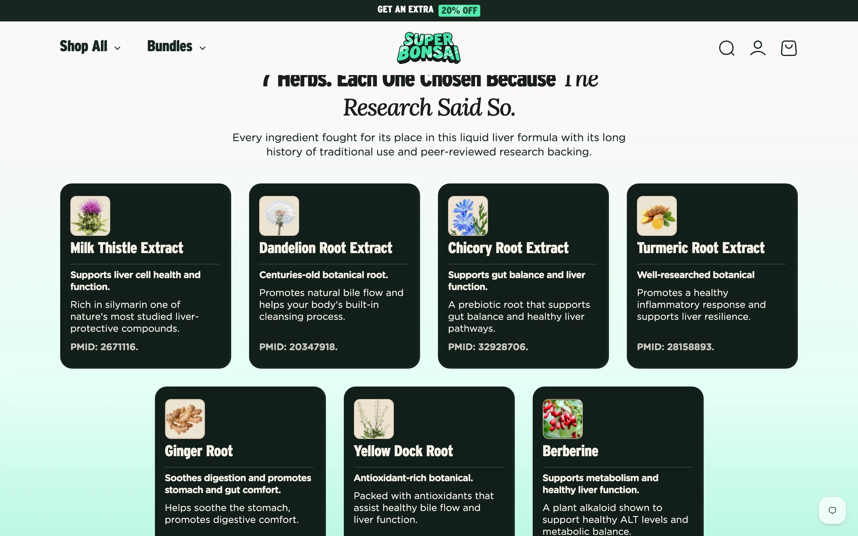
An ingredient breakdown with what each one does
Every ingredient gets its own card explaining what it does and a citation, so the formula reads as considered and evidence-backed rather than a bare list.
Super Bonsai
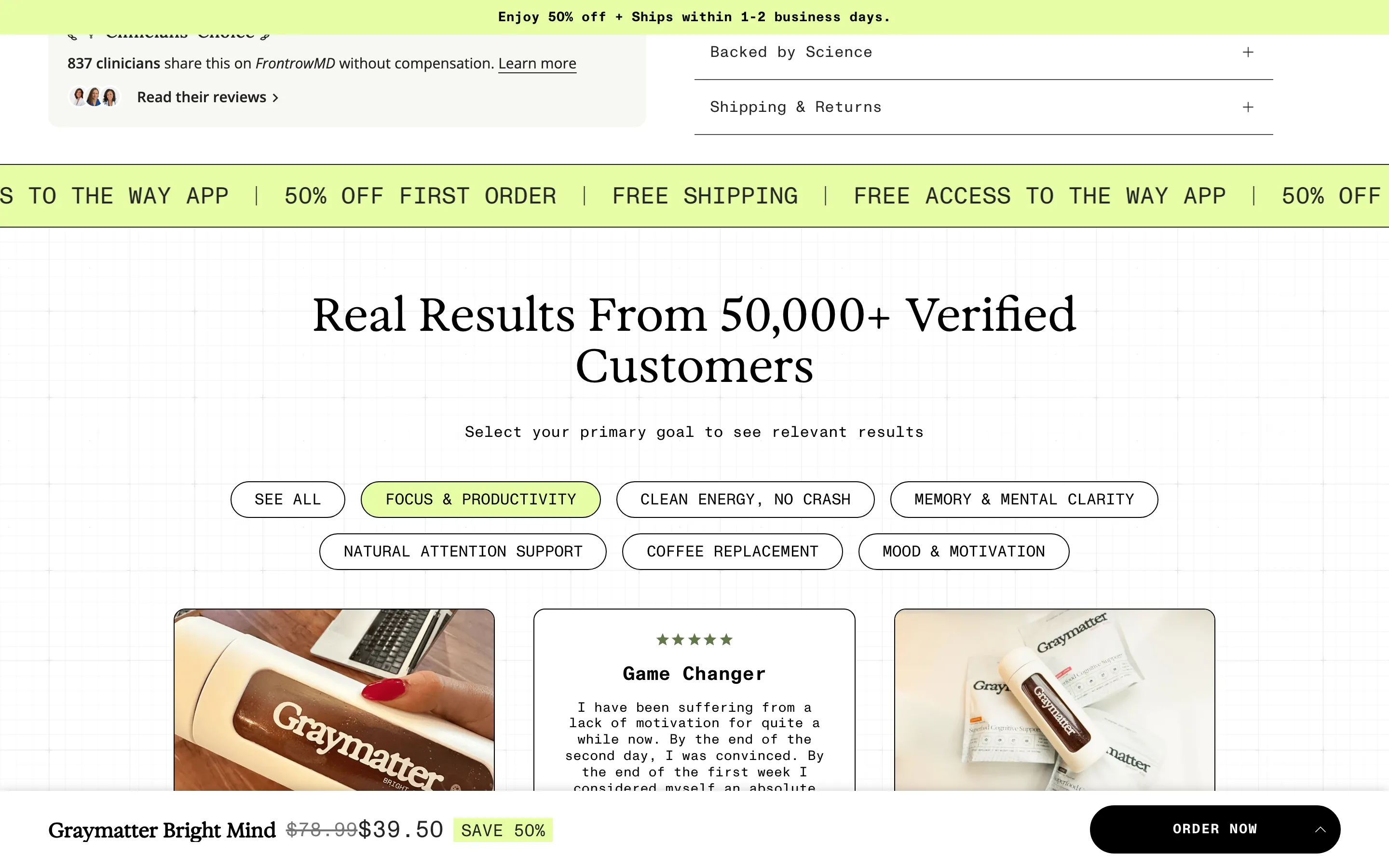
A filterable "real results" section by goal
A results section lets the shopper filter testimonials by their own goal (focus, energy, clarity), so the proof they see is the proof relevant to them.
Graymatter
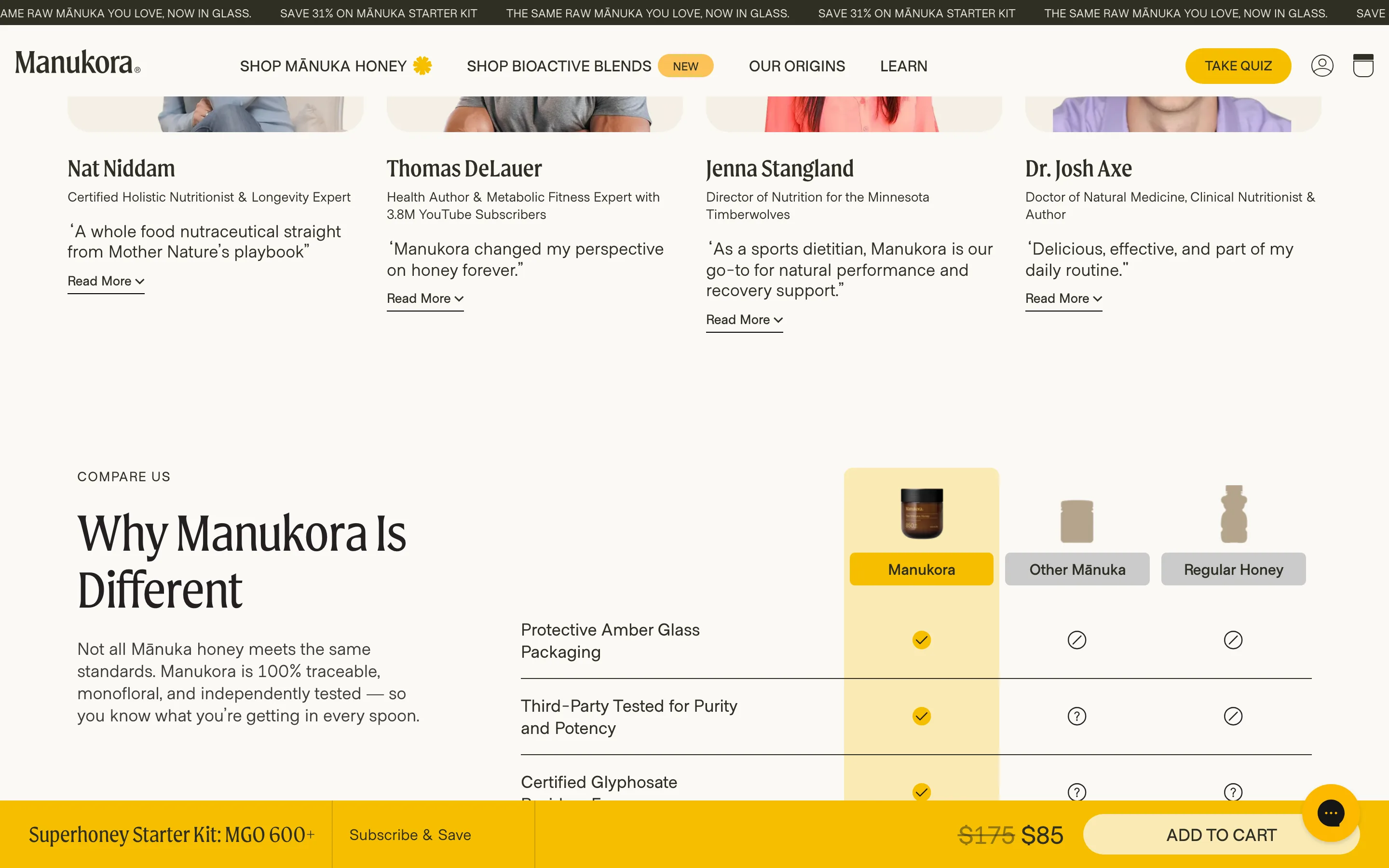
A row of named experts endorsing the product
A strip of real experts, each with a photo, title and short quote, puts credentialed third-party credibility on the page instead of anonymous praise.
Manukora
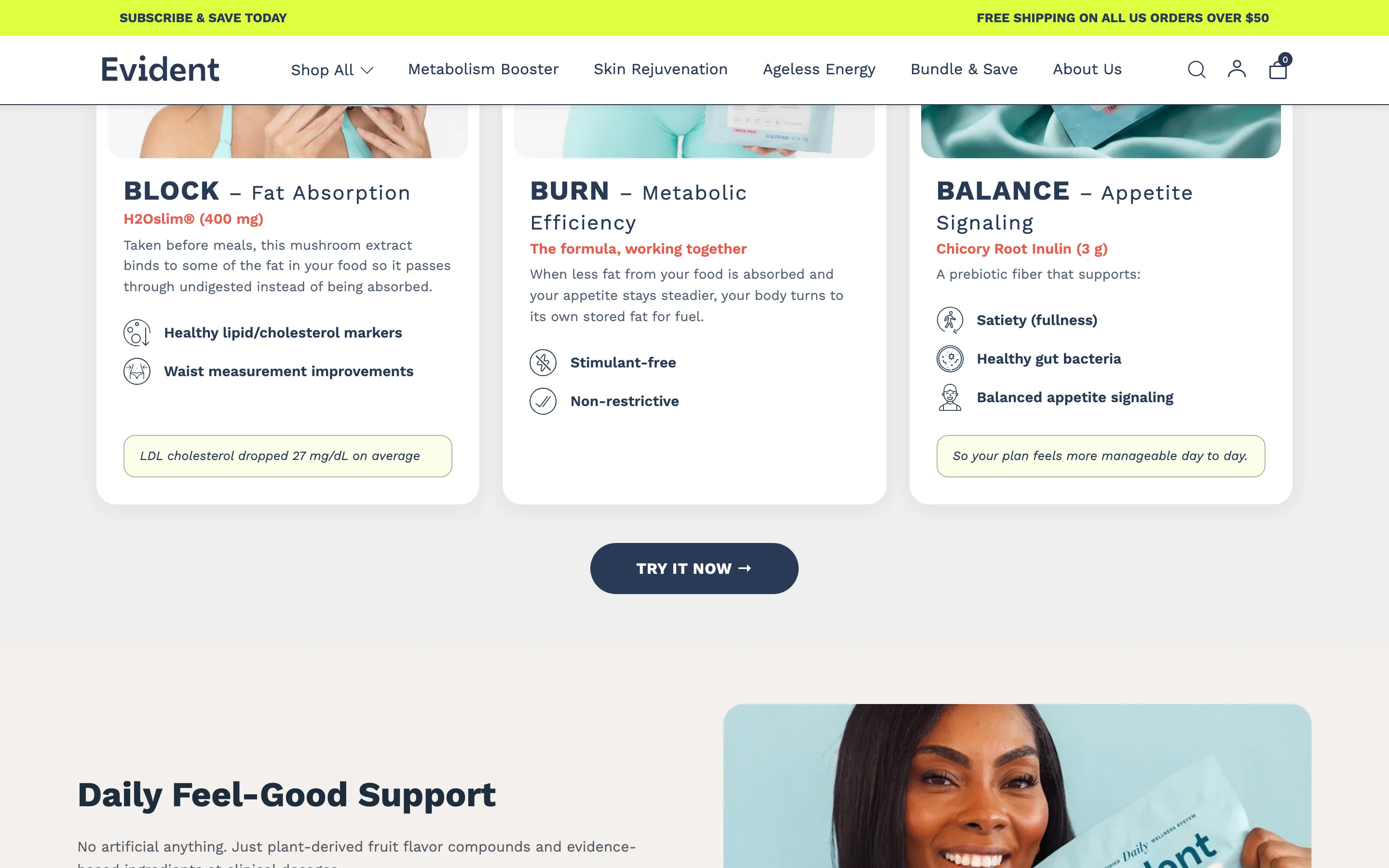
Show the science: each mechanism with its active and a result
Named mechanisms each carry the active ingredient, its dose, how it works and a specific result, so "clinically studied" reads as something concrete.
Evident
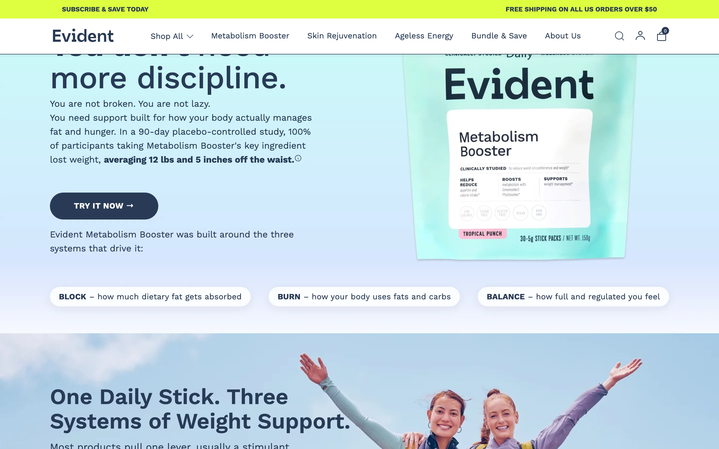
Lead with a specific clinical-study result
A callout states a real study result in plain numbers (in a 90-day study, participants averaged a named amount of change), so the claim is concrete and cited.
Evident
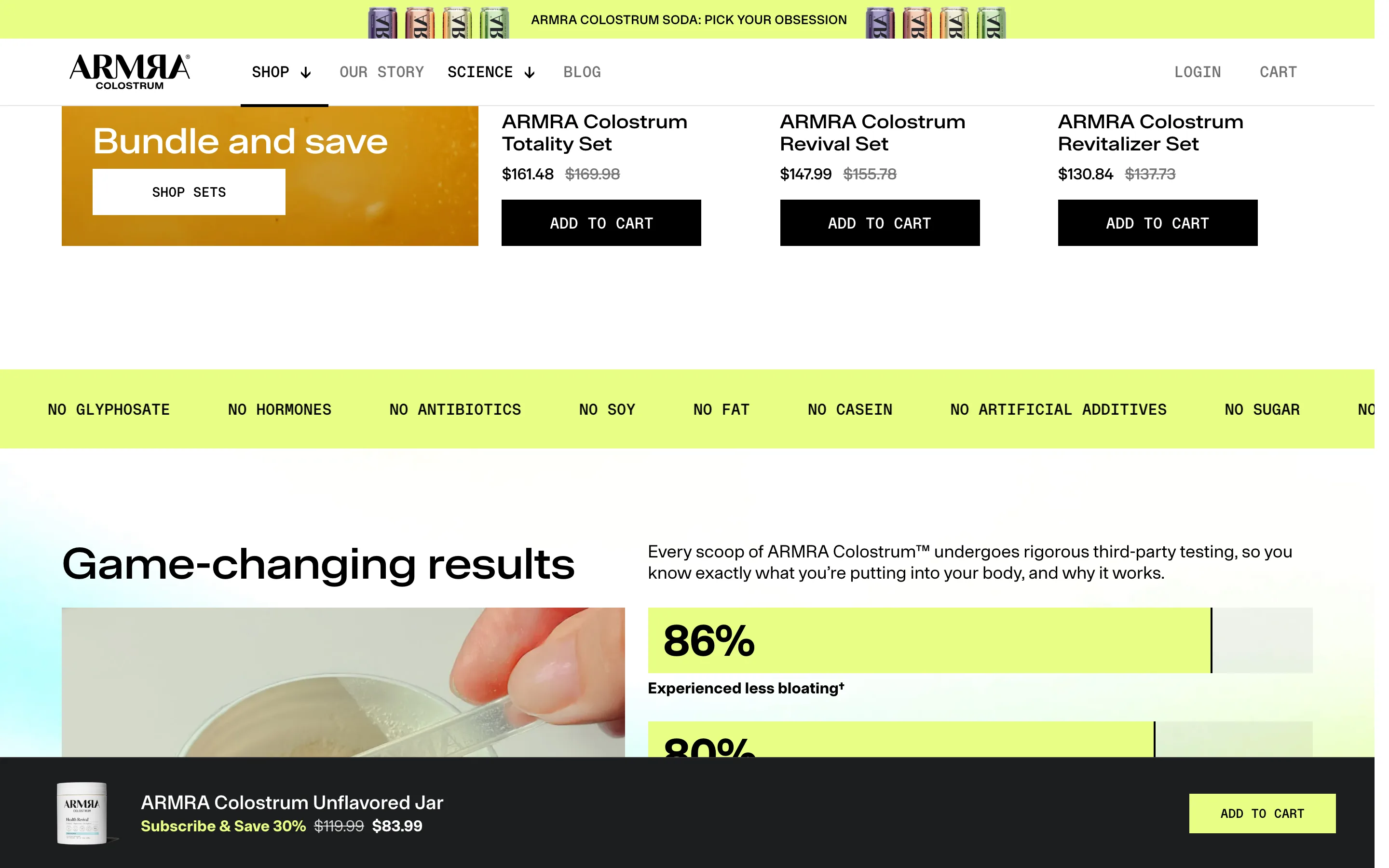
A "free from" strip listing what is NOT in it
A full-width accent strip lists everything the product leaves out (no sugar, no gluten, no additives), answering what-is-not-in-it doubts in one scan.
ARMRA
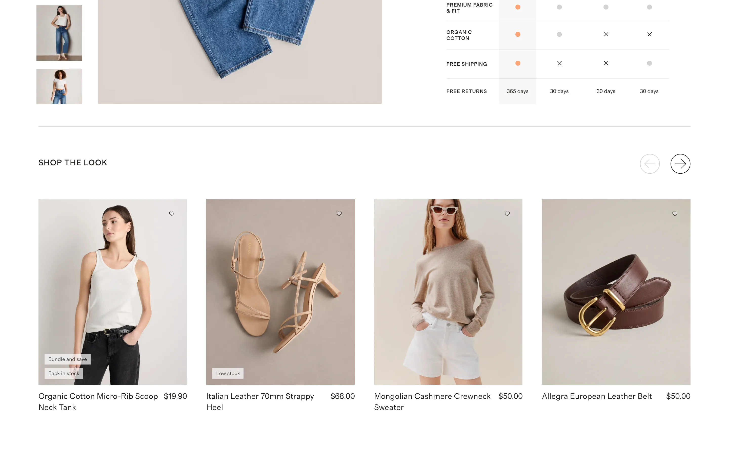
A "shop the look" styled cross-sell carousel
A carousel of styled companion items lets the shopper buy the whole outfit or set, shown on-model with stock and bundle badges, rather than a generic grid.
Quince
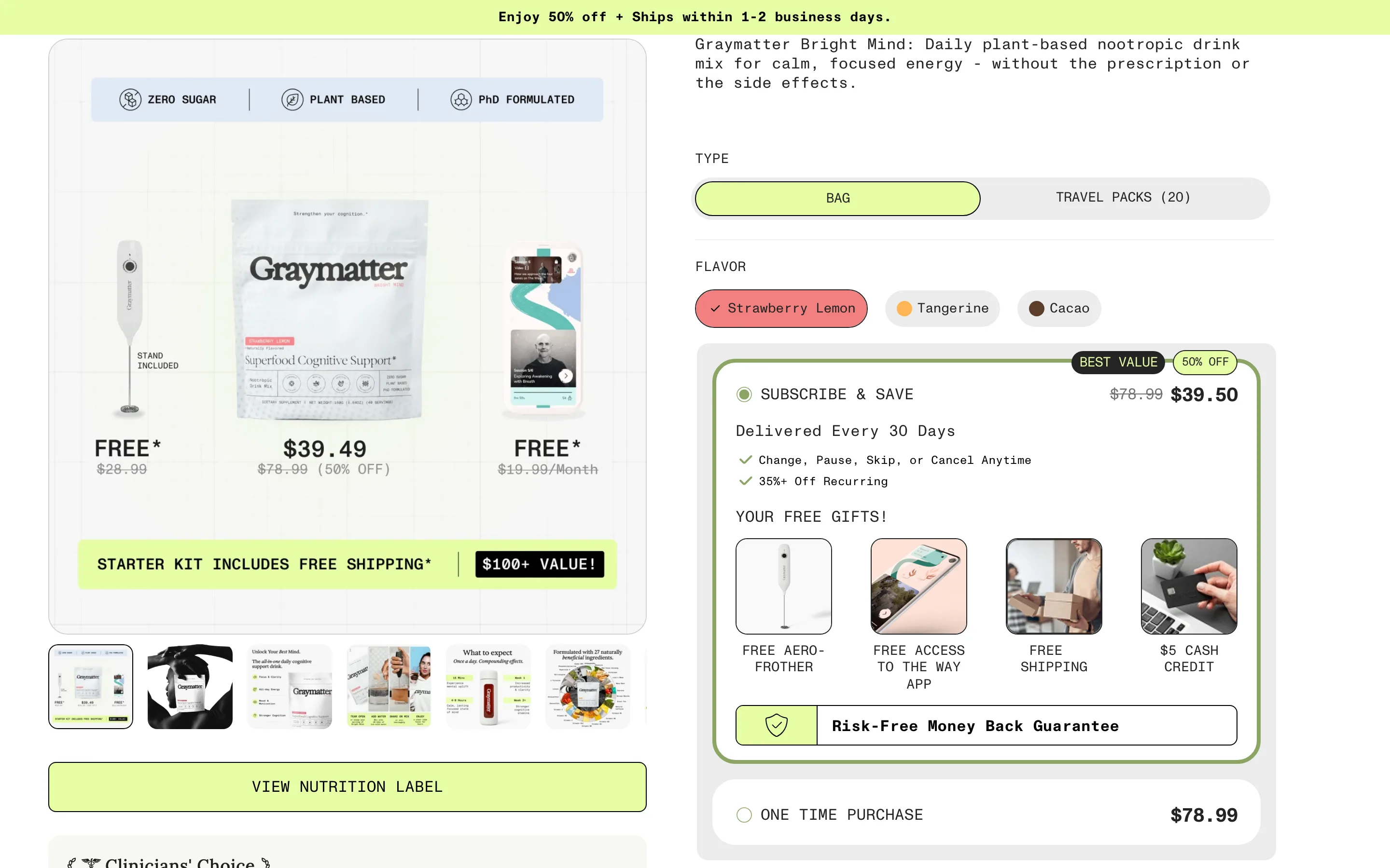
Stack the risk-reversal: cancel anytime and money-back
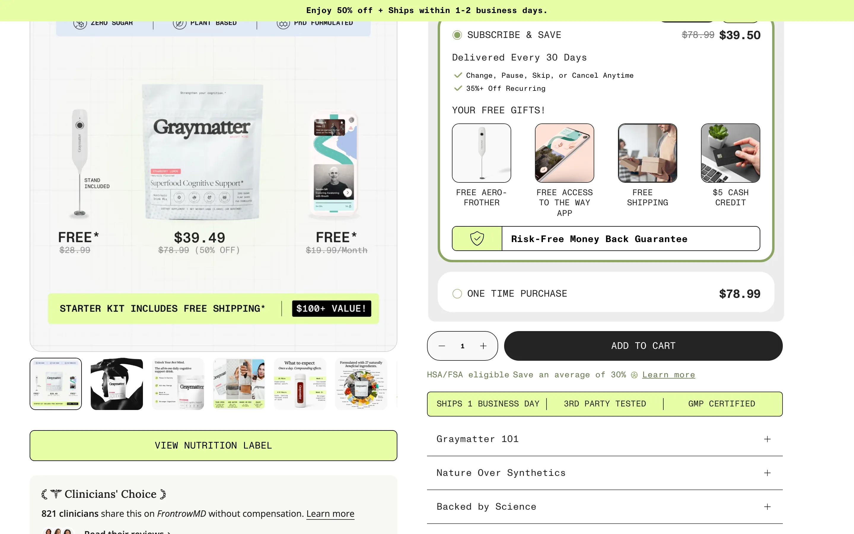
The subscription option pairs "change, pause or cancel anytime" with a money-back guarantee band and free gifts, so every reason to hesitate is removed at the buy box.
Graymatter
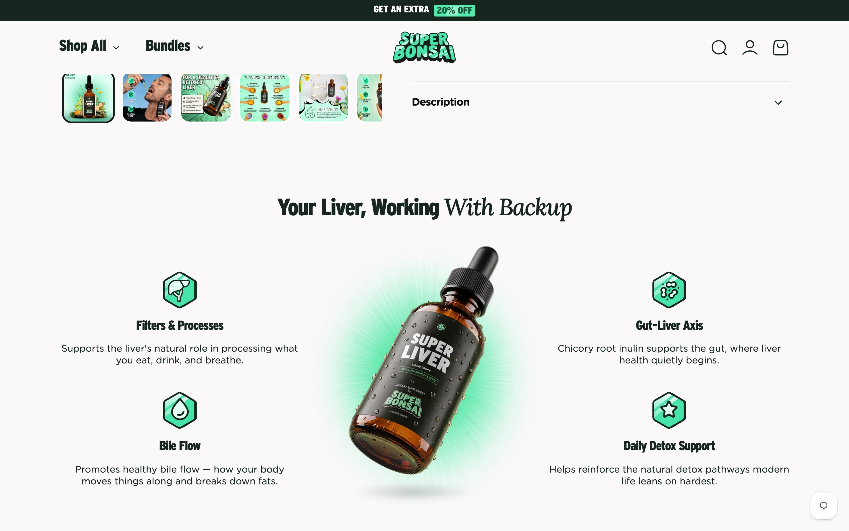
Arrange the benefits around the product itself
The product sits centre with its benefits placed around it as icon callouts, so the shot and the argument are the same visual.
Super Bonsai
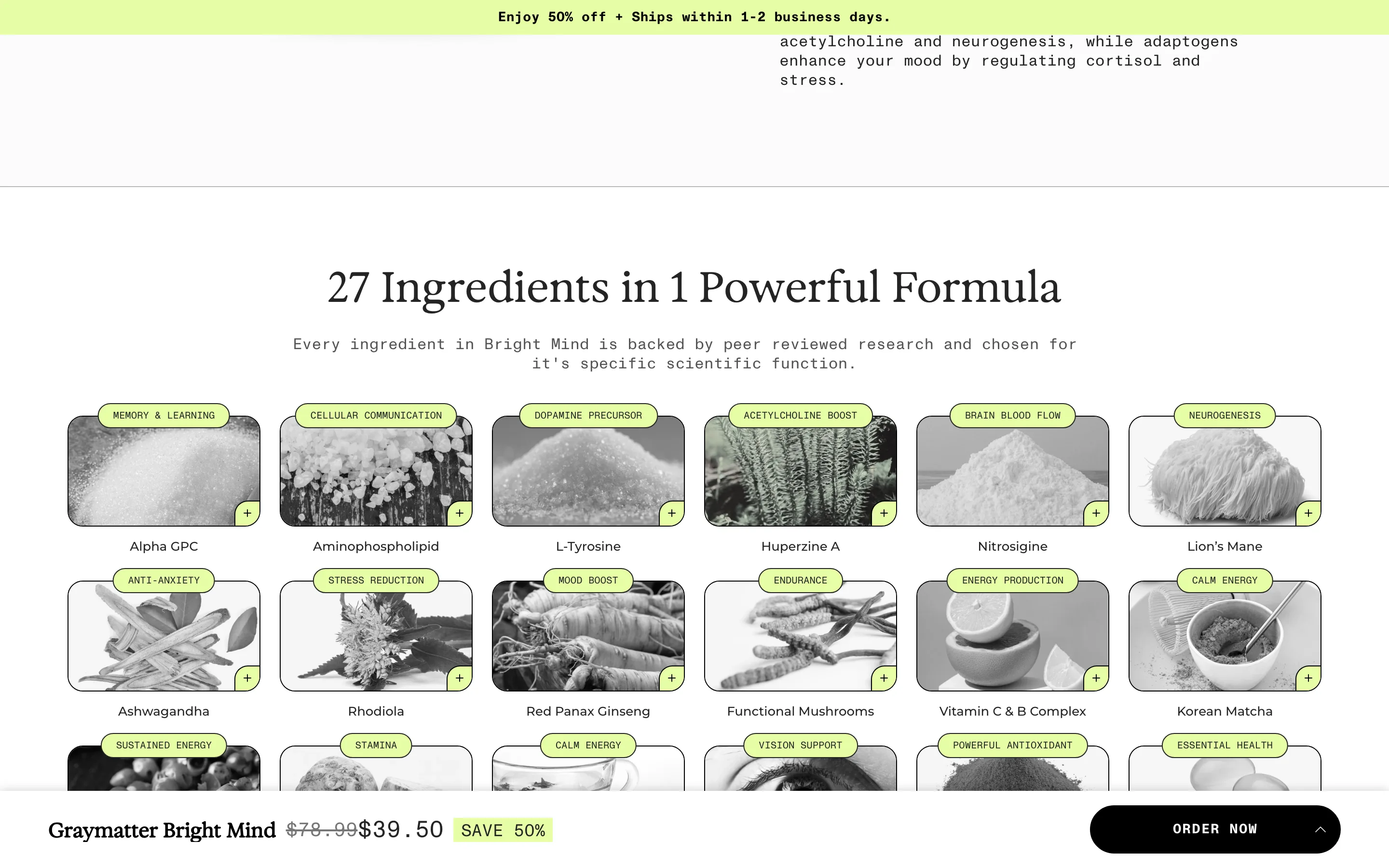
Tag every ingredient with the job it does
A grid shows each ingredient photographed with a small function tag (memory, mood boost, calm energy), making a long formula scannable by benefit.
Graymatter

Show a named medical advisory board
A section introduces the medical advisory board: named doctors with photos, specialties and quotes, giving the product governance-level credibility.
Graymatter
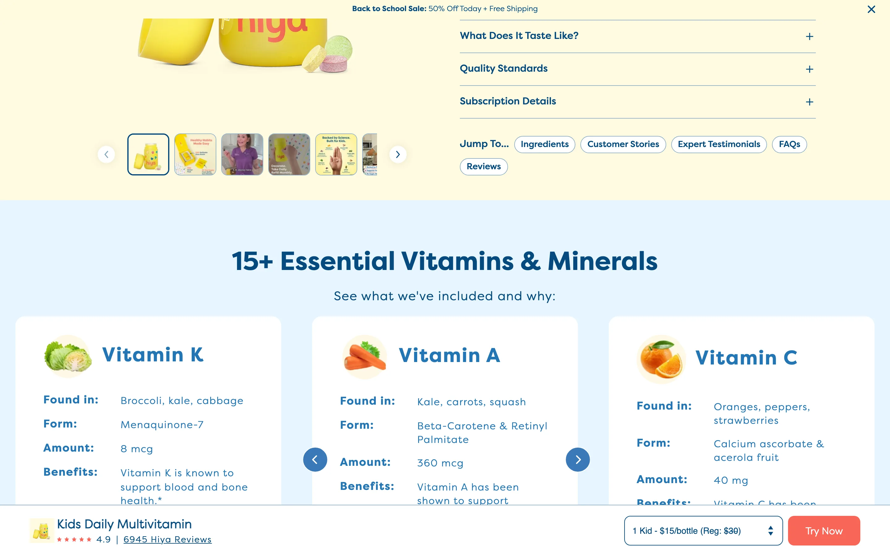
A "Jump To" chip nav for a long product page
A row of labelled chips (Ingredients, Customer Stories, FAQs, Reviews) lets a shopper skip straight to the section that answers their blocking question.
Hiya
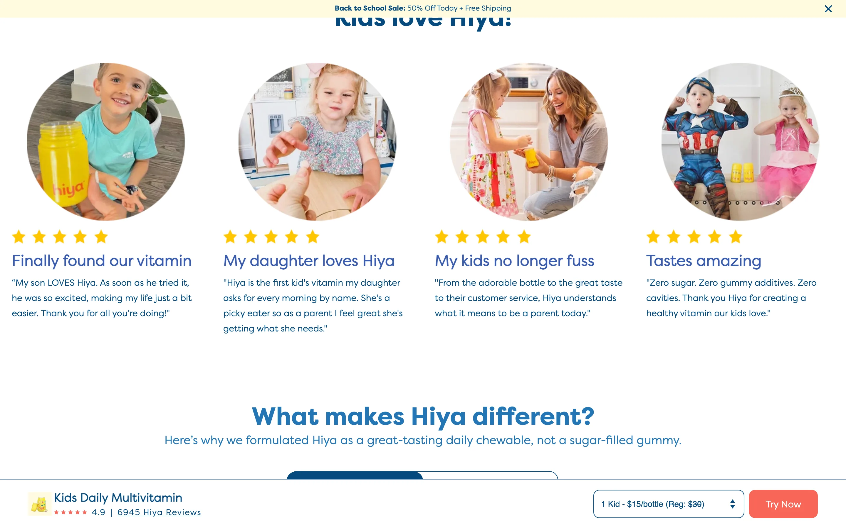
A row of real customer photos with their own quotes
Circular customer photographs of the product in real homes, each with stars, a quoted headline and a sentence in the customer's own words.
Hiya
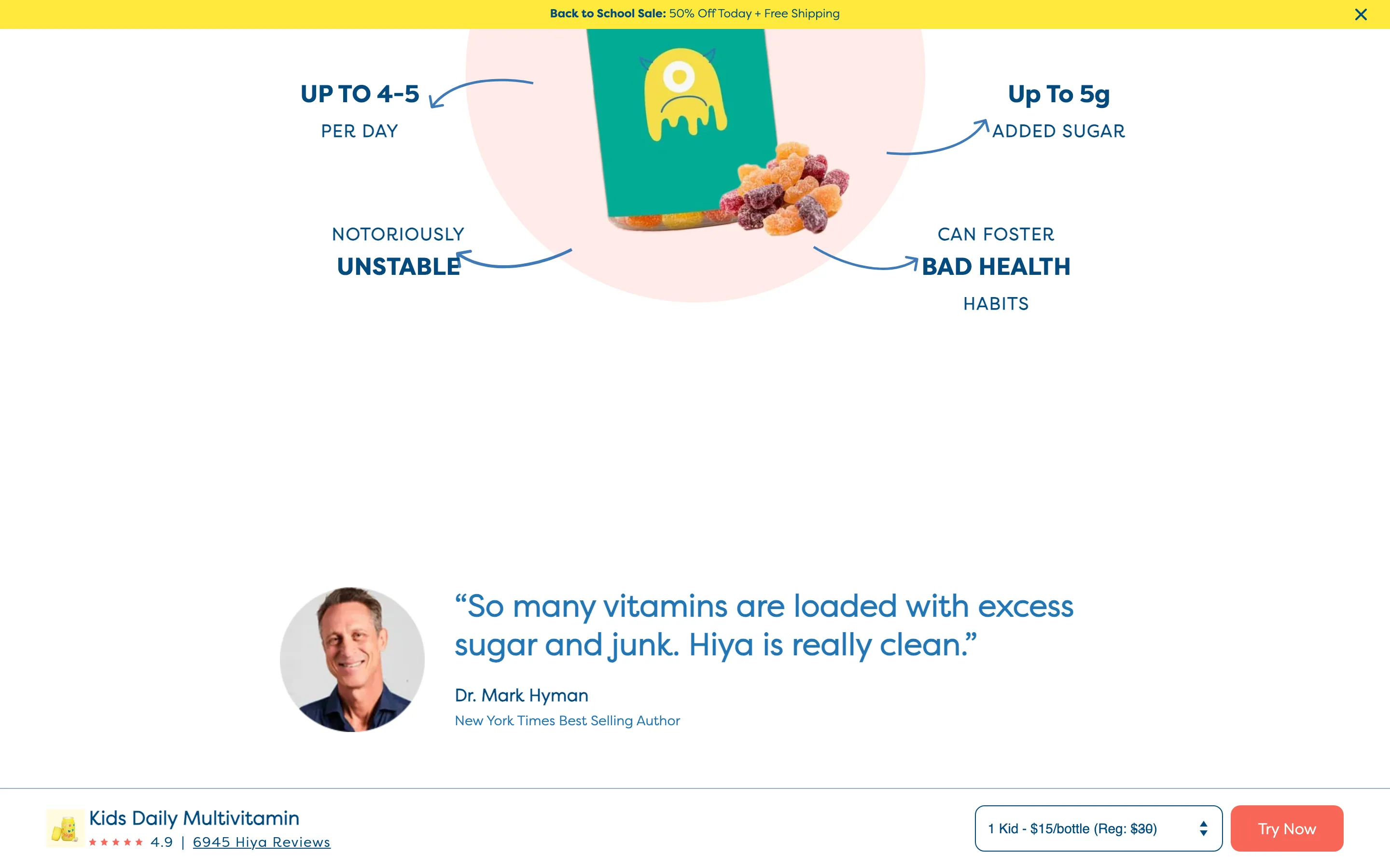
Annotate the alternative with everything wrong with it
The competing format is photographed with arrows pointing at its problems (added sugar, doses per day, instability), making the case on the image instead of in copy.
Hiya
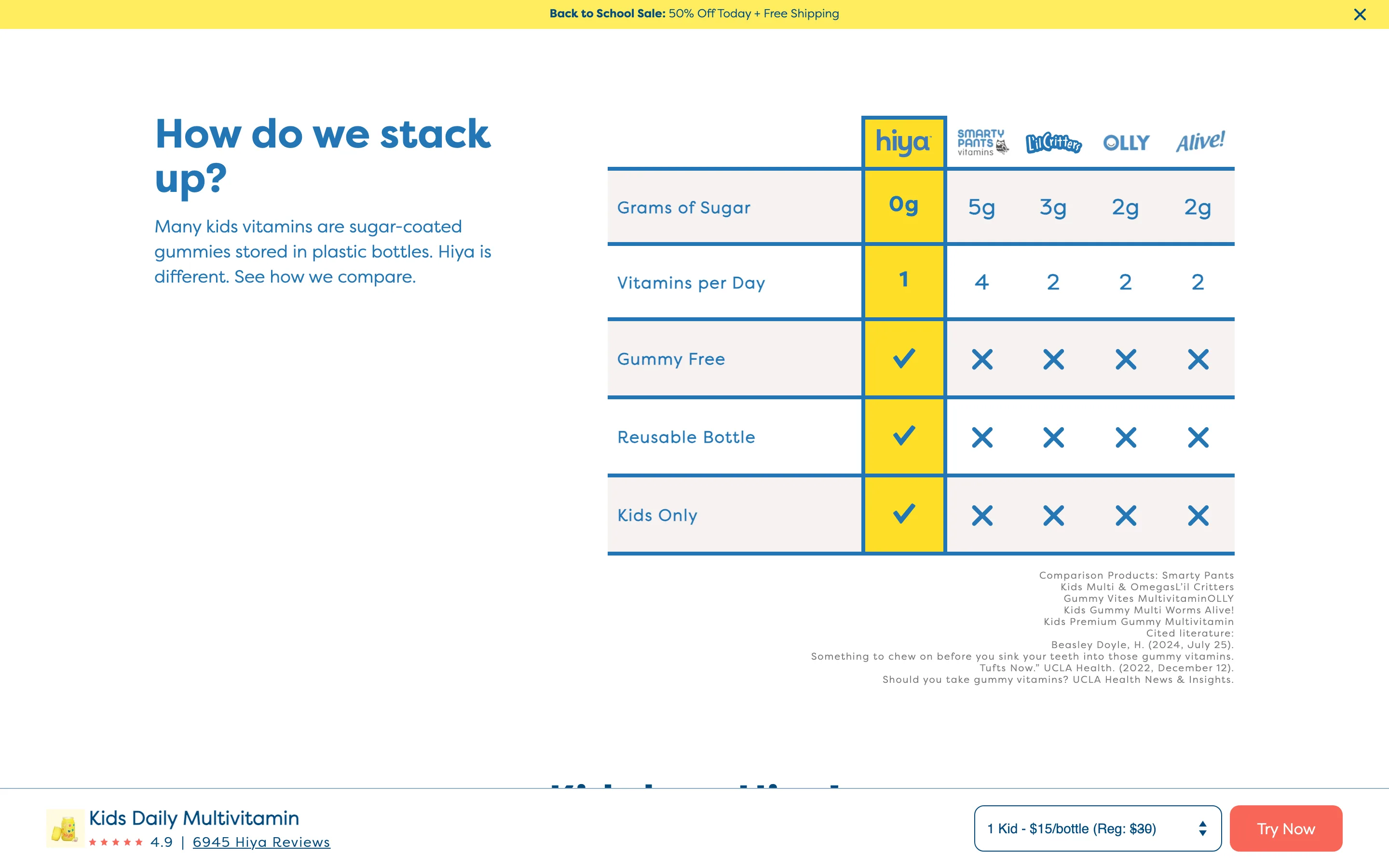
A comparison chart that names competitors and cites its sources
Named rival brands get their own columns with real numbers and checkmarks, footnoted with the exact products compared and the literature cited.
Hiya
Search
6 ideas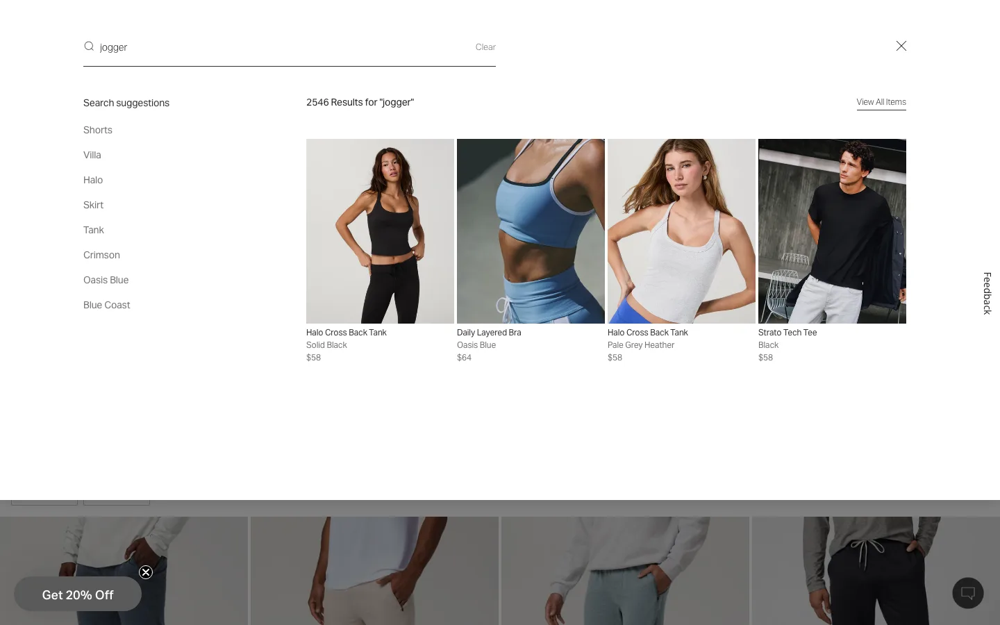
Show matching products, not just text suggestions, while the shopper types
Typing a partial query surfaces product photos, names and prices in a live-updating panel before the shopper presses enter, alongside a short list of related search phrases.
Vuori
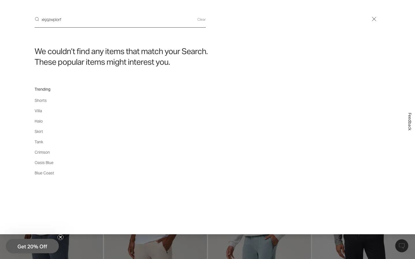
Replace a dead-end 'no results' page with trending searches
A search that returns nothing states that plainly, then immediately lists trending search terms the shopper can try instead, so the shopper has somewhere to go instead of a blank page.
Vuori
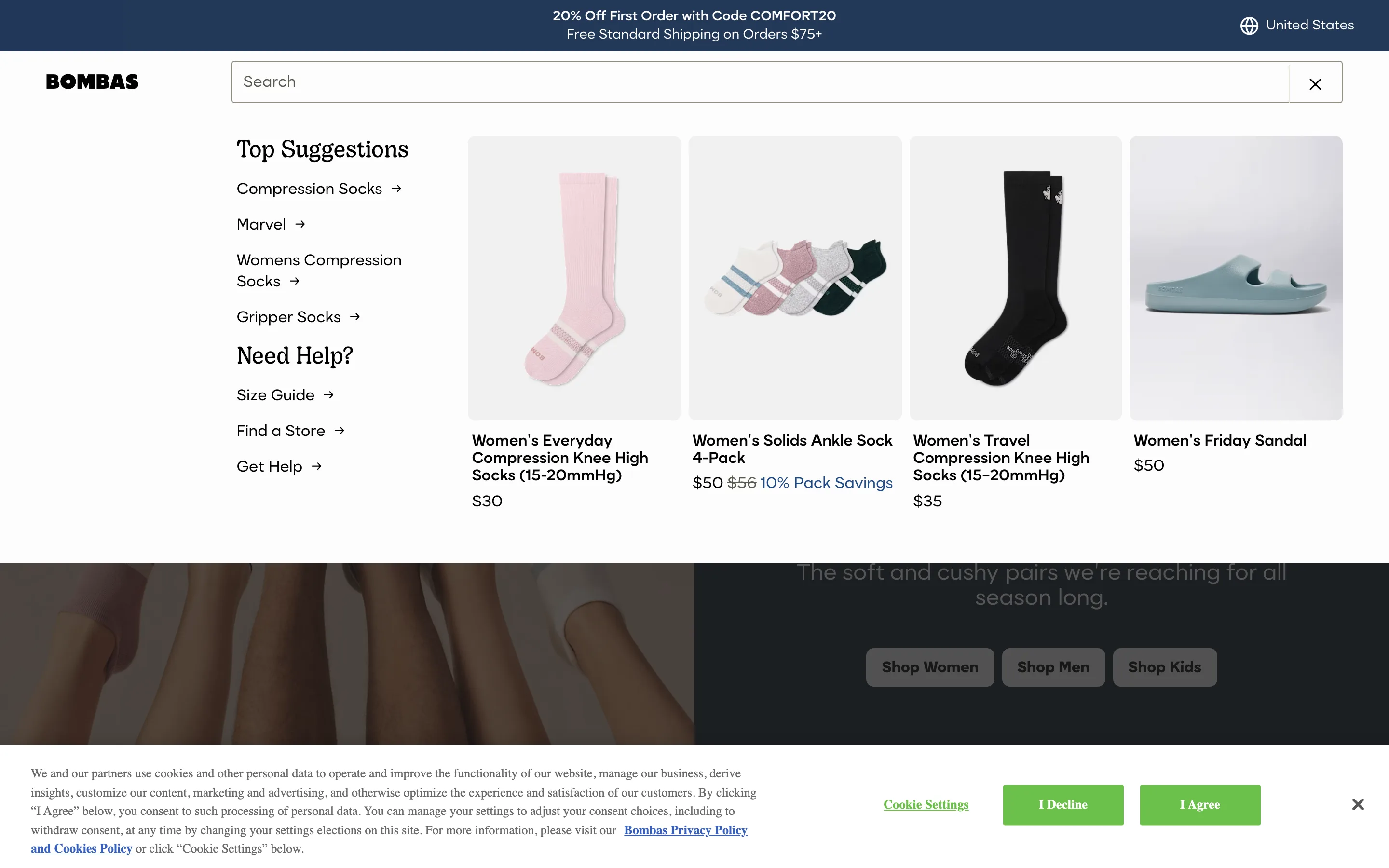
Give the search panel a 'Need Help' shortcut list before the shopper types anything
Opening the search box, before a single character is typed, shows popular search terms, bestselling product thumbnails, and a help block linking to the size guide, store finder and support.
Bombas
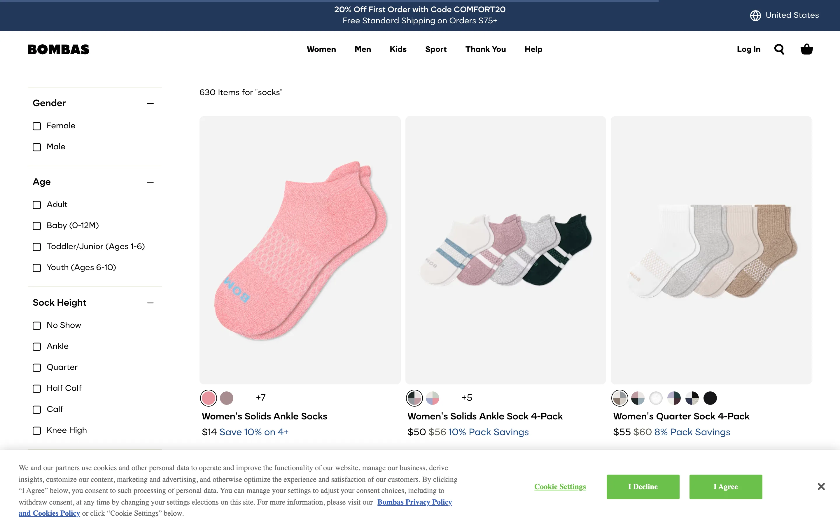
Give search results the same filter sidebar as a category page
A broad query returns hundreds of items with the full category filter sidebar already available, restating the query and count as a heading instead of dumping an undifferentiated list.
Bombas
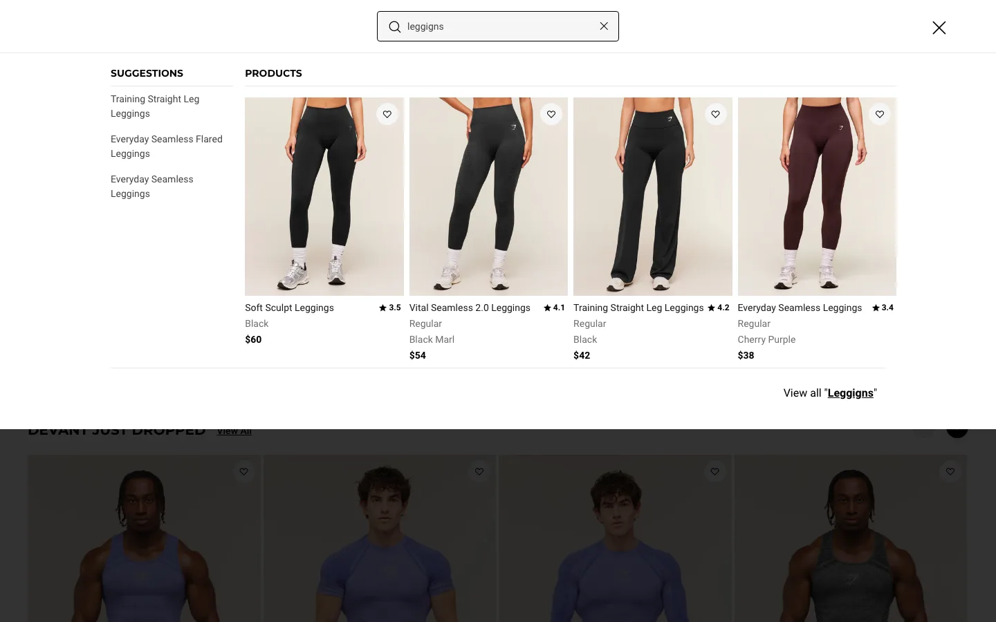
Return the right products even when the query is misspelled
A transposed-letter typo still returns correctly matched products, with the query itself corrected in the results heading, instead of a false zero-result dead end.
Gymshark
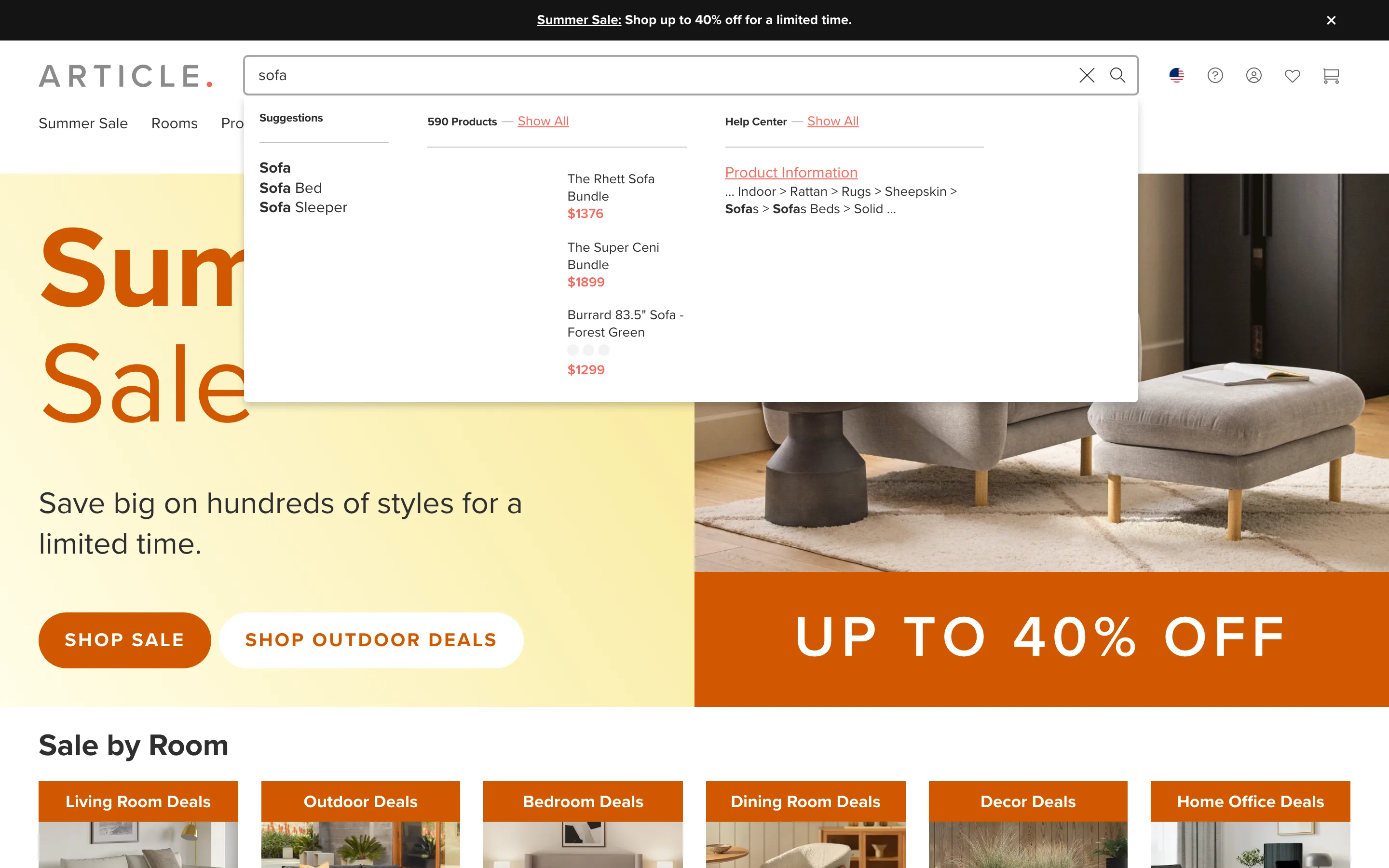
Split autocomplete into products and help-center answers, not just one list
Typing a query returns separate labeled groups at once, query suggestions, a product list with a live count, and a help-center section, so an informational query does not just return products with no help path.
Article
Cart
6 ideas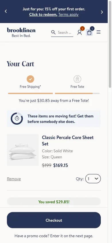
A free-shipping progress bar in the cart
A bar that fills as the cart total approaches the free-shipping threshold, showing the exact amount left to spend rather than just stating the threshold as a rule.
Brooklinen
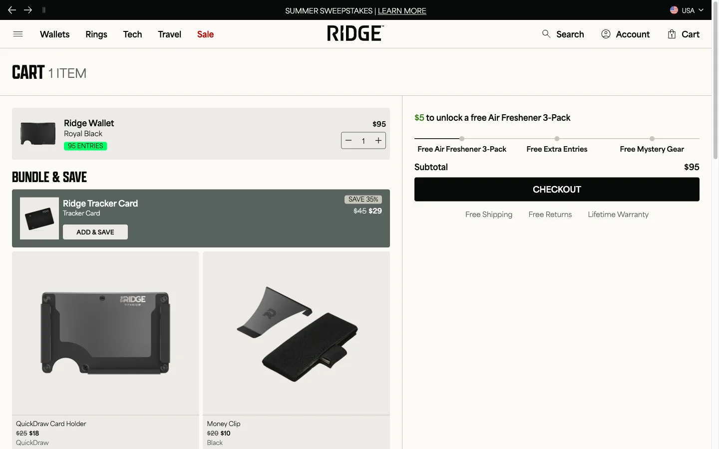
Add-on suggestions inside the cart, not just the product page
A short row of complementary products shown inside the cart itself, addable without leaving the page, chosen to fit what is already in the cart rather than generic bestsellers.
Ridge
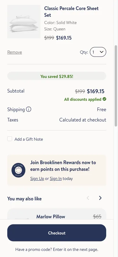
Skip the open promo code box until the shopper asks for one
A one-line "Have a promo code? Enter it on the next page" prompt replaces a visible, blank discount box sitting above the total by default.
Brooklinen
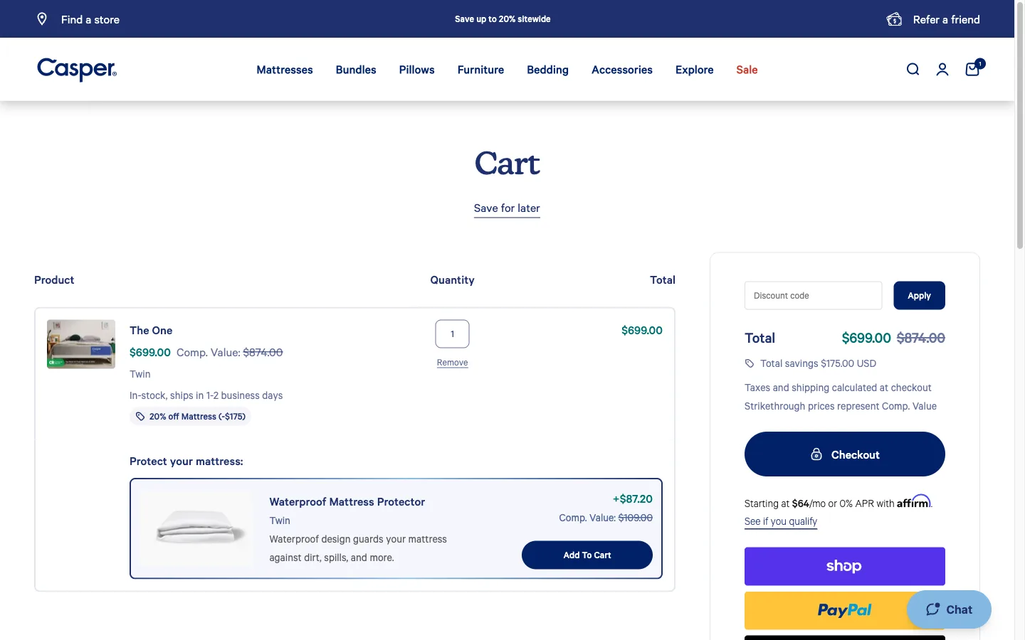
Save an item for later instead of forcing add-or-remove
A "save for later" action sits next to the Cart heading, separate from each line's own remove link, so a shopper unsure about one item does not have to make a final call on it to keep shopping.
Casper
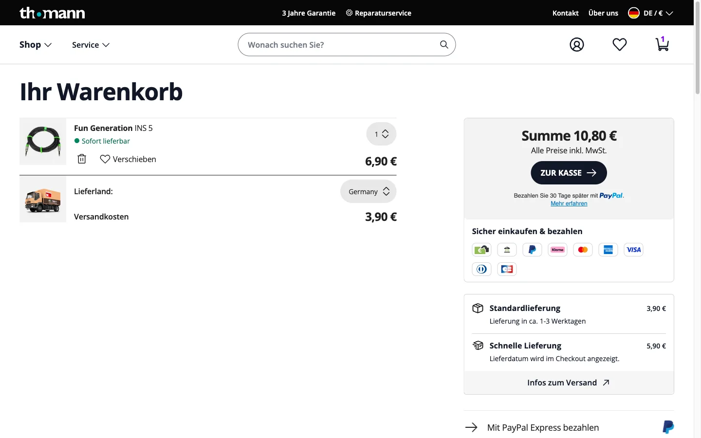
Show shipping and tax before the checkout step
Surfacing the full landed cost in the cart, rather than revealing shipping and tax at the final checkout step, means the number the shopper commits to is the number they actually pay.
Thomann
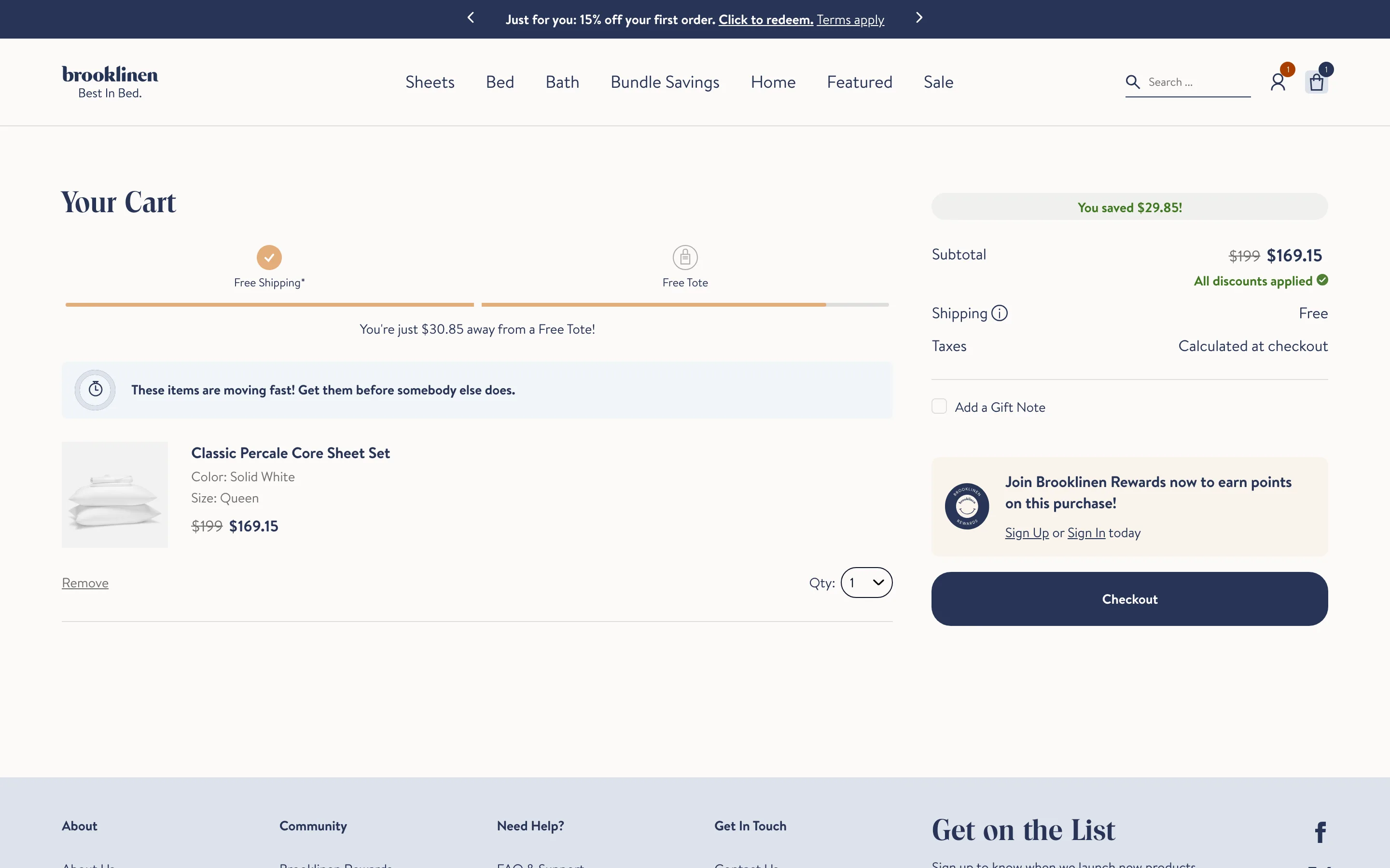
Restate the chosen variant in the cart line item
Spelling out size, color, and quantity on every cart line removes the doubt that sends shoppers back to the product page to double-check what they picked.
Brooklinen
Checkout
6 ideas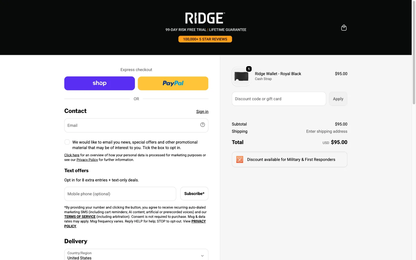
Make guest checkout the default path, not a hidden link
Checkout opens straight into a guest flow, with account creation offered as an optional step after the order is placed rather than a wall the shopper has to find a way around first.
Ridge
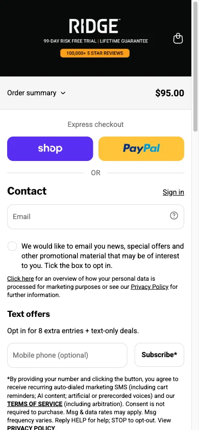
Put express wallet buttons above the checkout form, not below it
Apple Pay, Shop Pay, PayPal or similar one-tap options sit at the very top of the checkout screen, before the shopper has typed a single character into a form field.
Ridge
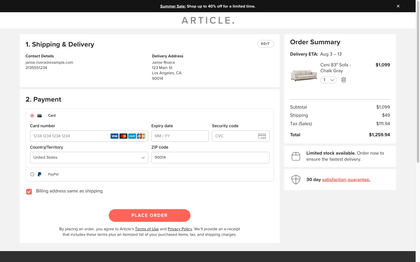
A visible step indicator across the checkout flow
Numbered sections, Shipping then Payment, collapse into a short summary with an edit link once completed, so the shopper always knows how much is left and can see exactly what they already confirmed.
Article
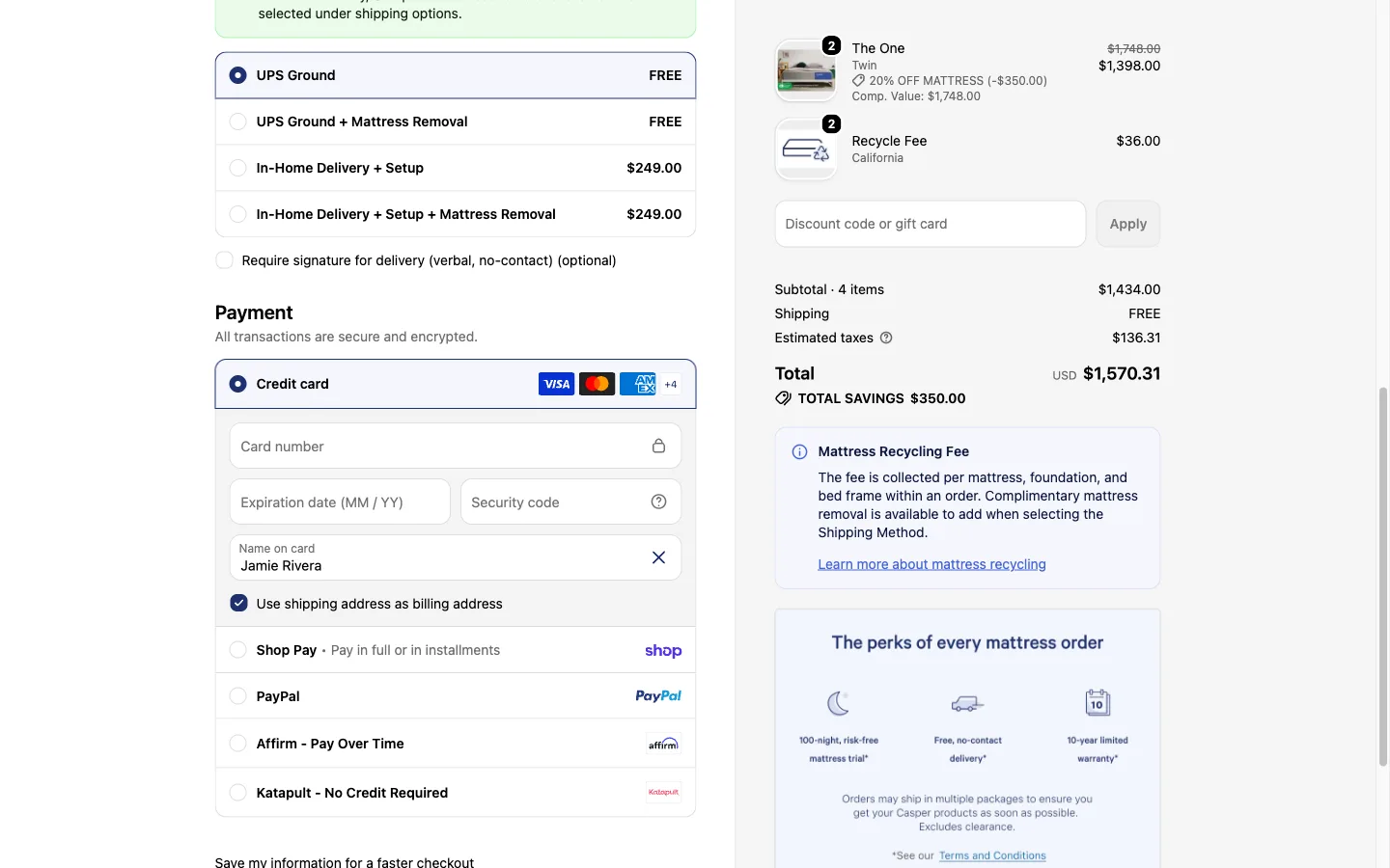
Keep the order summary visible through every checkout step
The cart contents, shipping cost, and running total stay visible in a sidebar or collapsible panel on every checkout screen, instead of disappearing after the first step.
Casper
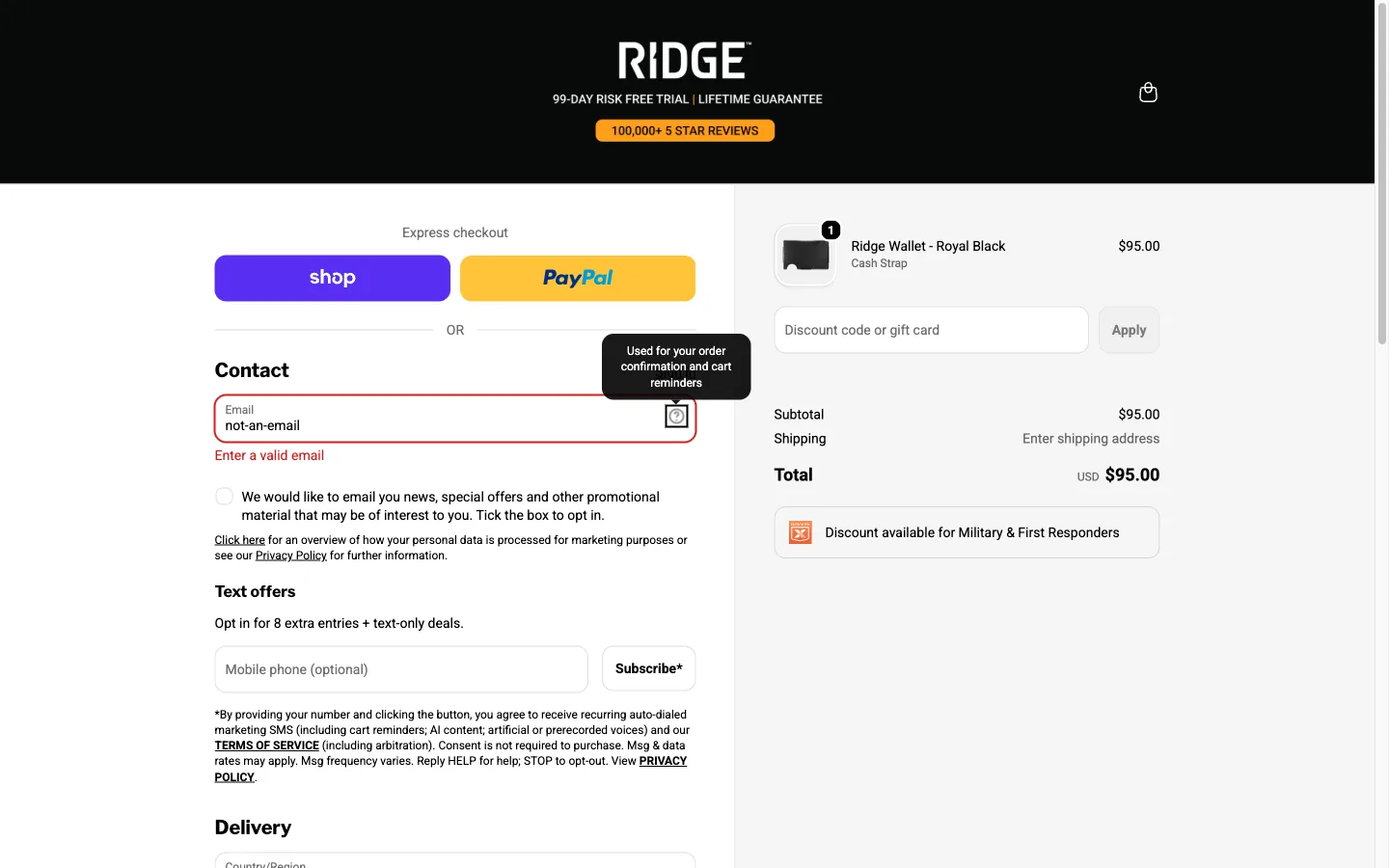
Validate each checkout field as the shopper fills it in, not after submit
A card number or postal code field flags a formatting problem the moment the shopper moves to the next field, instead of waiting until the whole form is submitted to show every error at once.
Ridge
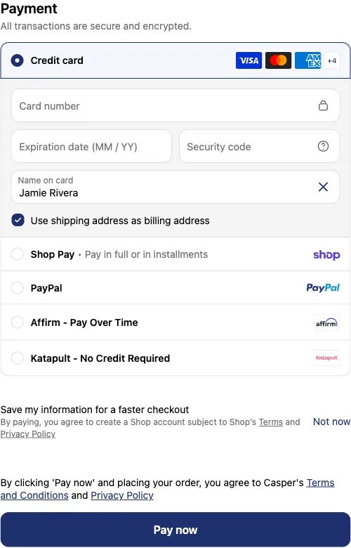
Offer multiple payment methods, including buy now pay later
Card, wallet, and an installment option like Affirm or Katapult all sit on the same payment screen, so the shopper who prefers to split the cost is not the one required to go find a different way to check out.
Casper
Nav & header
10 ideas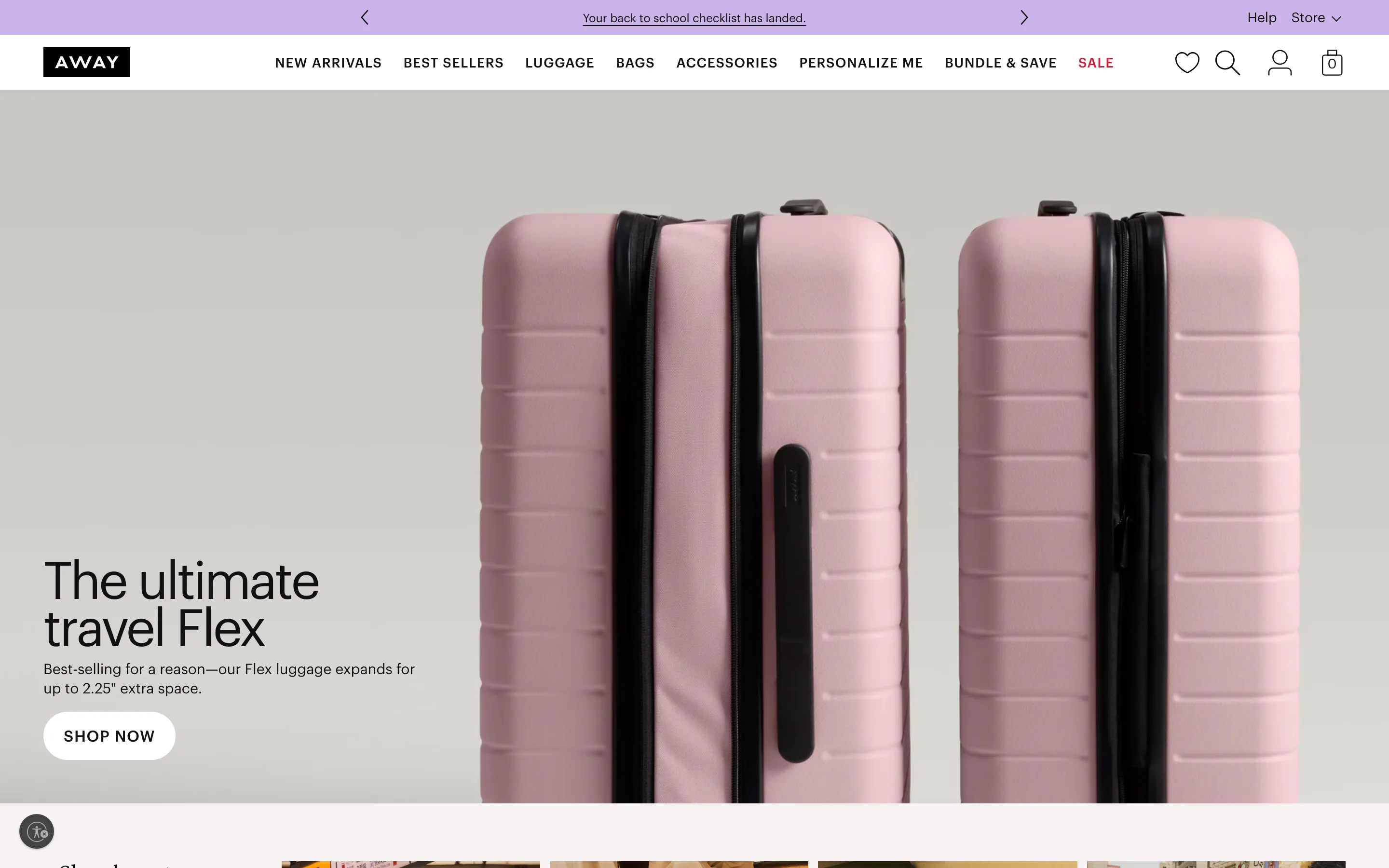
Give the header announcement bar arrow controls for multiple promos
The top utility bar cycles through several distinct promotions with manual arrow controls, letting the shopper browse every current offer instead of seeing just one.
Away
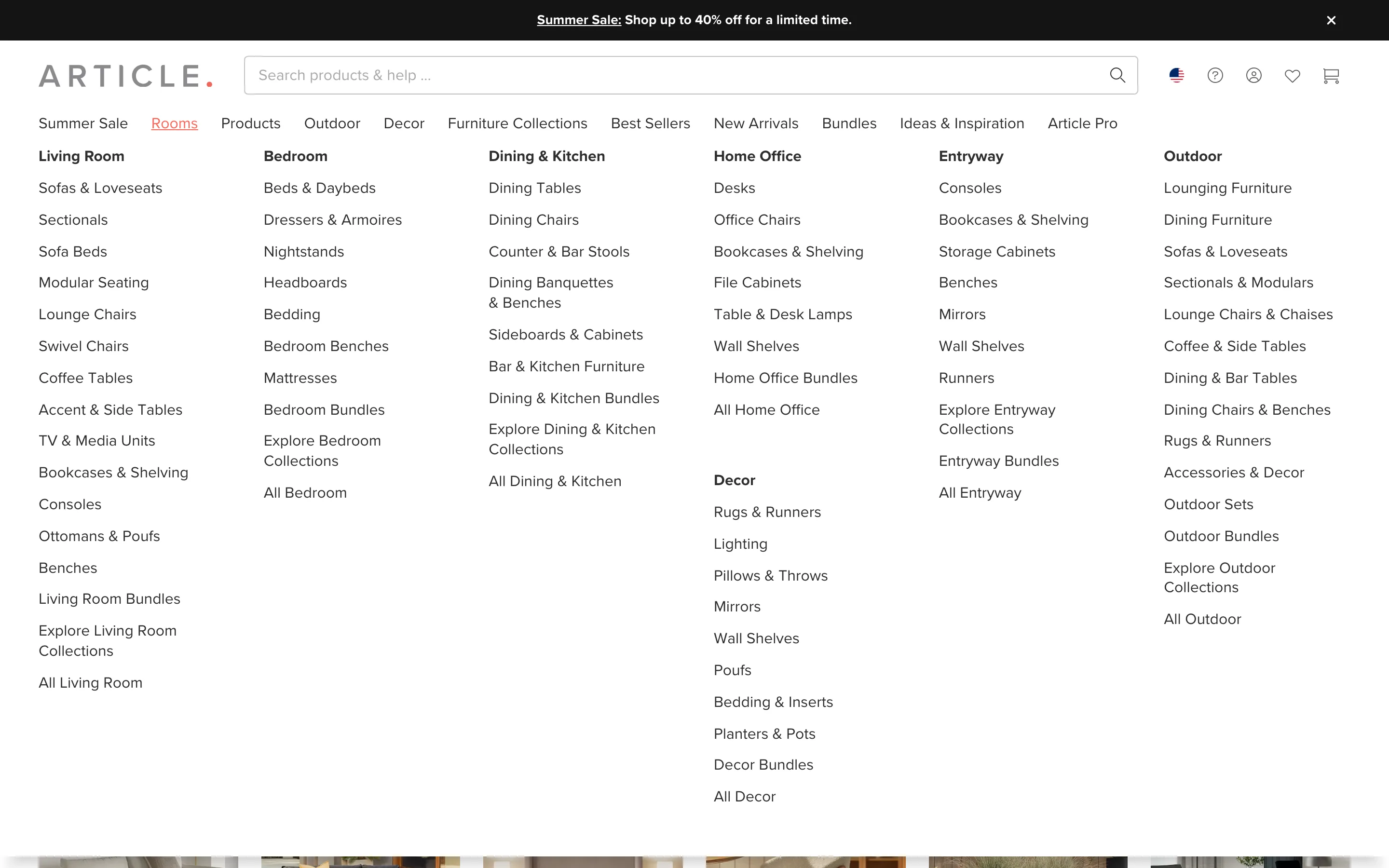
Organize the mega menu by room, not by product type
Article's Rooms mega menu groups furniture by where it goes, living room, bedroom, home office, instead of by product type, matching how a shopper actually thinks.
Article
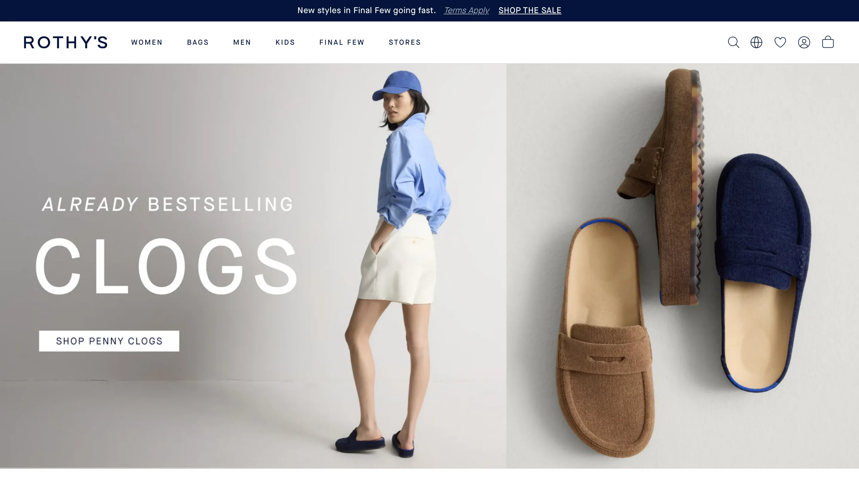
Give the wishlist its own icon in the header, not a hidden account submenu
A dedicated wishlist icon sits in the header's main icon row, next to cart and account, instead of hiding the feature inside an account menu.
Rothy's
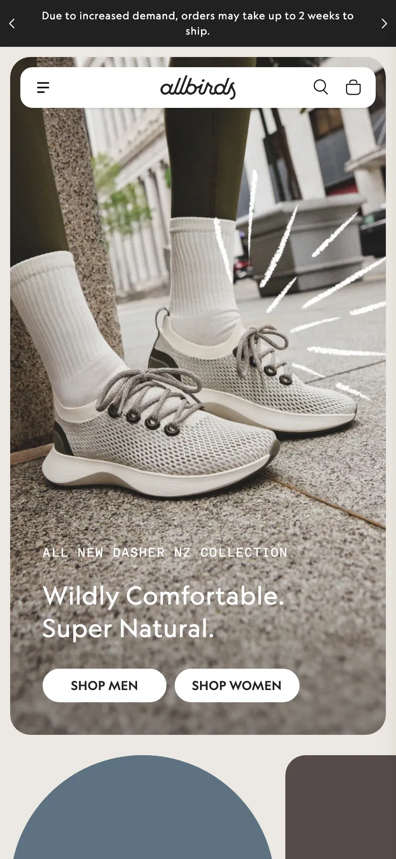
State a real shipping delay in the header bar, not just at checkout
Allbirds states a real shipping delay in the header bar itself, so the shopper knows before checkout instead of discovering it at the moment they're about to pay.
Allbirds
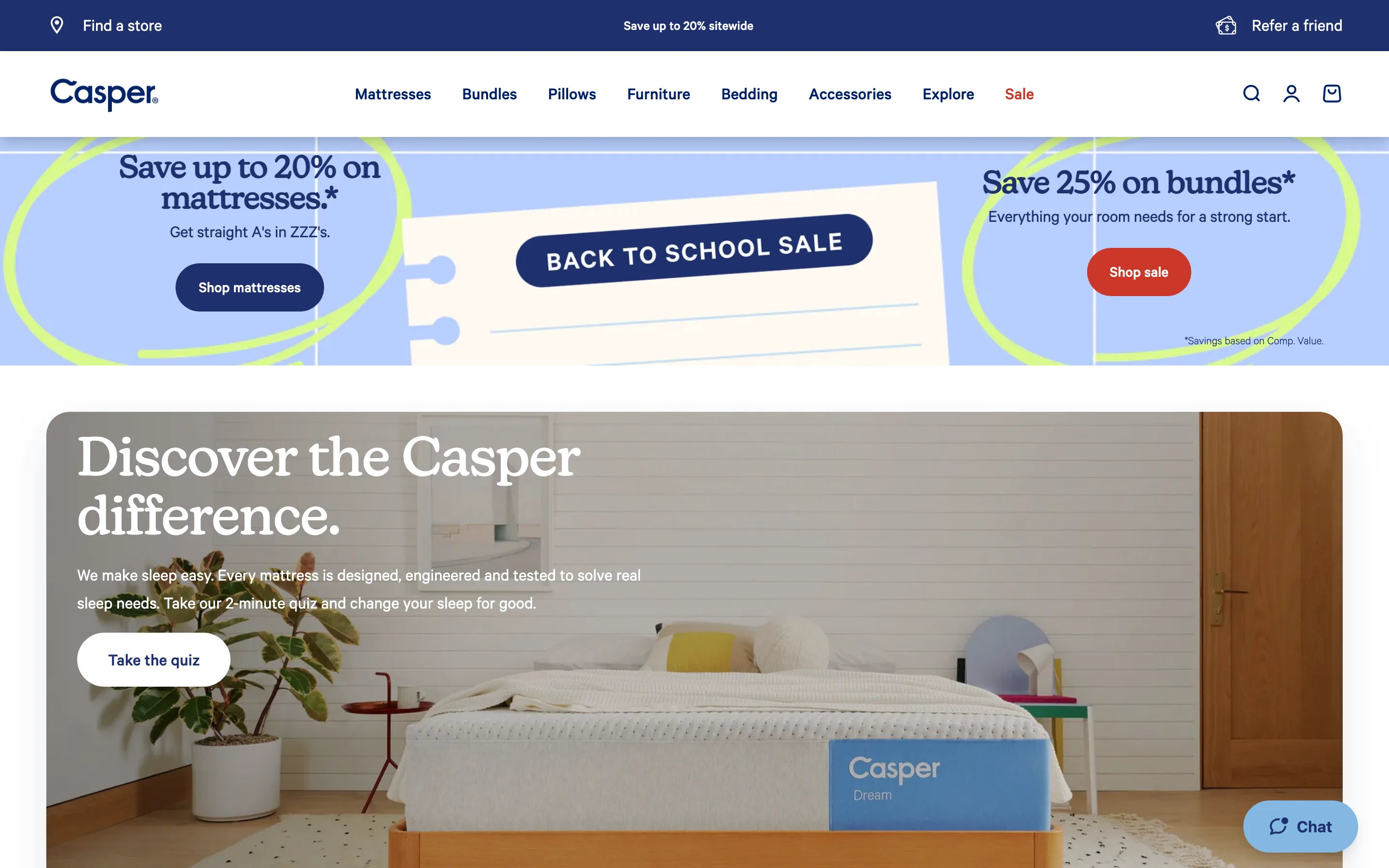
Split the header utility bar into three simultaneous purposes
Casper's header bar carries three separate items, store locator, promo, refer a friend, instead of one generic message competing for every shopper's attention.
Casper
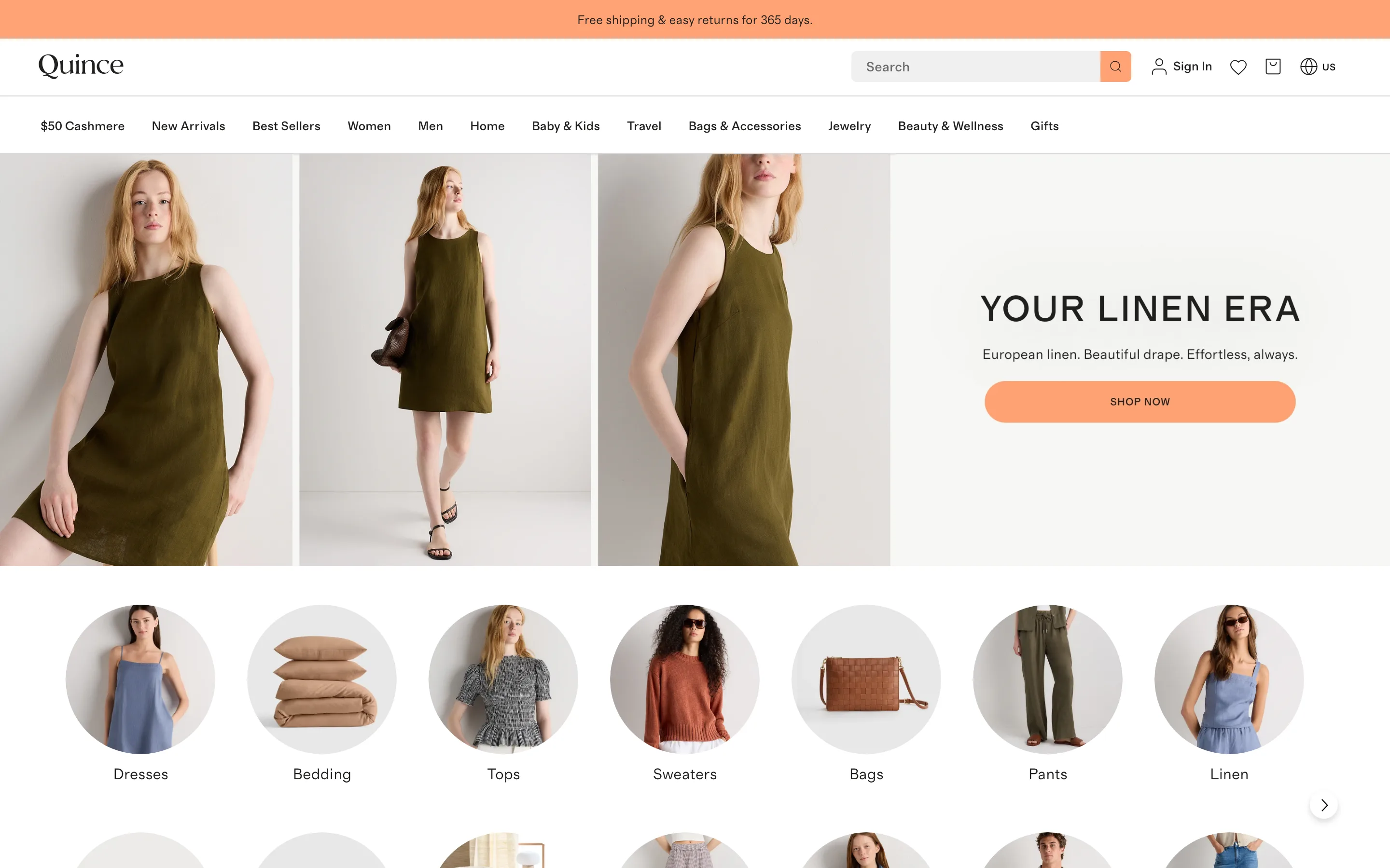
Pin the lead price-point promo as a permanent nav tab, not a banner
Quince pins its $50 Cashmere price anchor as a permanent nav tab, not a dismissible banner, so the shopper can return to it from any page at any time.
Quince
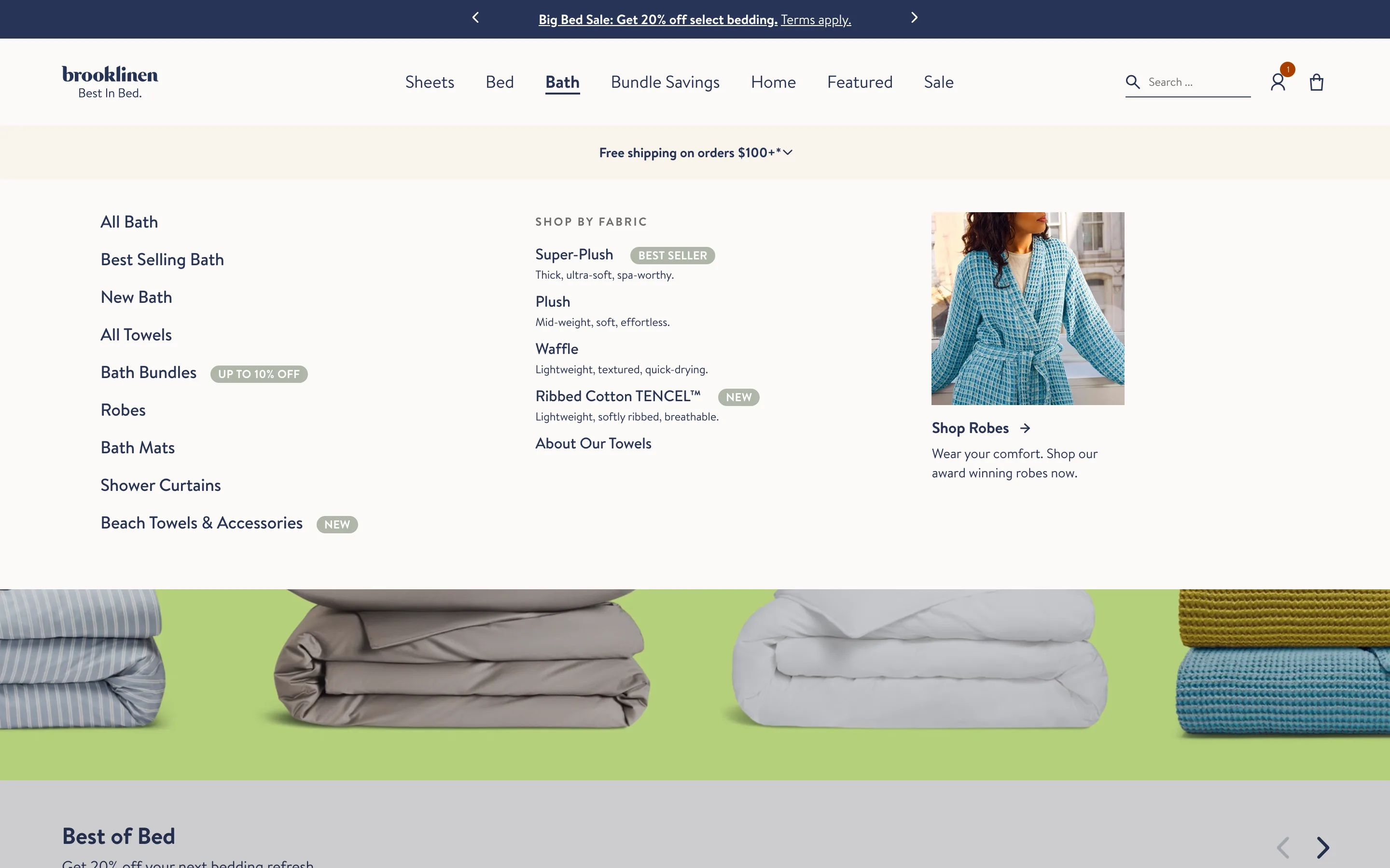
A mega menu with category columns and a featured panel
Hovering a nav item opens a full-width menu: a column of subcategories, a shop-by-attribute list, and a featured image tile promoting one collection.
Brooklinen
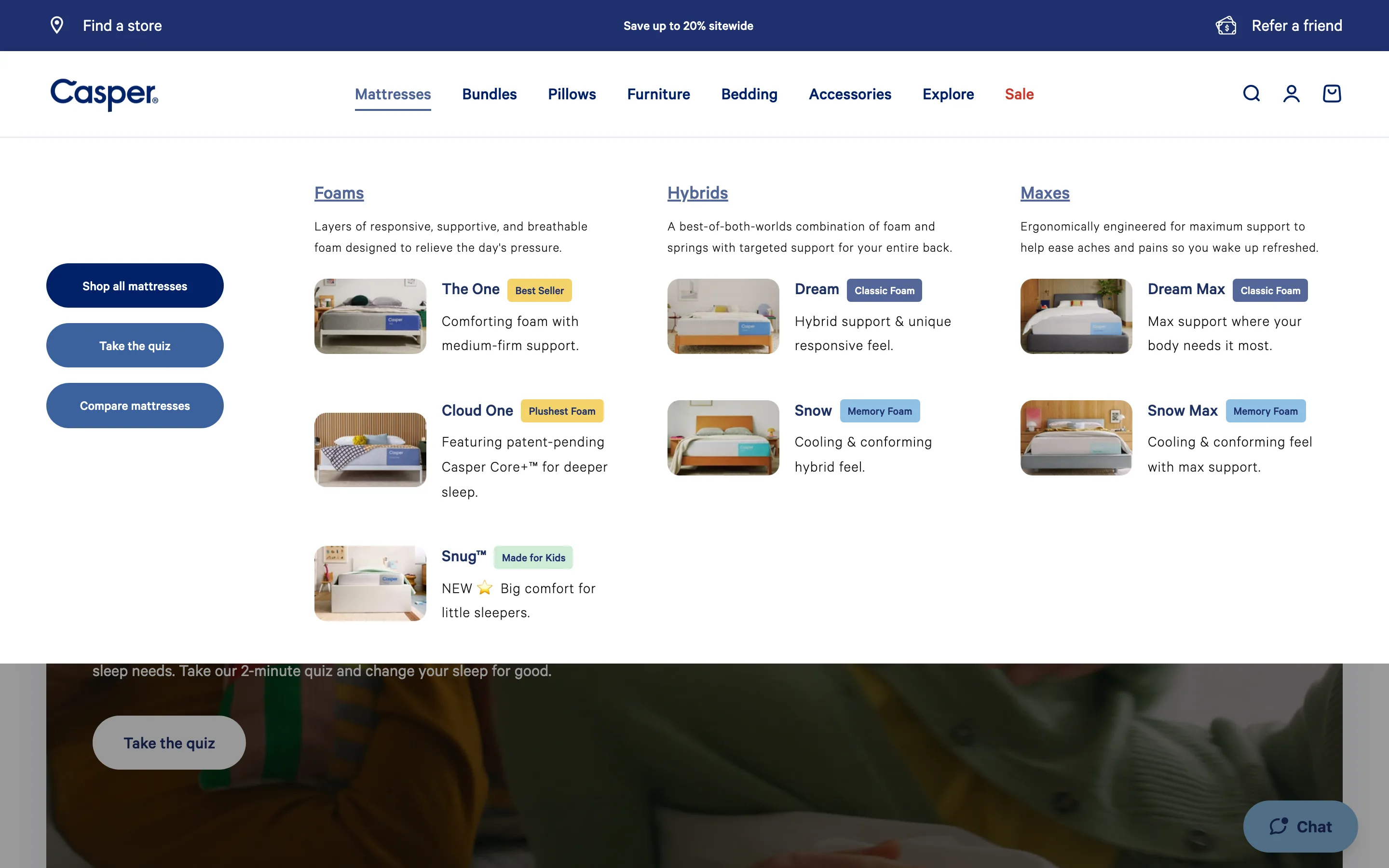
A mega menu that previews products with a quiz panel
The menu shows product-preview cards grouped by type with images and badges, beside a panel of shortcuts, so shoppers browse the range or take a guided quiz from the nav.
Casper
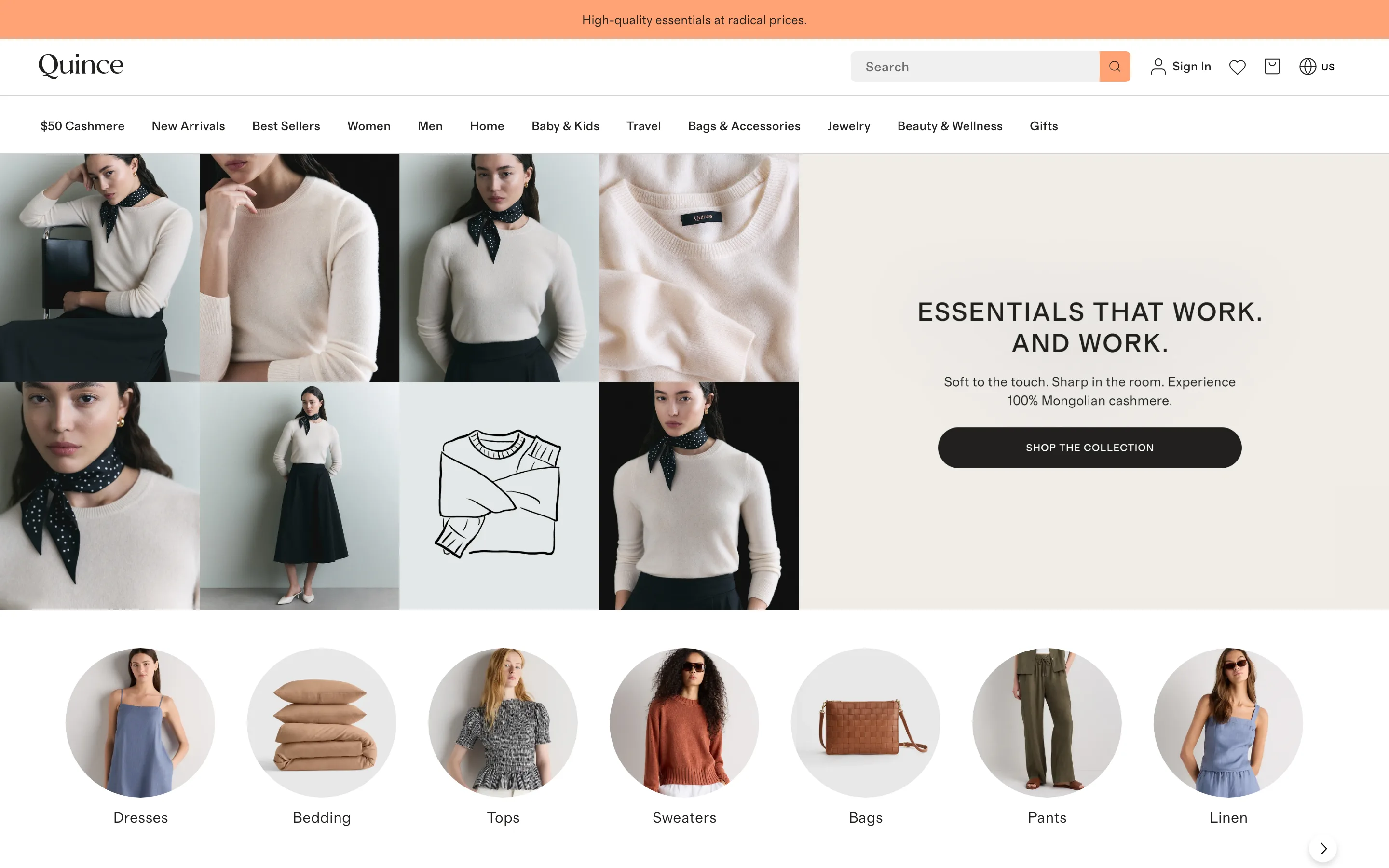
An editorial mega menu with imagery and collection tiles
The menu opens into a grid of editorial photography and a promo panel, with a row of circular collection tiles below, selling the range as a lookbook rather than a link list.
Quince
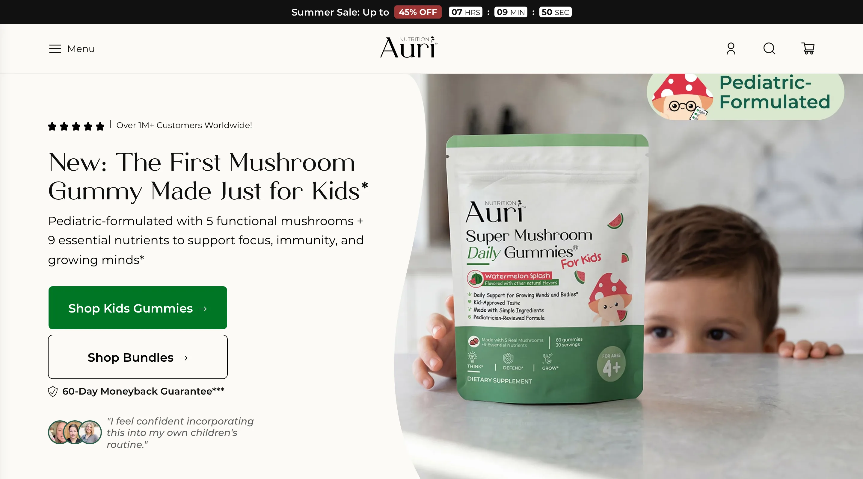
Put a live countdown in the sale bar
The announcement bar carries the discount plus a live hours/minutes/seconds countdown, putting a visible deadline on the offer sitewide.
Auri
Footer
6 ideas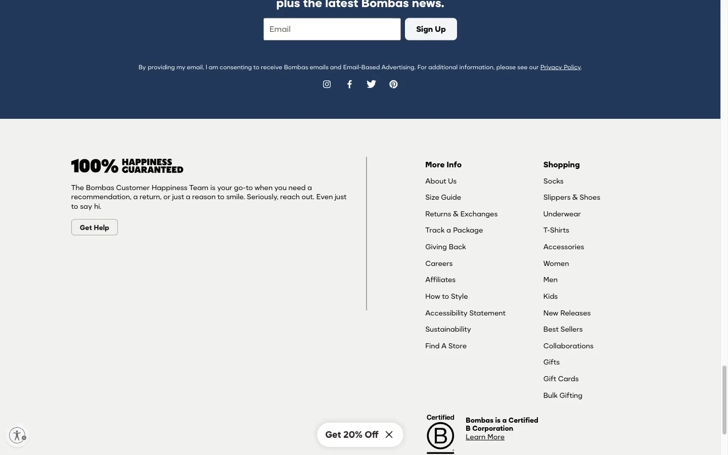
Lead the footer with a support statement, not a wall of links
Before any link columns, the footer opens with a "100% Happiness Guaranteed" headline and a single Get Help button, addressing the shopper's likely reason for scrolling that far.
Bombas
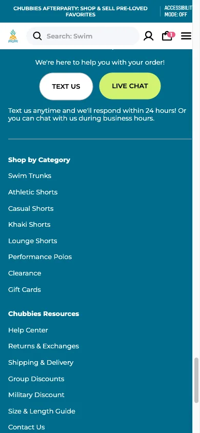
Name the actual support channels in the footer, not a generic Contact Us
The footer's support block offers a real number to text and a Live Chat button, each naming the expected response time, instead of one generic Contact Us link.
Chubbies
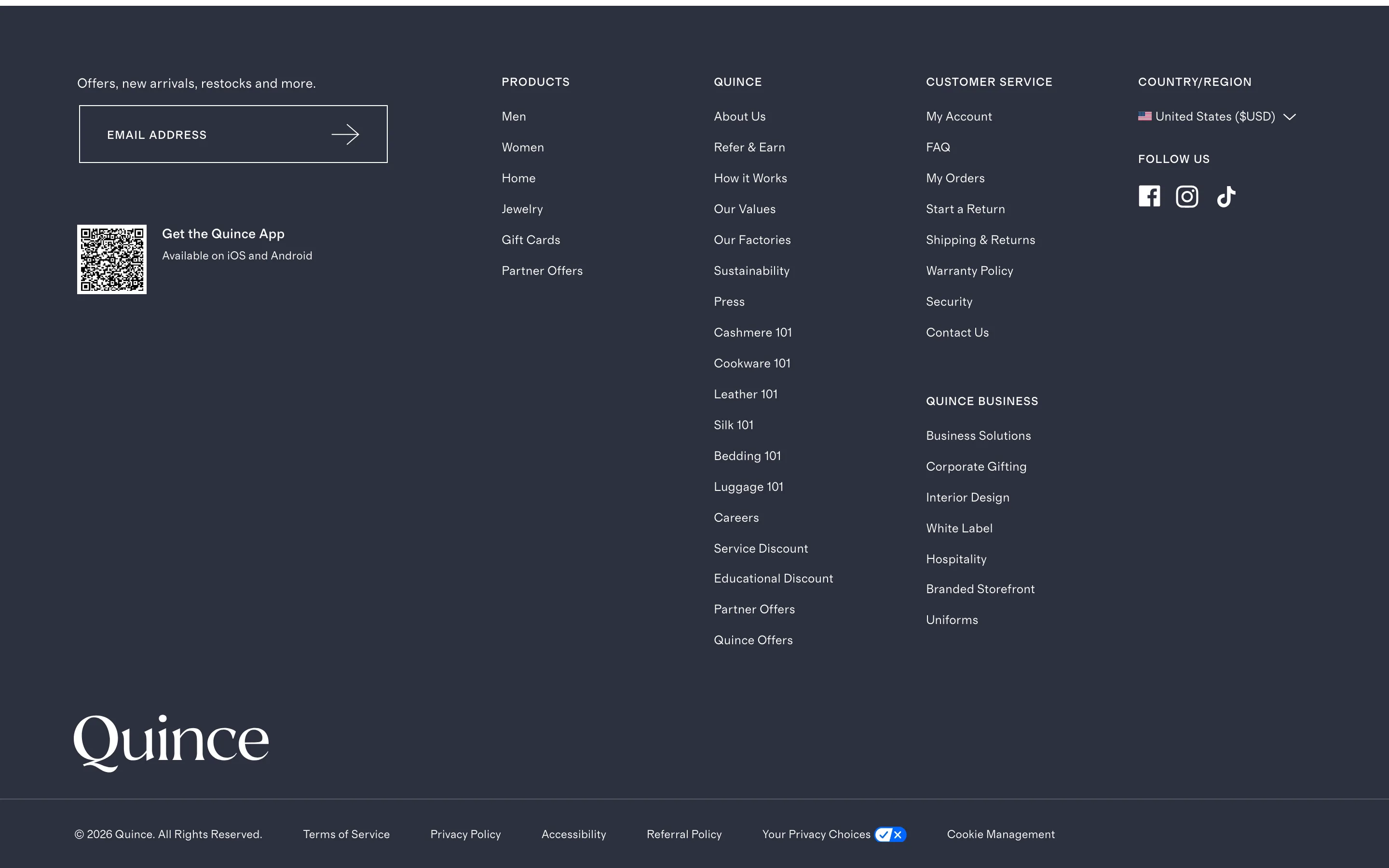
Put a QR code app-download prompt next to the footer newsletter box
A QR code sits beside the footer's email signup box, letting a desktop shopper install the mobile app by scanning instead of remembering to search for it later.
Quince
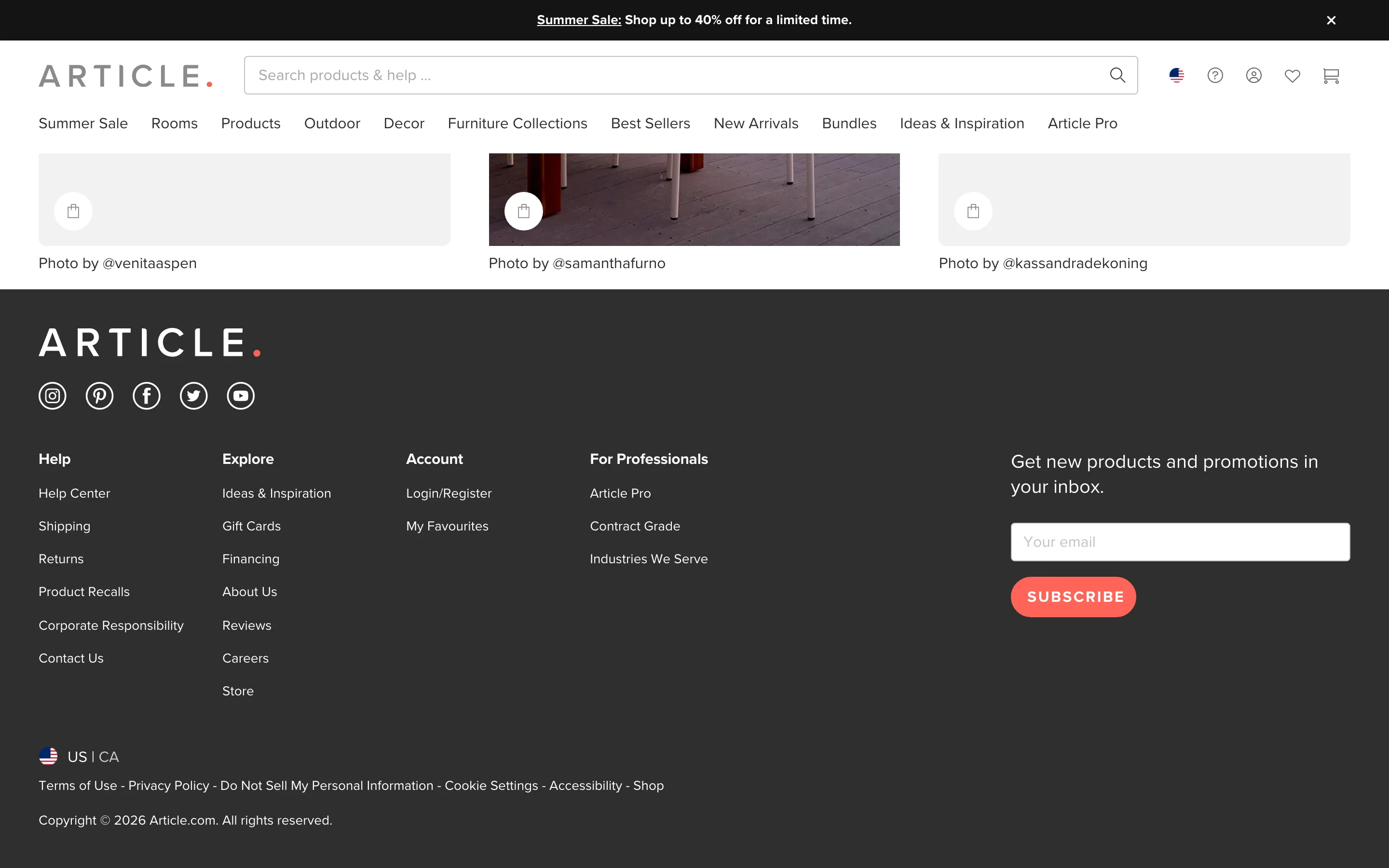
Give the footer its own email capture, independent of the homepage popup
The footer carries its own always-available email signup field, independent of any homepage popup, for shoppers who decide to subscribe later in their visit.
Article
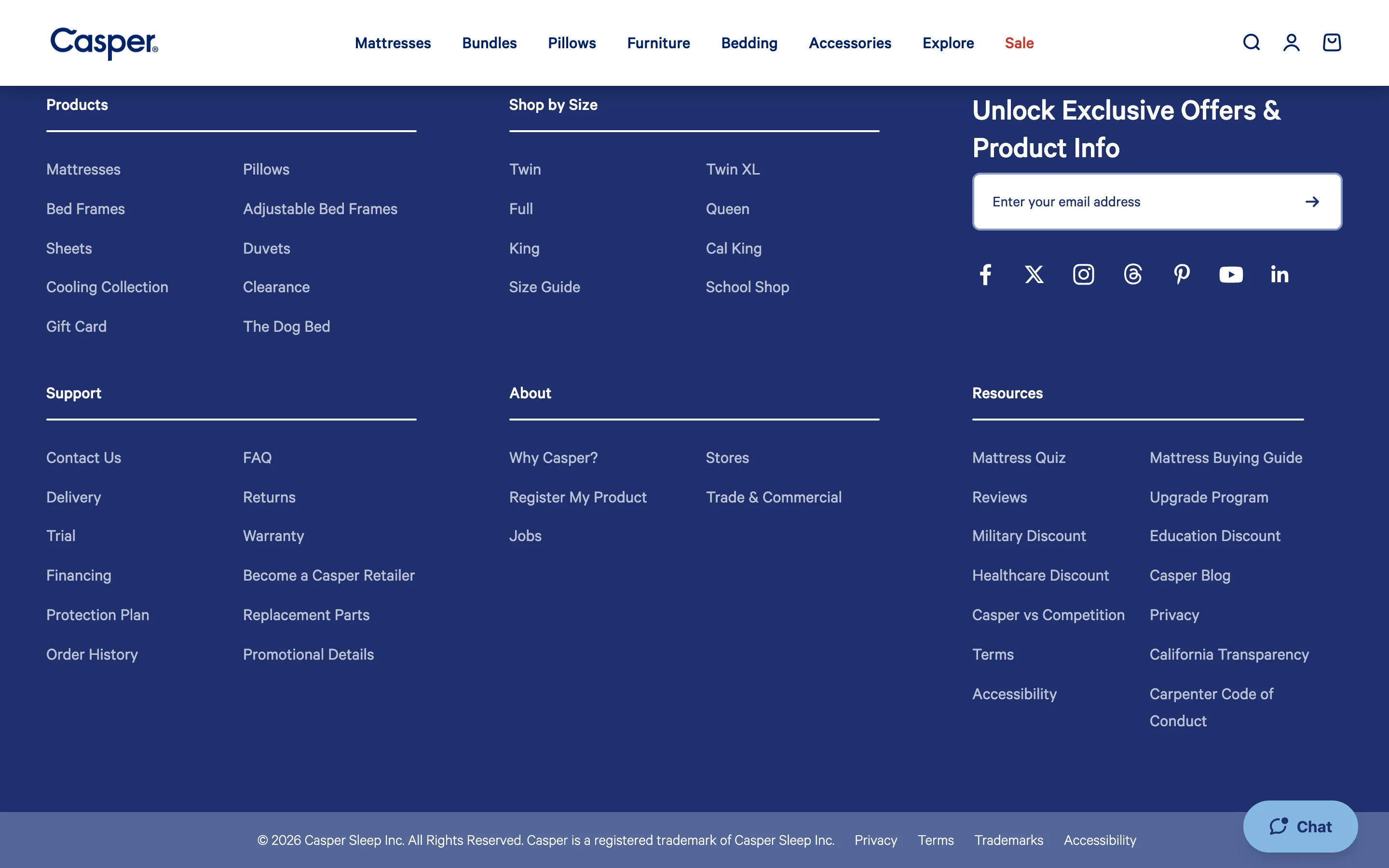
Add size-specific shortcut links to the footer for returning shoppers
The footer lists direct Shop by Size links, Twin through Cal King, so a returning shopper who knows their size can skip straight to it from any page.
Casper
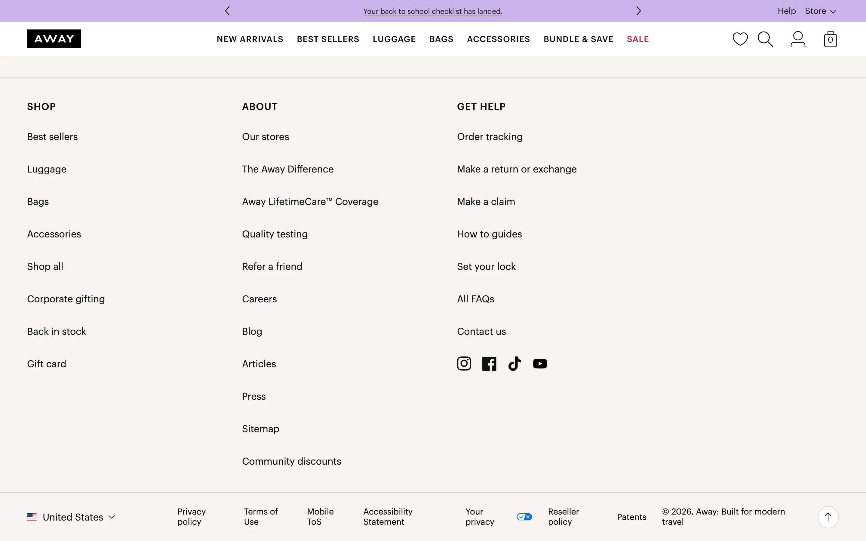
Name specific self-service actions in the footer, not one Contact Us link
The footer's Get Help column names specific self-service actions, order tracking, returns, warranty claims, lock setup, instead of routing every request through one Contact Us link.
Away
Ideas are cheap. Running them properly is the hard part.
We run these tests for ecommerce brands every week, and get paid on what they add.
See the performance program