Product pageDesktopClarityTrust
Add a side-by-side comparison panel on the product page
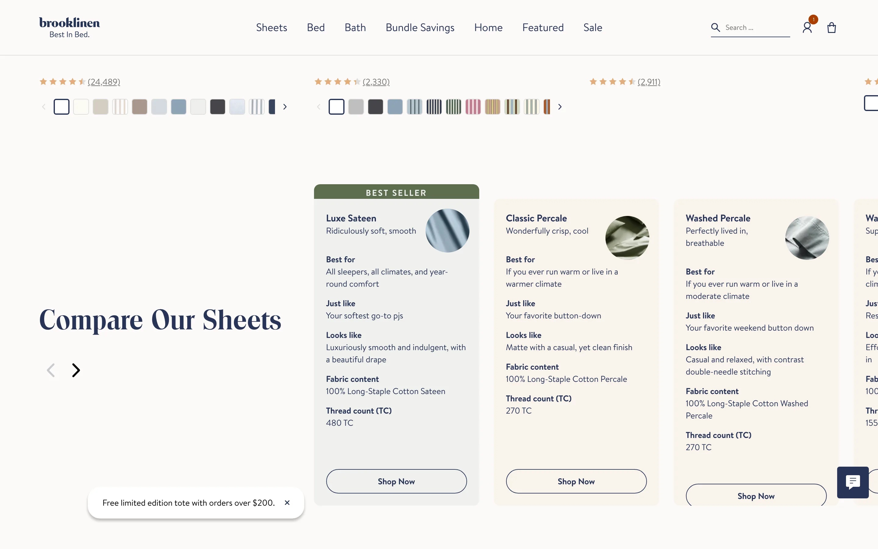
A compact panel sets the choices side by side, the range of options or the product against the usual alternative, so the right pick is obvious at a glance.
What it is
A compact comparison panel sets the choices side by side, whether that is the product against the usual alternative or the range of options against each other, so the shopper can weigh them at a glance instead of reading a wall of copy.
Why it works
A product advantage is often clearest by contrast. Framing it against the alternative the shopper already understands makes the value obvious without a wall of copy.
How to test it
- Hypothesis
- Adding a this-versus-the-usual-way comparison panel will lift add-to-cart rate by making the product advantage concrete.
- Primary metric
- Add-to-cart rate (product page sessions)
- Guardrail metric
- Bounce rate, to confirm the comparison does not invite competitor research
Related ideas
Want this tested on your store?
We run the experiment, call the result honestly, and get paid on what it adds.
See the performance program