Product pageDesktopClarity
Arrange the benefits around the product itself
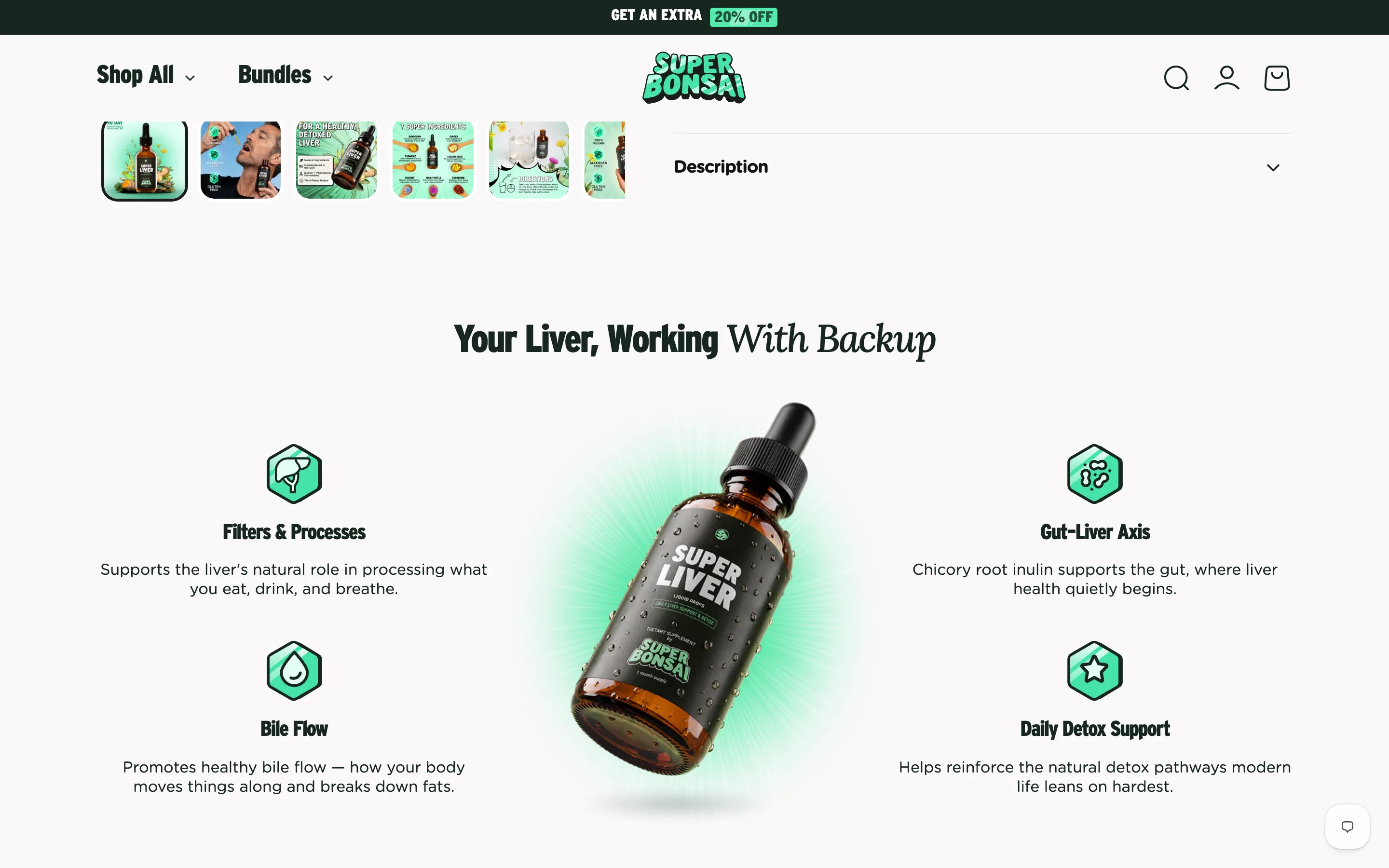
The product sits centre with its benefits placed around it as icon callouts, so the shot and the argument are the same visual.
What it is
A section places the product image at the centre and arranges its key benefits around it as icon callouts, each with a short explanation, so the product shot and the benefit argument are one visual.
Why it works
Anchoring the benefits physically to the product makes them read as properties of the thing itself rather than marketing copy beside it, and the radial layout gives the eye one clear focal point.
How to test it
- Hypothesis
- A benefits-around-product section will lift add-to-cart rate versus a plain benefit list by binding the claims to the product visual.
- Primary metric
- Add-to-cart rate (product page sessions)
- Guardrail metric
- Scroll depth past the section
Related ideas
Want this tested on your store?
We run the experiment, call the result honestly, and get paid on what it adds.
See the performance program