Put express wallet buttons above the checkout form, not below it
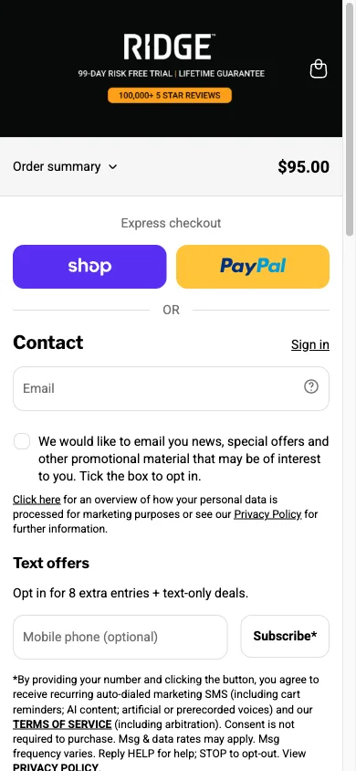
Apple Pay, Shop Pay, PayPal or similar one-tap options sit at the very top of the checkout screen, before the shopper has typed a single character into a form field.
What it is
The checkout page opens with express payment buttons, wallet options that carry a saved shipping address and card, positioned above the manual email and address form rather than as a smaller secondary option beneath or beside it.
Why it works
On mobile, typing a shipping address and card number is genuinely slow and error-prone: autocorrect fights with street names, card scanners misread digits, and a shopper on a phone is more likely to be doing this one-handed than sitting at a desk. A wallet button skips all of that by reusing information the device already has stored and verified. Putting it first is what actually gets it used; buried below a full form, most shoppers are already typing before they notice it exists.
How to test it
- Hypothesis
- Moving express wallet buttons above the checkout form will lift checkout completion rate on mobile, because shoppers with a saved wallet can skip manual form entry entirely instead of discovering the option partway through typing.
- Primary metric
- Checkout completion rate (mobile checkout sessions)
- Guardrail metric
- Average order value, which could fall if wallet checkouts skip an upsell step that the manual flow otherwise shows
Related ideas
Want this tested on your store?
We run the experiment, call the result honestly, and get paid on what it adds.
See the performance program