Lead the footer with a support statement, not a wall of links
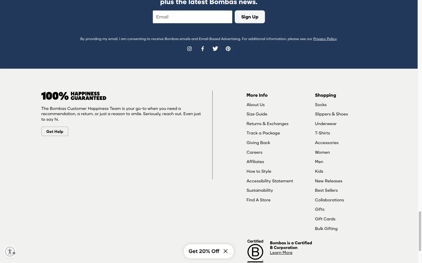
Before any link columns, the footer opens with a "100% Happiness Guaranteed" headline and a single Get Help button, addressing the shopper's likely reason for scrolling that far.
What it is
Before any of the footer's link columns, the top-left of the footer leads with a "100% Happiness Guaranteed" headline, two sentences inviting the shopper to reach out for any reason, and a single "Get Help" button, all ahead of the standard Shop/About/Support navigation columns.
Why it works
A footer that opens straight into columns of links treats every visitor the same: here is everything on the site, sorted by department. A shopper who scrolled all the way to the footer with an actual problem or a hesitation, not just looking for a sitemap, has to scan past several unrelated columns to find the one relevant link. Leading with a direct, human statement and a single button answers that shopper's likely reason for being there first, before asking them to do the work of finding "Support" buried a few rows into a link grid.
How to test it
- Hypothesis
- Leading the footer with a support statement and a single Get Help button, ahead of the link columns, will lift footer-to-support clickthrough rate, because shoppers who scrolled to the footer with an actual question no longer have to scan several unrelated columns to find where to go.
- Primary metric
- Clickthrough rate on the footer's support entry point
- Guardrail metric
- Clickthrough rate on the footer's shop/product links, which could fall if the support block, given the first and most prominent position, draws attention away from them
Related ideas
Want this tested on your store?
We run the experiment, call the result honestly, and get paid on what it adds.
See the performance program