Split the header utility bar into three simultaneous purposes
Casper's header bar carries three separate items, store locator, promo, refer a friend, instead of one generic message competing for every shopper's attention.
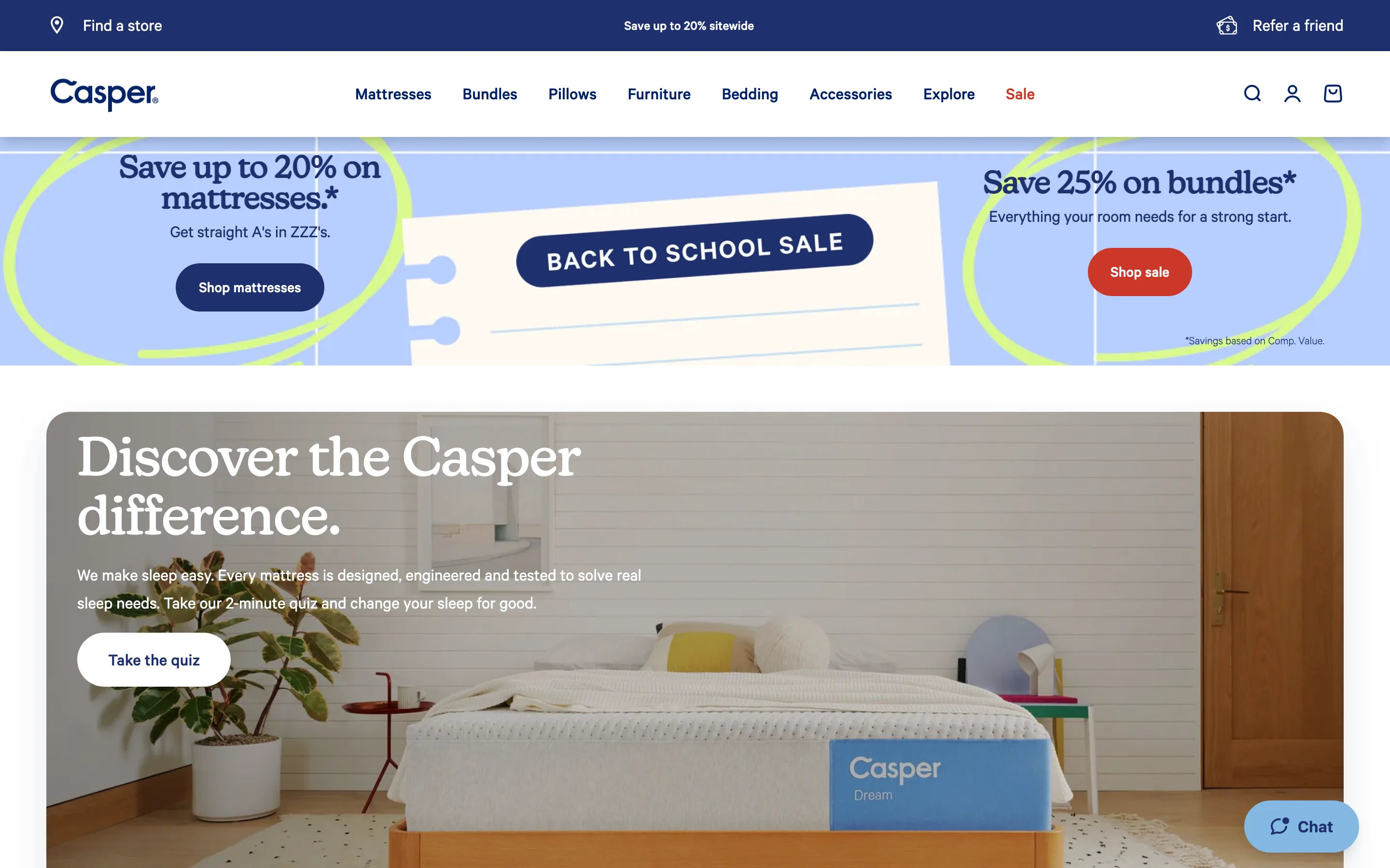
What it is
The persistent bar above the main nav splits into three simultaneous, independent items: a store locator link on the left, a sitewide promo in the center, and a refer-a-friend link on the right, rather than one bar carrying a single message.
Why it works
Different shoppers arrive with different unresolved questions, and a single-message utility bar can only address one of them. A shopper who already owns the product and wants to visit a showroom, a shopper deciding whether now is a good time to buy, and an existing customer who would refer a friend for a reward are three different people with three different reasons to look at that bar, and a bar that only ever shows the promo serves just the middle one. Splitting the bar into three fixed, always-visible items means each of those shoppers has their own reason to look up, without any of them competing for the same word count.
How to test it
- Hypothesis
- Splitting the header utility bar into three distinct, simultaneous items will lift the combined clickthrough rate on the bar, because each item serves a different shopper intent instead of every intent competing for the same single message.
- Primary metric
- Combined clickthrough rate on the utility bar (all three items)
- Guardrail metric
- Clickthrough rate on the sitewide promo specifically, which could fall if splitting its visual space three ways makes it less prominent than a single full-width message would have been
Related ideas
Want this tested on your store?
We run the experiment, call the result honestly, and get paid on what it adds.
See the performance program