Give the wishlist its own icon in the header, not a hidden account submenu
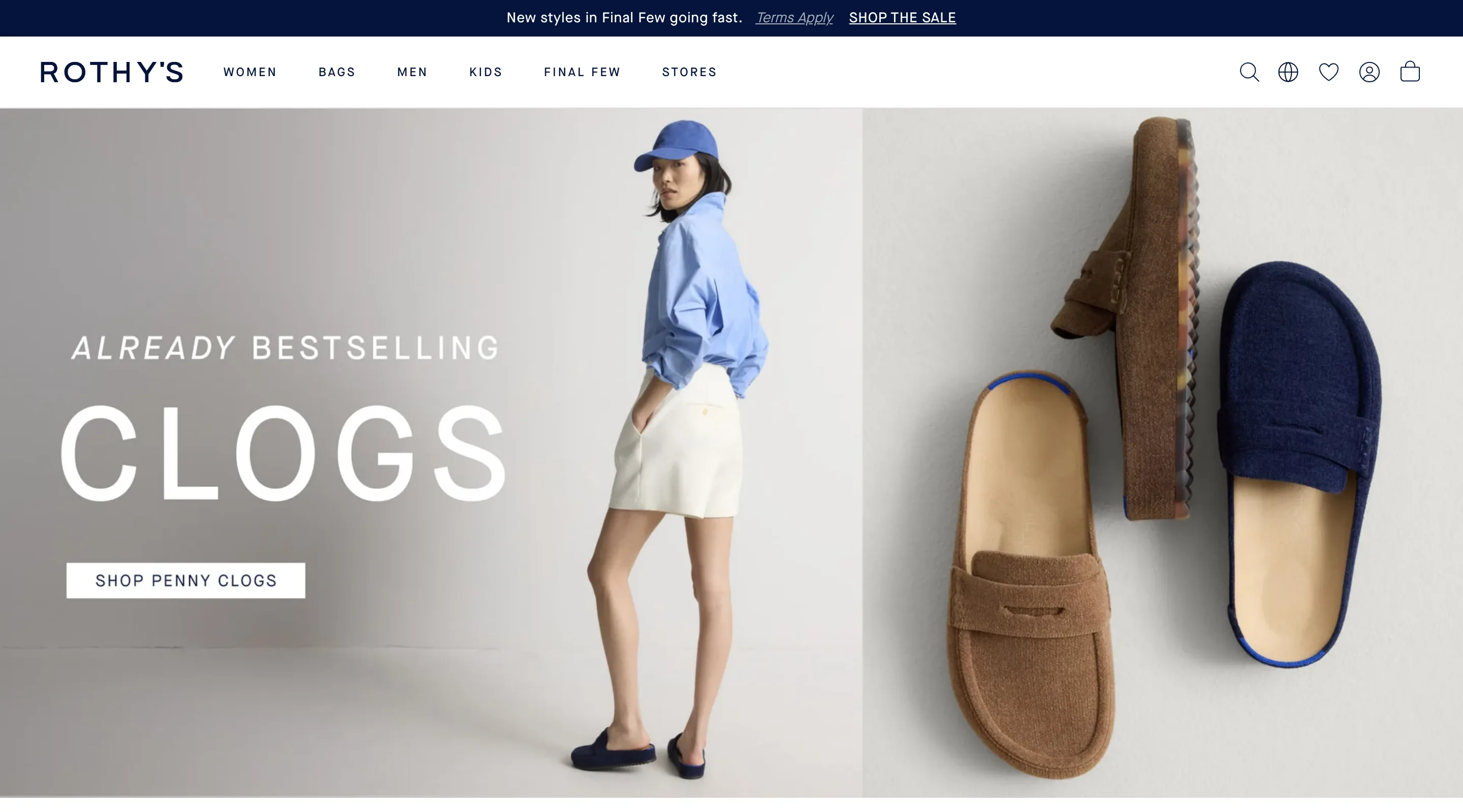
A dedicated wishlist icon sits in the header's main icon row, next to cart and account, instead of hiding the feature inside an account menu.
What it is
The header's utility icon row carries a dedicated heart/wishlist icon alongside search, a region selector, account and cart, all visible on every page at the same visual weight as the cart icon, regardless of whether the shopper has signed in.
Why it works
A shopper comparing several products across sessions needs a lightweight way to bookmark items without committing to a purchase. If that action lives only inside an account menu, a shopper has to first locate and open that menu, then find the wishlist inside it, before they can use the feature even once, and most first-time visitors never discover it is there at all. A dedicated icon in the same row as cart signals that saving something is a first-class action, not a hidden sub-feature, which lowers the bar to trying it on a shopper's very first visit.
How to test it
- Hypothesis
- Giving the wishlist its own icon in the main header icon row will lift wishlist add rate, because shoppers no longer have to find the feature inside an account menu before they can use it for the first time.
- Primary metric
- Wishlist add rate (sessions that view a product page)
- Guardrail metric
- Add-to-cart rate, which could fall if shoppers who would have bought immediately save the item for later instead
Related ideas
Want this tested on your store?
We run the experiment, call the result honestly, and get paid on what it adds.
See the performance program