Product pageDesktopClarityTrust
Annotate the alternative with everything wrong with it
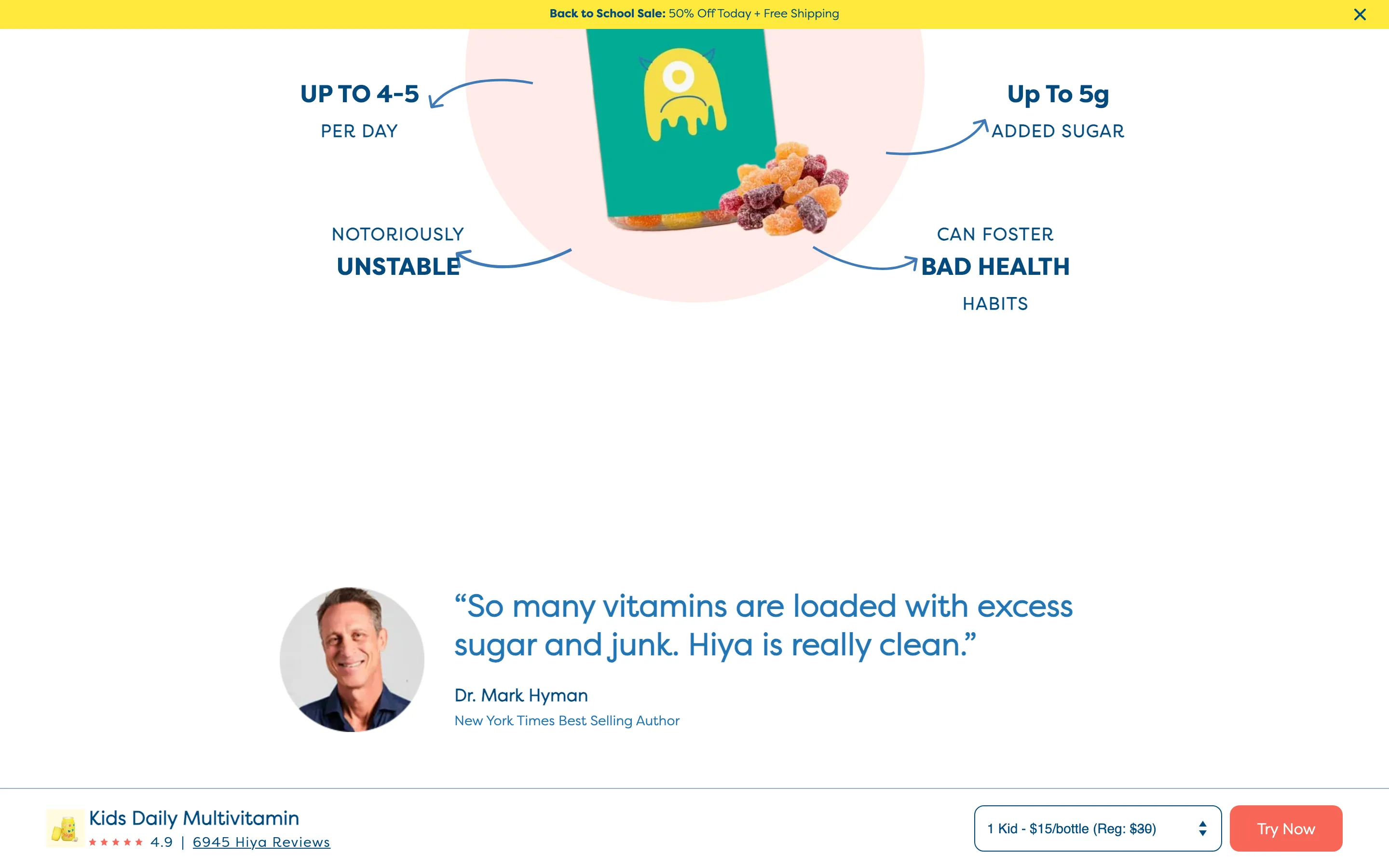
The competing format is photographed with arrows pointing at its problems (added sugar, doses per day, instability), making the case on the image instead of in copy.
What it is
A photograph of the competing product format sits centre with arrows and short labels pointing at each of its drawbacks (added sugar, number of doses per day, stability, the habits it encourages), so the argument against the alternative is made on the image itself.
Why it works
It is the annotated-diagram device pointed at the alternative instead of at your own product. Arrows on a photo get read and remembered where the same points in a paragraph are skipped, and the shopper reaches the conclusion themselves.
How to test it
- Hypothesis
- Annotating the competing format with its drawbacks will lift add-to-cart rate by making the case against the alternative visual rather than written.
- Primary metric
- Add-to-cart rate (product page sessions)
- Guardrail metric
- Bounce rate, to confirm the negative framing does not read as attacking
Related ideas
Want this tested on your store?
We run the experiment, call the result honestly, and get paid on what it adds.
See the performance program